‘Sweet Magnolias’ Home Decor – Secrets from Sweet Magnolia Set Designer
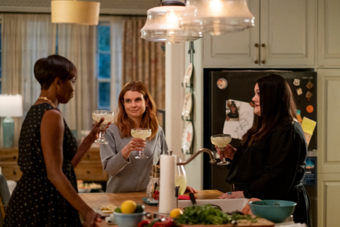
If you’ve watched an episode of Sweet Magnolias on Netflix and found yourself getting dreamy-eyed over Maddie’s kitchen tile instead of Coach Cal’s smile, well then you’ve come to the right design-obsessed place. Because we’ve already tracked down where you can buy the outfits from the show, we’re now directing our Nancy Drew-style sleuthing to the show’s warm and welcoming set design. You may already know that most of the series is filmed in and around Covington, Georgia, but did you know many of the interiors (including Sullivan’s, The Corner Spa, and Maddie’s and Dana Sue’s houses) are sets built from scratch on a stage? Production Designer Aimee Holmberg and Set Designer Nik Morgan, both of whom actually have a background in—who would have guessed?—the horror genre, spoke to Country Living about why the Southern setting inspires she show’s aesthetic, how they scheme up spaces around each character, and where they sourced all that cute decor. (Good news: Much of it’s from budget-friendly sources including Home Goods, Rooms to Go, Etsy, and Spoonflower!)
“Sweet Magnolias is very much a character-driven story and we approached [the design] with the intent of developing the characters’ spaces in ways that would further their personal stories in the eyes of the viewer,” says Aimee. “We discussed each character at length with our lovely show creator Sheryl Anderson, right down to their hobbies, favorite foods, books and artwork.” If you look closely, Aimee notes you can spot hints about each character in the design details. “Clues to Dana Sue’s wild child past can be found featured on her mantel and wall mounted display shelf above,” says Aimee. Here’s the nitty gritty on all that pretty.
MADDIE’S FEMININE FARMHOUSE
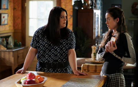
The location used for the exterior shots of Maddie’s home is an 1890s farmhouse—”one of the oldest in Covington,” notes Aimee. To bring the interior to life, the team embraced a “palette of soft warm neutrals and floral patterns, with punches of more vibrant teals, corals and blues to keep it fresh,” says Aimee, as well as a “stylish but effortless mix of newer furniture, antique store finds, and family heirlooms.” Set designer Nik Morgan also notes there’s a lot to be learned from those layers: “In Maddie’s case, the most important story to tell was that of her family, specifically their past and what their lives had been up until where we find them now. All the photos and trinkets, the different styles of furniture gathered over time to fit her taste and needs, the messes that comes with children and teenagers, the kitchen that most definitely has seen some huge meals and action, all these things were there to show the foundation and home she had built expanded upon—only to have it serve as a reminder that it will never be the same again.”
Get Maddie’s Look
Kitchen Tile: Palazzo 12”x12” in Antique Cotto Bloom from Bedrosians (You can find it in a slightly different colorway at Lowe’s!)
Green Kitchen Island/Cabinet Paint Color: Sherwin-Williams 6191 Contented
Kitchen Barstools: At Home, find similar here
Kitchen Stove: Lacanche Chagny Classique
Living Room/Family Room Curtains: Catamarca Curtain (family room, find similar here and here) and Gleaming Elora Curtain (living, find similar here and here), both originally from Anthropologie
TV Console: American Heritage Furniture, find similar here and here
Blue Sectional: Rooms To Go
Living Room Tufted Queen Anne Sofa: Vintage; recovered in rose gold shantung, find similar here and here
Original Artwork (Throughout the House): Paintings by Cansu Porsuk (the brilliant artist behind Paula’s magnolia painting), photography by Stephanie Shamban and Semi Sweet Studio (kitchen and living room), botanical watercolors by Torey Wahlstrom (Maddie’s bedroom), embroidery artwork by Meaghan Pauley Nespeca (family room, Maddie’s bedroom and mudroom) and folk art-style bird paintings by Silly Goose Studio (mudroom).
DANA SUE’S ECLECTIC & BOLD FARMHOUSE (AND RESTAURANT!)
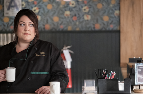
“We gave Dana Sue’s turn-of-the-century farmhouse darker, more moody colors, earthy greens and purples with pops of cobalt blue, fuchsia and rich golden yellows. Her house is more cluttered, with art and found objects that express her personality and an open chef’s kitchen packed with the tools for culinary creativity,” says Aimee. (Since Dana Sue’s style is also reflected through her restaurant, we included sources from Sullivans’, too.)
Get Dana Sue’s Look
Bird Motif Wallpaper: helenpdesigns on Spoonflower
Butcher Block: A combination of two different antique pieces purchased separately, find similar here
Sullivans’ Citrus-Print Wallpaper: Vintage William Morris block print custom colored for us bypeacoquettedesigns on Spoonflower
Sullivans’ Bar Backer: Cle’s Zellige Tile in fired opal; find similar here
Sullivans’ Entry Tile: Maharaja by New Ravenna
HELEN’S POLISHED & MODERN RENOVATED CRAFTSMAN
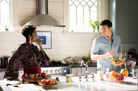
Helen is more about the new and modern—hence, her contemporary renovation on the bones of an older craftsman- style bungalow. “Helen’s world is the most put together of the three, with luxe furnishings on a palette of deep, almost black, blues and grays, and bold patterns,” says Aimee. “Flourishes of pink and yellow, and natural blonde woods and woven textures keep her contemporary look from feeling cold.”
Get Helen’s Look
Hanging Bed: Came with the location (Try this for similar)
Hanging Bed Throw Pillows: Anthropologie
Grasscloth Wallpaper: Came with the location; try Serena and Lily for similar
Woven Wall Hanging: Anthropologie
Figurative Artworks: Tracy Murrell (local to Atlanta)
Abstracts: VictoriAterlier and Duealberi, both on Etsy
THE CALM & SOOTHING CORNER SPA
Filled with “silky and soothing” paint colors, Aimee notes The Corner Spa was a complex design challenge, as the team had to recreate the elaborate historical details of a Greek Revival house on a stage. (The Covington, Georgia, property is actually a law office.) “Our construction crew, lead by John Hair, did an incredible job installing the many layers of moldings and replicating the graceful curves chosen for the build. Silky and soothing neutral paint colors were used throughout, with modern wallpaper details to bring in some subtle patterns. Tile played a big part in lending the spa feel, the overall feeling fresh and light. Plants were also an important factor, both large floor plants and hanging planters, to keep what could be a stuffy architectural style feeling alive.”
Get the Spa’s Look
Paint Color (Foyer): Sherwin-Williams 6204 Sea Salt
Paint Color (Cafe): Benjamin Moore OC-20 Pale Oak (with Jacobs Tree wallpaper detail)
Paint Color (Exercise Room): Sherwin-Williams 7571 Casa Blanca
Paint Color (Trim Throughout): Sherwin-Williams 8971 Shell White
Paint Color (French Doors): Sherwin-Williams 0032 Needlepoint Navy (to complement the entry’s tile mosaic)
Wallpaper (Yoga Studio): Farrow and Ball’s Yukutori wallpaper
Light Fixtures: Mostly Rejuvenation and Anthropologie
Entry Tile: New Ravenna’s Giverny mosaic design in Carrara marble
Magnolia Artwork: “The artwork was commissioned from Cansu Porsuk, an incredible artist from Turkey we met on Etsy. We were so inspired by her work we ended up including 12 of her pieces on Maddie’s set and 3 on Dana Sue’s.” (Paula’s abstract canvases featured in her studio were also painted by Cansu.)
Caustic Works: Caterina Martinico
Watercolors: Elizabeth Becker
Art Deco Prints: Georges Barbier
Jade Sofa: West Elm, find similar here
Cane Chairs (Flanking the Entrance): Anthropologie, find similar here and here
DESIGN RAPID FIRE
We asked Aimee (over an imaginary round of margaritas, naturally!): Which Sweet Magnolias character is most likely to…
…Brake for Antiques?
“Dana Sue and Maddie would make antiquing a regular weekend outing. Dana Sue could never pass up outsider art, anything with an owl theme, and perfectly smooth vintage cast iron pans. Maddie has a soft spot for vintage bird and botanical lithographs, and vintage furniture in need of being reimagined and refinished”
…Shop at Home Goods?
“Maddie’s found some steals at Home Goods, such as the pinstriped linen armchair in her living room. She’s got a sharp eye for design but also for bargains. She has all the dance lessons, drama classes and baseball trips to think of.”
…Decorate with Family Heirlooms?
“Maddie holds on to that strong sense of family, in her children and the family she came from. She has classic pieces throughout the house, including the piano that definitely has a story. She also cherishes her children, with kid-created heirlooms such as the three framed hand print paintings (one from each child) hanging in the kitchen above the living room door.”
…Renovate Every Three Years?
Helen’s sense of fashionable and feminine modern is an important element in expressing her personality. She embraces Serenity’s small town vibe but does not want to be defined by it.
…Plant a Garden?
All three! The southern aesthetic has so much to do with the outdoors. Maddie would favor petunias, begonias and sunflowers for their joyful pops of color, Dana Sue would go for some easy to care for but high-impact in the kitchen (and cocktails) herbs like Genovese basil, marjoram, chervil and unusual mints, and Helen would go for something that is at the same time both exotic and classic, like vibrantly colored dahlias.
…Embrace Chintz?
Dana Sue loves a little sparkle, flash and fun in her eclectic decor.
…Take Up Needlepoint?
Maddie might think about it, with a sense of soothing nostalgia. But we know with her three kids and busy schedule finishing a project would be near impossible.
…Binge-Watch HGTV?
Maddie, she loves the DIY ideas. Though Helen probably takes a sneak peek every now and then to make sure she is solidly on trend.
…Read Country Living
Maddie! Her vibrant and effortless style feels like a perfect match. (Maddie, your subscription’s in the mail.)
This content is created and maintained by a third party, and imported onto this page to help users provide their email addresses. You may be able to find more information about this and similar content at piano.io
