
How Landscaping Businesses Can Build a Stronger Online Presence

How Landscaping Businesses Can Build a Stronger Online Presence

A well-designed garden can transform a home, but potential clients may never see your work if they cannot find your business online. For landscapers, a useful website is more than a digital business card: it can show the quality of past projects, explain services, and help local homeowners decide whom to contact. A few thoughtful improvements can make your online presence clearer without taking time away from the work itself.

1. Build a Portfolio That Tells a Story

Photographs are often the first thing visitors notice on a landscaping website. Choose clear images that show the space as a whole, then add details that reveal the quality of the work: stone edging, planting combinations, lighting, or a carefully finished patio. Before-and-after pairs can be especially helpful because they show the challenge as well as the result.

Give each project a short description. Note the homeowner’s goals, the main features installed, and any practical constraints, such as a narrow side yard or a sloped site. This context helps readers imagine how your approach might work for their property. It also gives search engines meaningful text to understand, rather than leaving a page made up entirely of images.

Ask permission before publishing client photographs, and avoid including addresses or other private details. A small, well-chosen portfolio is more convincing than a large collection of similar images with no explanation.

2. Make Services and Service Areas Easy to Understand

Homeowners often arrive at a landscaping site with a specific need: a planting plan, regular lawn care, a new walkway, or a complete garden renovation. Organize services into straightforward pages or sections, and explain what each one includes. If you offer design and installation, for example, clarify whether consultations, material selection, and ongoing maintenance are part of the process.

Be equally clear about where you work. List the towns or neighbourhoods you genuinely serve, rather than naming a long string of places you rarely visit. Local details can help a visitor judge whether you are a practical choice, especially when travel distance affects scheduling or project costs.

Include a simple way to get in touch on each key page. A phone number, email address, or short inquiry form is usually enough. Tell people what information is useful for an initial estimate, such as approximate dimensions, preferred timing, and a few photos of the site.

3. Share Useful Advice, Not Just Promotions

Articles and seasonal notes can answer common questions and demonstrate knowledge. Topics might include selecting plants for a shaded yard, preparing beds for winter, planning drainage before installing a patio, or choosing surfaces that are comfortable to walk on. Advice should be specific enough to help a reader take a sensible next step, while making clear when a site visit or professional assessment is necessary.

Keep recommendations grounded in your local conditions. Soil, rainfall, temperature, and regional planting guidance vary, so broad claims may not apply to every garden. A concise article based on jobs you have actually completed is often more useful than a general list of trends.

Consistency matters more than publishing every week. A few carefully maintained pages that reflect your work and service area can serve visitors better than a busy blog full of outdated posts.

4. Approach Online Links with Care

Other reputable websites linking to your pages can help people discover your business and may support search visibility. For a landscaper, useful connections might come from local garden groups, suppliers, community projects, or publications that feature home and outdoor design. The strongest links tend to arise from a genuine reason to mention your work, such as a helpful guide, a noteworthy project, or a contribution to a local resource.

Some businesses consider an outsourced link building service when they lack time to manage outreach themselves. Before hiring anyone, ask how potential sites are selected, what work will be reported, and whether the approach relies on relevant editorial mentions rather than bulk placements. Avoid promises of instant rankings or large numbers of links on unrelated sites. A modest, transparent plan is easier to evaluate and less likely to create a poor-quality footprint.

5. Use Freelancers for Defined Tasks

Not every business needs a full-time marketing team. A freelancer may be able to retouch project photos, write a service-page draft, improve a site’s layout, or prepare a few social media graphics. The best results usually come from a clear brief: describe the audience, the materials available, the expected deliverables, and how you will judge whether the work is complete.

Marketplaces such as Osdire let buyers hire freelancers across more than 900 categories, including writing and translation, graphics and design, programming and tech, photography, and marketing. That range can be useful when a small website task calls for more than one kind of skill. Pricing is flat with no hidden fees, and payment is held securely during the order and released when the delivered work is approved. As with any hire, review examples, confirm the scope, and agree on practical milestones before work begins.

Wrapping Up

A strong online presence grows from clear information and evidence of good work. Show projects with enough context to make them meaningful, explain what you offer and where you operate, and publish advice that helps local homeowners make informed choices. If you bring in outside help, set realistic goals and check that each task supports the way your business actually serves clients. The result should feel like a natural extension of your work: useful, trustworthy, and easy to navigate.

Best of Design 2023: This New Home is a Work of Art in More Ways that One

200 Buckingham4

It’s simple to suppose sure matters basically won’t perform collectively: Ultra-modern architecture cannot also have a warm, inviting vibe a property with mostly windowed walls can not accommodate an considerable artwork assortment the Pittsburgh weather isn’t conducive to a household designed all-around the notion of indoor/outside dwelling.

In Fox Chapel, an strange property has managed to defy all individuals assumptions by way of a complex structure that lends itself to a lived-in, welcoming space in which the outdoors play as much a purpose as every little thing occurring inside. It also wowed our judges, who named it their Most effective New House in this year’s Greatest of Style and design Contest.

200 Buckingham19

“I appreciated the custom made details that are executed in the course of the dwelling. The move of the indoor/outdoor practical experience is phenomenal,” claims Crystal DeCastro Knapik, a venture designer at Vocon, which has spots in Cleveland and New York City.

Indeed, each individual depth of the property — a collaboration in between the property owners (who want to continue to be anonymous), Chicago-centered architect Thomas Shafer and lead carpenter Mike Craig — carries meaning and objective, resulting in a seamlessness that can be both of those observed and felt.

“There will be those people who will have complications inserting this architecture inside of their definition of a ‘house,’” claims Shafer, principal at Shafer Crowe Kueck Architecture + Design. “It’s not a common brick-and-wooden-sided house. There is not a gable or a brick chimney. There are no columns, or turrets. It is not referential.

“What are those concrete partitions for? Is it a museum or a college? What particularly is it? It problems notions of ‘house.’ And nevertheless that was just it — the commencing position wasn’t to be prescriptive,” he suggests. “It was not an itinerary to in good shape within just a distinct glimpse or definition — rather the opposite.”

200 Buckingham30

The exterior by yourself has been regarded to quit passersby in their tracks. When the proprietors ended up creating the dwelling, a female driving by pulled around to talk to the house owner what the composition was likely to be. When he replied, “My dwelling,” she immediately responded: “It’s so unattractive!”

Perhaps she was thrown by the sweeping concrete wall major up to the driveway of the courtyard-type home, 1 of several that the two afford to pay for the residence privacy and allow any customer know they are not approaching anything at all standard to the Pittsburgh area.

200 Buckingham24

But any operate of artwork is intended to elicit a response, and all functions took the reaction in stride.

“Personally, I adore this story,” Shafer says. “It’s so appealing how a thing so wonderful and normal to one particular could be so alarming to an additional. It certainly was outside her convenience zone.”

It also was a strike with Ideal of Style and design judges, who praised the seamlessness amongst the indoor and outside areas as very well as the thoroughly clean lines uncovered in the course of the home.

“I like that this is Mid-Century Modern day design and style, but it however felt extremely warm and inviting,” says choose Katie Savakis, a challenge designer at Vocon in Cleveland.

200 Buckingham5

That was one of the most important aims for the householders, who had been specified about wanting a modern-day aesthetic but also desired to stay clear of it experience much too sterile or cold. They wanted a area where by they could occur household and place their ft up a put exactly where their puppies could operate about outdoors then curl up with them by the hearth a put exactly where friends didn’t feel like they experienced to continue to be standing and not dare touch anything.

To attain the preferred stability, Shafer relied on proportion, scale, shade and texture. Use of mild was possibly the most crucial element in infusing the property with its inviting come to feel, he says. As these, the floor-to-ceiling windows through the home immerse the occupants in the 1.5-acre house outdoor. Shafer also states the house is oriented to improve variations in gentle all through the days and seasons.

“It’s a living and at any time-altering sculpture,” he suggests. “In the tumble, the yellows and reds of the altering trees mirror into the household.”

200 Buckingham7

The 4,500-sq.-feet area was intended in volumes, each made up of a collection of cozy areas with guest quarters on just one close and the owner’s own quarters at the other the two are related in the middle by the key living areas. Shafer suggests the plan was to create locations in which day-to-day life could overlap but that also let for isolation when necessary.

“Several significant and vibrant pivoting ‘doors/panels’ assist in opening or closing off the spaces to make it possible for for these distinctive pursuits to occur,” he states. “These thresholds consistently modify dependent on who is there and/or what is going on. It breathes and modifications appropriately, not always the similar.”

1 of the most important worries with fashionable houses is the lack of trim, in accordance to the owners. That signifies everything has to line up there is nowhere to cover any disconnect or flaw. The ceilings and the overhangs are on the identical plane. Steel beams achieve exterior with no noticeable disruption. Charred Shou Sugi Ban partitions designed from Japanese cypress carry from the inside out to line the home’s exterior. The crew also created a Mid-Century Modern day corduroy siding detail for particular exterior walls, which wraps into the dwelling and blends into walnut cabinets.

Throughout the residence, hardwood was preferred for flooring about stone to incorporate warmth it also enhances and softens the aluminum curtain wall, Shafer claims. The home’s playful shade palette ranges from heat grays and whites, to soft blues and sage greens, to even the occasional pop of vermillion.

200 Buckingham2

From the rows of guitars adorning the wall of the property place of work to the pieces by common Pittsburgh artist Burton Morris in the key-ground gym, artwork also infuses the dwelling with identity. Residing in a residence of mostly windows also did not restrict the householders from displaying their intensive assortment. For occasion, a tryptich of Damien Hirst artwork is embedded inside of the glass curtain wall of the dwelling place to get the job done with the open up space all around it.

Lighting decisions also spotlight the all-natural setting, these as the bronze wire Moooi piece over the eating desk that illuminates although nevertheless making it possible for the eye to move through to the outside the house. Higher than the customized blackened steel hearth, fabricated by Jorg Gerlach and his team at Echt Style Solutions, a wall of polished Venetian plaster dances with gentle when the sunlight hits it.

200 Buckingham9

In the kitchen, the granite of the substantial island will come alive as it demonstrates golds and blues new tones are discovered from every single vantage issue as ample natural light-weight skims across the surface. A relaxed take in-in nook with seating for two is the great location to sip coffee and glance out into the private zen backyard. A glass enclosure separating a place from the walk-in closet is supposed for a saltwater fish tank.

Even though Shafer says he does not assume the house owners anticipated to end up living in a concrete, aluminum, wooden and glass property, their willingness to acquire quite a few odds resulted in a property not like any other.

“A profitable venture is a consequence of a exceptional customer, and [the homeowners] were being surely distinctive,” Shafer says. “They were curious and engaged and remained open up-minded each and every stage of the way. They dependable the procedure and suspended disbelief. It was a distinctive collaboration, and frankly, is the very rationale it turned out to be these kinds of a successful challenge.”


Suppliers

Architectural Style: Tom Shafer, Shafer Crowe, Kueck Architects, Chicago, IL
Inside Layout: Tom Shafer, Marian Leventon Interiors 
Landscape Architect: Frank Dawson, J.Frank Studios
General Contractor: Hainer Construction Team
Website Operate: J.A. Martin Enterprises
Structural Metal: MultiMetal Inc.
Home windows and Doorways: SCHÜCO Home windows
HVAC: Climatech
Electrical: S& L Electric powered
Plumbing: East Conclusion Plumbing & Mechanical
Cabinetry/Casework: The Kitchen area Gallery
Paint Get the job done: Rieger’s Painting
Customized Millwork: Allegheny Millwork
Counter tops: Greatest Granite, Morrow Brothers Countertops
Tile Function: Mandy’s Tile Service
Ornamental Steel Fabricator: Echt Design and style Services
Landscaping: Evanovich, Inc.

Casa Azucar is a tropical home with a modern twist

Casa Azucar was born from a client’s dream to dwell in a ‘habitable yard pavilion’. Situated in Costa Rica, the new dwelling was conceived as a lush eco-friendly getaway for its house owners. Its architects, San José-based Studio Saxe, obliged, crafting a tropical retreat with a solid up to date twist that ticks all the appropriate boxes. 

hero exterior with flowers of casa azucar by studio saxe

(Graphic credit rating: Andres Garcia Lachner)

Casa Azucar by Studio Saxe

The property’s plot is located in the coronary heart of the city of Nosara, which meant that while it is shut to the seaside and nearby facilities, the perception of seclusion and verdant environment the shoppers were being right after were being probably trickier to recreate. The remedy to this problem came in the condition of a compact seasonal creek that operates across the web site and serves as a wildlife corridor. ‘We decided to emphasis our focus on making the feeling of a secluded oasis, merging architecture and landscape design to cautiously body all sights toward the creek and the wildlife that spawned from there. The property in change is conceived more like a habitable back garden pavilion,’ the architects produce.

aerial view of casa azucar by studio saxe in costa rica

(Impression credit score: Andres Garcia Lachner)

So the architecture staff not only highly regarded the existing trees and ecosystem, but sought to additional assistance and enrich it, guaranteeing the construction feels really embedded on its web site and, in time, results in being engulfed in nature. This ‘bridges the best of both of those worlds: closeness to all the things and solitude in the forest’, the group demonstrate. 

swimming pool at costa rica house casa azucar

(Graphic credit score: Andres Garcia Lachner)

In phrases of the architecture, the Studio Saxe designers, headed by founder Benjamin G Saxe, are deft arms at producing domestic experiences that mix within and outdoors, modern tropical modernism, and local supplies and design tactics – previous illustrations contain the light-weight Jungle Body Residence, and the much more recent Raintree Residence, both of those in Costa Rica. The same approach was adopted here the household is dominated by large open up spaces with glazed walls or generous windows, and exterior parts. 

kitchen at costa rica house casa azucar by studio saxe

(Picture credit history: Andres Garcia Lachner)

At the exact same time, the studio provides: ‘This household is a apparent reflection of our client’s temperament [they] preferred to create a thoroughly clean beach-like experience, so the colors, textures, and materials preferred ended up light and gentle. This method gave us the prospect to put into practice a fashionable inside style that is the two reliable and rooted in the earlier as effectively.’

open living space at costa rica

(Graphic credit score: Andres Garcia Lachner)

bedroom at casa azucar

(Graphic credit rating: Andres Garcia Lachner)

bedroom side view at costa rica

(Impression credit score: Andres Garcia Lachner)

front door entrance at casa azucar

(Picture credit: Andres Garcia Lachner)

open plan living space at casa azucar in costa rica

(Picture credit history: Andres Garcia Lachner)

studiosaxe.com (opens in new tab) 

River view, gilded ceilings and lush landscaping at this $4.8 million Placer County home

(KTXL) — Rural Placer County is acknowledged to have multi-million dollar residences in gated communities with lush landscaping, but this $4.8 million mansion is an mind-boggling case in point of decadence and splendor.

Built in 2006, 9692 Sterling Pointe Court docket in Loomis features a 7,194-square-foot 5-bed room, 5-toilet dwelling, a 6-auto garage, a pool, gardens and ponds more than a 2.80-acre property.

– Video clip higher than: Sacramento Kings themed Oreos

Did we mention the see even though? No? Well, it is amazing. A spectacular check out of the North Fork of the American River, just ahead of it flows into Folsom Lake and the bordering hills greats these who make their way into the stunning backyard.

Before chatting about the yard although, let us return to the entrance of the home the place a massive metal gate opens to a rotunda with a landscaped fountain at the centre.

On your left is a big coy pond with many coy fish and on your appropriate is one more pond with a manicured tree-lined path.

Just after generating your way up the stairs, by the glass-pained entrance doorway and into the primary atrium, a breathtaking picket double-curved staircase frames the see towards the seating space and the significant windows experiencing the yard.

Each place has a signature style to it that evokes the sensation of Old Entire world Europe and the continuous splendor of the dwelling.

Some of the most breathtaking rooms are the learn bedroom, kitchen, eating home and library.

Gilded ceilings, heated flooring, towel warmers and two stroll-in closets are just some of the luxuries showcased all over the residence.

Going again exterior the in depth landscaping of the front lawn breaks away to give place for an infinity edge pool, sizzling tub, many outside seating areas, firepits, a large pergola, vineyards and more.

According to the home’s Zillow listing the household has been on the internet site for practically 130 times, has nearly 4,300 sights and much more than 120 will save.

The property is detailed with Guide Authentic Estate which specializes in luxurious houses and has office spots in Roseville, Midtown and East Sacramento.

This Midcentury Modern Home Design in Hyde Park Is Stunning

How charming is this midcentury modern-day home? Photography by Winona Barton-Ballantine, @shelterupstate

Buy a Hyde Park dwelling that hadn’t been updated in above 60 years, sight unseen? Inside designer Ana Claudia Schultz was all in—and then some. The success had been nothing brief of extraordinary.

Growing up in Miami, Ana Claudia Schultz liked to re-do her bed room every single pair of decades and shift her home furnishings all around a lot—but she did not consider she was on to one thing occupation-wise. “My mother could’ve been a decorator, but she preferred to aim on her property and little ones,” says Schultz. Moreover, her mom thought that professionally adorned homes lacked the owner’s identity and character, which cooled any opportunity enthusiasm Schultz may possibly have had for the field. She selected to study business enterprise in college, then veered into architecture. “Later I worked in retail furnishings revenue, and that’s where I acquired passionate about materials and furniture layout,” suggests Schultz. “With my architectural qualifications and household furniture expertise, I understood that interiors was my legitimate calling, in particular when my retail consumers ended up inquiring me to style their residences.”

Living room

In the meantime, as her qualified lifestyle was taking condition, Schultz adopted the route of several university grads and moved to New York Metropolis. Her faculty roommate invited her to a Christmas party becoming thrown by her brother, Aaron Smyle. The two—who had never ever met, even with obtaining gone to the very same higher school—hit it off proper away.

Quickly ahead by means of a few many years of living together in Brooklyn, and Schultz and Smyle had been all set to get started scouting a weekend area. However she was their official structure professional and he was a tax accountant, Smyle has a sizable innovative bent, so they both experienced heaps of ideas. Their wide original search bundled Windham and The Poconos, but a couple of evenings at a B&B in Beacon sealed the offer for the central HV.

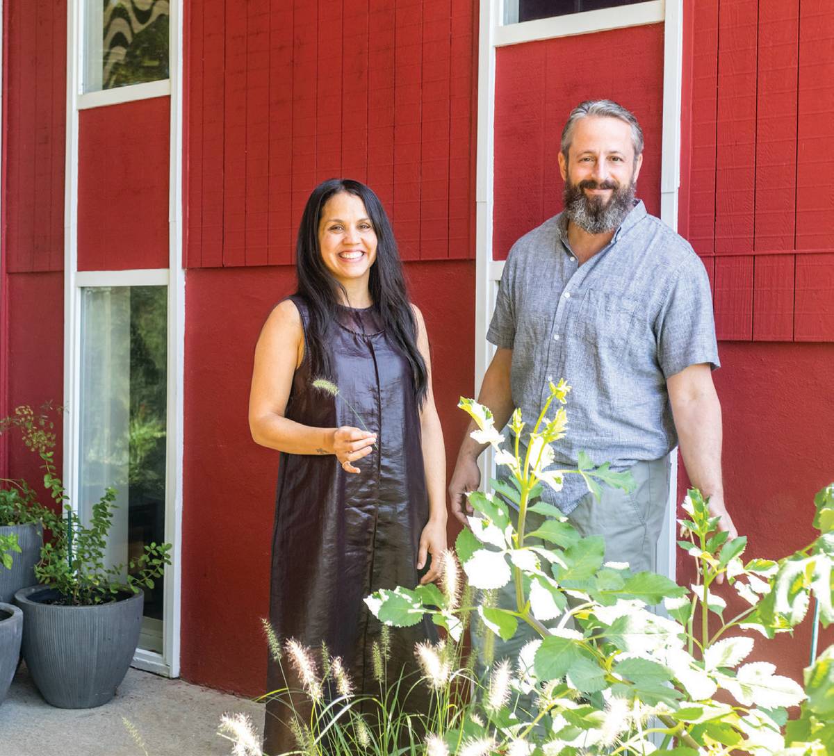
Ana Schultz

The very first home they bid on, in Hyde Park, was bought out from less than them by an all-funds buyer. Then Schultz recalled a nearby estate sale she’d long gone to and requested her realtor to find out if that house was going to be coming on the market. The solution was indeed. Loving the spot, established on a hill, and supplying crystal clear sights of the river, they acquired it without the need of ever placing foot inside of.

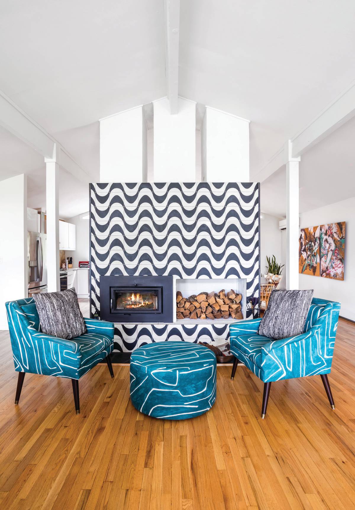
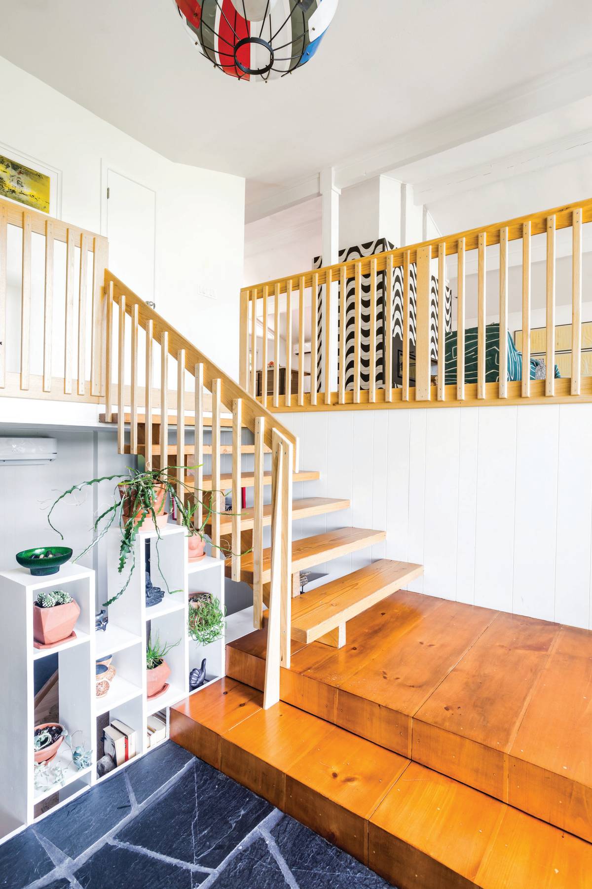
Built in the late 1950s, the midcentury-impressed 5-bed room and 3-bath property hadn’t been updated in six decades. “We did a gut reno in advance of shifting in,” states Schultz. They taken out inside stone walls dividing the kitchen area/dining and dwelling rooms to open up and brighten up the room, and entirely renovated the kitchen and two loos. They retiled the fireplace, replaced windows, and upgraded the insulation. The update built the household considerably far more match for existence in this century, with out losing any of its bones or organic integrity.

Living room with blue couch

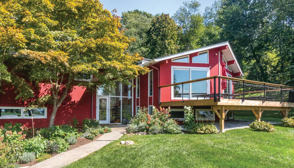
Eye-catching colors are a recurring theme both inside of and out. A daring blue velvet sectional normally takes center stage in the residing area, giving loads of space to lounge and appreciate the impressive views. Green crops grace tabletops and peek from windows and corners. As for the crimson exterior, which is primary to the household, suggests Shultz. They imagined about portray it, but the color grew on them. “It’s effortless to say. ‘We’re the red house’ when we give our mates instructions,” she says.

The Cringiest Home Decor Trends, According to YouTubers and TikTokers

Kiva cites the difficult routine maintenance of these areas as 1 reason to not go for the maximalist trend. “You have to be so tactful with exactly where you area things so that it appears stunning and there is space for every thing else,” she says. 

To prevent going way too deep into a cluttercore hole, Classic HQ founder Heather Hurst, broadly known on TikTok and Instagram as @Pigmami, indicates the pursuing: “Microdose things of recent traits that excite you, when leaving things of your earlier taste and jobs that you nonetheless keep dear.” 

Monochrome-on-monochrome aesthetics starving for personality 

Equivalent to maximalism, too much of a single color can be overdoing it. For Caroline Winkler, a Washington, DC–based interior decorator, YouTuber, and host of the podcast Not For Everyone, monochrome-on-monochrome does small to satiate the design hunger that people today have for a small assortment in the kind of saturation and sample. “White-on-white is a matter of the past, and every little thing is heading to be all right,” she reassures. 

Kiva sees a slight advancement in going from all-grey, all-white, or all-greige interiors to all-brown with a slight caveat. “There’s a incredibly wonderful line amongst getting heat, brown interiors and then it seeking like a man cave, which is not always a superior factor,” she notes. 

Designer dupes that truly feel even worse than they glimpse very good

With the proliferation and democratization of style, thanks in component to social media, it can be tempting to see an It furnishings item and straight away covet it. Much better nevertheless, there are dupes of designer parts offered at acceptable rates. On the other hand, most of the material creators that we consulted are more than it. (And so had been we when we incorporated “duped to death” patterns in our “out” traits for 2023.)

While Kellie is all for accessibility in design, she’s not a enthusiast of “really horrible reproductions of legendary items that experience form of bastardized,” like the beloved Ultrafragola mirror. Not to point out how several of the household furniture dupes are not-so-incredibly unpleasant. Arvin Olano, a Las Vegas– and California-centered inside stylist, was after duped by a dupe that created him come to feel like he was sitting down on plywood. “Instead of purchasing a dupe of a designer piece, probably find one thing that’s equally as incredible from the exact period which is designed very well, made with genuine wood, or just get a piece which is a nod to that bulbous Camaleonda couch that you like, but it’s possible not the correct exact same,” he advises. 

Heather is also very on board with this professional suggestion. “If you are head-above-heels for a big expenditure piece, use it as inspiration to request lesser regarded designer pieces, go classic, or hold out until eventually it’s passé and rating a deal on it!” Emphasizing the importance of individual design above trends, Kellie believes that “the cringiest thing you can do is to be a follower compared to figuring out what really makes you happy and speaks to you.” As she so eloquently puts it, “What I do not like does not necessarily issue to you if you appreciate it. I often say, If you love it, place it in your residence. You have to search at it, you have to love it.” We could not concur a lot more!

Go away the unpleasant, blobby furniture in the funhouse

While sculptural and curvaceous pieces have been en vogue for a whilst now, both of those Kiva and Nick pressured the degree of distress from these if not fashionable pieces. In a current YouTube online video, Kiva jokes about needing an elevator to achieve the low seat of the aforementioned Mario Bellini couch: “It’s pretty lower! You simply cannot lay on it! I want to be ready to take a 10-hour nap on my couch if I want to.”