
Mismatch plates and hang art low: 18 ways to create a more beautiful home | Interiors

For the past 16 years, I have spent my days nosing round other people’s homes like a design-obsessed basset hound. I have been granted access through hundreds of locked doors, perched on wobbly Windsor chairs, and taken tea in stylish studio flats, cleverly converted factories and even a working barge.

Throughout all this, I’ve learned a lot. As The Modern House has grown, I’ve discovered that these homes – from studio flats to listed architectural masterpieces – have the same design principles in common: clever layouts, masterly manipulation of natural light, tactile materials, a connection to nature, sheer exuberance and personality in decoration – and much more.

The good news is that these principles can be applied to any home, in ways large and small. You can create a space that will support and inspire you throughout your life. It’s worth it: beyond our relationships with family and friends, home is the most important thing we have.

Live upside down

If your home has more than one level, consider inverting the traditional layout. Admittedly, you might never get used to the idea of declaring “I’m going downstairs to bed”, but in most other respects it makes a lot of sense, unlocking the light and views for the living spaces, and using the naturally darker areas lower down the building for sleeping.

Sleep in a nest

Wooden slatted bed area
An intimate sleeping space returns you to the sanctuary of the womb

In the same way that a swaddle prevents a newborn baby from flailing its limbs, an intimate sleeping space returns adults to the sanctuary of the womb. In a studio flat, this might involve using a curtain to demarcate a corner of the space, while in a larger bedroom it could mean creating a canopy over the bed. I find it strange that the price of a hotel room usually correlates to its size. In my opinion, go for the smallest one – it’s not only the cheapest, but it gives you the most satisfactory sleeping experience.

Aim high

When trawling through property listings, carefully consider the natural attributes of each building. Flats on the lower-ground floor are nearly always cheaper, but that’s because they are less secure from intruders, closer to street-level pollution, and often suffer from a lack of light. I recommend going for something higher up if you can: the trade-off for a daily hike up the stairs is a life-affirming spillage of sunshine. If you can, it’s best to find a home with some semblance of separation from those around it, such as an end-of-terrace.

Take your time

It’s tempting to immediately purge your new home of its previous occupants using a sledgehammer and a vat of emulsion. While it’s certainly true that your space should reflect your own view of the world, think carefully before major interventions. Live in it for a while if you can, ideally for a full year, so that you get a sense of how best to utilise the space, and how the light moves through the day and the changing seasons. You might also gain respect for some of the existing materials. For example, that wooden floor you thought was a bit beaten-up when you moved in could start to take on some significance – its warmth beneath bare feet, or its ability to absorb the comings and goings of daily life.

Follow the rule of three

Three pendant lights over dining table
Grouping three objects together always looks harmonious

Next time you go to your favourite restaurant, have a look at the plate: it’s likely there will be three main ingredients grouped together in a harmonious way. If things are arranged asymmetrically, the eye is forced to move around them to fully absorb what it sees. In the home, this rule applies on every scale, so you might place a sofa and two chairs together, three pendant lights over a dining table, or a trio of ceramics on a tabletop.

Make space flexible

With their sliding partitions and room dividers, flats on modernist housing developments such as the Barbican Estate in London remind us of the value of flexible space. It’s useful to have a guest sleeping area or workspace that can be sectioned off for privacy, but contributes to the sense of expansiveness in the living room when not in use. A pocket door, glazed partition, bookcase on castors or a large plant can help the space adapt.

Don’t be afraid of the dark

dark spaces with dark walls
Build in dark spaces for reading and thinking

We should build in dark spaces for reading and thinking, acknowledging that the unfocused atmosphere of a dimly lit nook allows daydreams to take hold. Dining rooms are at their best when they exude the decadent fug of a gentlemen’s club. In Japan, darkness is part of the culture: houses have extended eaves, paper screens and deep alcoves that conjure the tranquillity of an ink-wash painting.

Create variety

Aim for as much spatial variety as possible: ceiling heights that change as you move through the home; a hidden door like something from a Scooby-Doo cartoon; an unexpected nook for a chair. Even a simple step within an open-plan space is a powerful psychological device, keeping the tide of children’s toys at bay, or acting as a symbolic shift from day to night as you step up to the sleeping area.

Open the windows

kitchen dining room with open windows
Open your windows to release hidden fumes from carpets and cleaning products

The materials we live with release fumes into the air without our knowing about it, like a flatulent uncle at Christmas. The latex backing and adhesive used to stick down carpets can continue to off-gas for years after installation. Open windows and doors for ventilation, add extractor fans, trickle vents and ceiling fans to encourage the flow of air, and use natural cleaning products.

Don’t forget the details

A simple way to transform an interior is to update the things that you come into physical contact with every day – not only the door furniture, but also the light switches, the loo seat, the kitchen worktop, and so on. Choosing tactile materials can have a significant effect on our experience.

Follow the sun

Many of us are still working from home for at least part of the week, so a simple but effective way to get more natural light is by placing a desk near a window. We should aim for as much light in the morning as possible, because it moves the circadian clock to an earlier time, ushering us into bed sooner and helping us achieve a longer sleep. A report in California showed that children are more productive, and even achieve better exam results, when they are able to work in a sunny space.

Avoid blinding lights

If you can look straight into the blinding filament of a lightbulb then it’s probably in the wrong place. The biggest scourge of modern interiors are spotlights in kitchens. Ceiling lights should be recessed so they are invisible, or surface-mounted and angled so they provide a wash of light across the walls or the corners of the room. Use wall sconces and plug-in lamps on five-amp circuits, and try to ensure every light is placed on a dimmer, so the atmosphere can be varied and the intensity managed.

Use colour in context

Be more daring with colour in lesser-used spaces, such as cloakrooms
Be more daring with colour in lesser-used spaces, such as cloakrooms Photograph: PR

When poring over the paint chart, remember that light colours bring big rooms to life and dark colours enhance the intimacy of small ones. You can afford to be more daring in the spaces that are used less, such as spare bedrooms and cloakrooms. Use tonal changes to emphasise decorative features like panelling, cornices, fire surrounds and old doors.

Put radiators beneath windows

Placing a radiator under a window frees up valuable wall space for furniture and is more energy-efficient: induction causes the cold air coming through the glass to push the warm air from the heater into the room. Try not to sandwich a sofa or bundle a bed against a radiator because it will restrict the flow of heat. Just be sure to insulate windows.

Let go of perfection

Copper pots and pans hanging against a weathered stone wall
Embrace weathered surfaces, tarnished metals and mismatched materials

The Japanese philosophy of wabi-sabi teaches us to accept transience and asymmetry, and find joy in weathered surfaces, mismatched materials and natural ageing. If we stop striving for perfection, everything becomes less anxiety-inducing. For example, choose a flooring that will weather gracefully and won’t show up every crumb. Serve dinner using mismatched plates and glasses, and forget about burnishing the cutlery – it looks much nicer when it’s a bit tarnished and neglected.

Embrace curves

“I am of the opinion that anyone who wants to rest his rear end on a rectangle adheres in his heart of hearts to a totalitarian creed,” said designer Josef Frank, who clearly wasn’t a fan of straight lines. One of the principles of biophilia is that sharp-angled objects stimulate the amygdala, the part of the brain associated with fear, whereas rounded forms are suggestive of life. Choose curvaceous sofas, plump vases and tables with rounded edges, and put pebbles, pine cones and shells on the mantelpiece.

Hang pictures low

Think about how pictures occupy the space, and their relationship to the floor and ceiling. The most common mistake is to place them too high. Use your eye to find what feels like the right place instinctively, then take it down by six inches. A picture hung too high looks bereft.

Finally … surround yourself with meaningful things

Matt gibberd portrait
Matt Gibberd … ‘creating a home is a personal process’. Photograph: Vivek Vadoliya

Avoid buying the on-trend furnishings that everyone seems to have on Instagram. Aesthetic preferences evolve, so stick with objects that are timeless and have the most emotional significance. In my case, that’s a lustreware jug held together with sticky tape which I inherited from my parents, and drawings, painted stones and pottery that my daughters have thrust into my possession over the years. Creating a home is a personal and heartfelt process. It is about building memories with the ones we love most.

A Modern Way to Live by Matt Gibberd is published on 28 October by Penguin Life
New exhibit at the Honolulu Museum of Art showcases issues of urgency in Hawaii

HONOLULU (KHON2) — In September, a new show at the Honolulu Museum of Artwork (HoMA) opened up titled ‘Artists of Hawai’i Now,’ and it is an exhibit discovering some of the most urgent challenges of Hawaii’s time and area.

KHON2 explored inside of to verify out more and was joined by just one of the exhibit’s co-curators, Marlene Siu.

Get news on the go with KHON 2GO, KHON’s early morning podcast, each individual morning at 8

It is fascinating when a job like this new show arrives about it is not just for display screen but there is also a purpose that is really driving it, as perfectly. KHON2 asked Siu to share what this show is about and what attendees can anticipate to see.

“HoMA’s significant fall exhibition characteristics 13 site-specific, world-course artwork by 18 Hawai’i-based artists,” described Siu. “You’ll uncover a huge spectrum of mediums in this exhibition. Any where from new engineering to far more conventional techniques, like textile and ceramics.  And you are going to also discover that all the work listed here converse to examine problems of our time and spot.”

The exhibit is a excellent issue to have and to touch upon in each of these items. KHON2 then asked Siu: What is an case in point, and how is this piece contributing to that urgency?

She said a terrific example would be a piece by Jennifer Goya:

“It’s a piece that asks audiences to physically engage with the piece by stepping on these flooring sensors. And as you move on the floor sensor, you will see that the screen on the monitors start to adjust. And so, you’ll get a diverse expertise from every single sensor, and what this piece is seriously bringing awareness to is Quick ‘Ohi’a Dying and the cultural and environmental importance of ‘Ohi’a Lehua to Hawai’i and really asking guests to genuinely imagine about their personal engagement in conservation,” Siu described.

Each individual piece has a ‘call to action’ for visitors. KHON2 also requested Siu: As a complete — as a museum — what is then the much larger ‘call to action’ for company as they leave this exhibit?

“The larger ‘call to action’ would be first for visitors to arrive and working experience these will work as a beginning position — to truly commence to interact with these various concerns that are impacting Hawai’i and our international community, and then viewing that these challenges are not independent, they are all related by some means. 

Marlene Siu, a single of the exhibit’s co-curators

“So, this exhibition would be a starting off issue for them to then test to come across out far more facts on how they could get associated with various associates who have labored with artists as element of this exhibition,” Siu reported.

‘Artists of Hawai’i Now’ opened up Sept. 16 and will carry on this yr until Jan. 16, 2022.

Starting next week, however, the museum will be offering a suite of general public plans that only broaden these troubles currently being spoken within this show — from artist talks to workshops to local community message boards.

Check out out what’s heading on about Hawaii on our Area News page

For all the information, click on below.

Williams College Museum of Art to Begin Design Phase for New Building / iBerkshires.com

image description
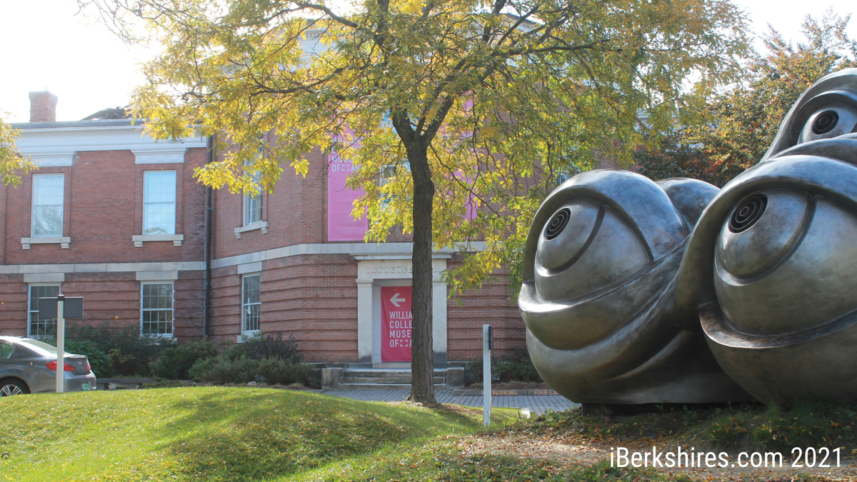
Lawrence Hall on Main Street, the current home of the Williams College Museum of Art. At right, Louise Bourgeois’ ‘Eyes,’ a granite, bronze and electric light sculpture commissioned for the museum’s 75th anniversary and installed in 2001 according to a marker on the museum grounds.


The site of the old Williams Inn will be WCMA’s new location.

WILLIAMSTOWN, Mass. — The Williams College Museum of Art has been in the queue for a new building for years as the college has dramatically revamped its campus over the past two decades. 


Now the nearly 100-year-old museum is finally getting its turn at a new facility.


The Board of Trustees vote at its last meeting to enter the design phase marks a significant step forward in relocating the museum from the 1846 Lawrence Hall. The trustees two years ago voted to site any new building at the now vacant lot where the old Williams Inn once stood. 


“We have been doing really extensive building programming study and work for the last 22 months, since January of 2020, to come up with the space needs for the museum and the art at the college,” said Pamela Franks on Friday, the Class of 1956 director of the museum. “And now, with the completion of this programming exercise, the decision is to go forward to design.”


The museum has been housed in Lawrence Hall since its founding in the 1920s. The octagon hall on the south side of Main Street was the college’s original library and has been expanded numerous times over the past 180 years, the last in 1986. 


The deficiencies in the museum’s infrastructure have been cataloged for some time — there are problems with climate control across the five different buildings that now make up the museum; a lack of classroom, office and studio space; difficulty in accessing the building for pedestrians and motorists; no space for further expansion; and little room for an art collection and faculty that has grown exponentially, particularly over the last two decades. 


The collection has meanwhile grown to more than 15,000 items, including more than 1,000 from philanthropist Peter Norton and 340 objects of African art from Drs. Carolyn and Eli Newberger just in this century. The bulk of the collection is stored offsite. 


Franks, who came to WCMA from Yale University Art Gallery in 2018, said the pandemic lengthened the amount of time that was spent on developing the programming study that will inform the design. The original 10-month study turned into 22 after the novel coronavirus pandemic struck in March 2020. The work was done in consultation with architecture firm Deborah Berke Partners of New York City.


“We ended up being able to delve even more deeply and it was a really rich and productive discussion of a very consultative project,” she said. “It’s a project with lots of conversations with students, faculty, community members and alumni, and, of course, museum staff.” 


The museum also did some outreach with other regional museums, especially with the nearby Clark Art Institute and the Massachusetts Museum of Contemporary Art. The project will really benefit from having that additional time, Franks said. 


“And it’s very abstract because it’s not about how the museum will look or what the spaces will look like, but it’s about functions and simply space needs,” she said. “You’re looking at classrooms, you’re looking at gallery spaces, you’re talking about back of house preparation spaces … every kind of function you can imagine.”


Space needs are a priority, and not just for classrooms and offices. There’s specialized furniture for exhibiting art and where does that furniture live when it’s not being used, and where is the art going to be exhibited. 


And for instance, the single Rose Object Classroom can be used for displaying pieces of the collection for seminar studies.


“That is extremely popular classroom and it is used really pretty continuously,” she said. “As a college museum, the academic connections are really deep with the Art Department, and then really wide across every department on campus.”


The collection cuts a broad swat across history and culture, with links to every discipline on campus, Franks continued, “so being able to access the collection for teaching is a huge part of what we do …


“Every year there’s math classes, biology classes, chemistry classes, but also for the art classes, art history classes and literature classes … We have this kind of signature course every other year that is both an art course and an economics course, on acquiring art for the museum collection. Our program is very much tied to the educational mission of Williams College.”


The museum is also, of course, open to the public and Franks sees its global and historical range as very complementary to the Clark ‘s largely European focus and Mass MoCA’s contemporary works.


“Gallery space is essential to show the collection” to serve both an academic and public audience, Franks said. “But we also want the museum to be extremely accessible and welcoming for all.”


College President Maud Mandel, in a statement Monday, said the new museum will grow out of the college’s commitment to the arts that has defined it for more than a century. 


“Each year, faculty, students, and museum staff incorporate our collections into dozens of courses, ranging from art history to anthropology, biology, environmental studies, and mathematics, while our curators mount exhibitions that engage campus and diverse public audiences,” she said. “The new museum’s educational and exhibition spaces will open up new possibilities for our work with campus and community. In the process, they’ll also create further opportunities for collaboration with the thriving arts community of the northern Berkshires. This is far more than a building. It’s the next step in Williams’ commitment to the vibrancy, relevance, and educational importance of the arts.”


Museum construction is still some ways off. The museum staff knows what it needs to function and now it will be up to finding a designer who can bring that vision to life. The cost is also unknown at this point, but the college spent more than $80 million on the new Sawyer Library seven years ago. 


Franks anticipates more campus and town discussion as the plans for the building began to take shape. The building project will proceed on a timeline aligning with WCMA’s centennial year of 2026-27.


The old Williams Inn location had been considered one of two potential spots for a new museum. The other, at the intersection of Main and Southworth streets, was abandoned after pushback for residents in that neighborhood. 


The inn was purchased by the college in 2014 and demolished last year after the opening of a new inn at the bottom of Spring Street. 


Franks said she was excited to be part of this next stage for WCMA.


“I think we have a real an incredible opportunity to have a building that really works beautifully with not only the campus and the town but with also with the landscape,” she said. 

Tags: WCMA,   Williams College,   

Inverness selects first mural as part of new art program | Local News

Inverness took its initially massive stage this week toward applying its newly designed general public artwork plan by picking out a mural for the city’s downtown.

The collection of the mural among the a few demonstrated the metropolis council Tuesday is meant to coincide with the city’s Festival of the Arts. The mural will be by Christian Stanley, an artist dependent in Orlando. Stanley will paint the mural throughout the Nov. 20 and Nov. 21 artwork pageant in hopes to draw in people to view the art remaining made.   

“This is an fascinating challenge,” explained Metropolis Supervisor Eric Williams immediately after the council associates unanimously picked Stanley’s proposed mural.

Get much more from the Citrus County Chronicle

Williams stated he expected many of the competition website visitors to assemble close to the mural to check out it staying painted.

The mural will be painted on the out of doors wall of Coach’s Pub & Eatery dealing with Pine Avenue.

The primary proposal experienced an otter in place of the bass, but advisory committees and other people involved requested the animal be changed with a little something that far better reflected the metropolis.  

The plan is to on a yearly basis provide a general public artwork set up to Inverness.

For  2021, the Aesthetic/Architectural Evaluation Committee, the Art Pageant Committee, the entrepreneurs of Coach’s, and the city’s general public art expert Pamala Zeliak introduced the town council through its regularly scheduled conference 3 possible murals for the Pine Avenue wall at 114 W. Primary St.

Zeliak defined to the council the course of action by which the mural was selected and claimed the method will also be employed in the foreseeable future.

She reported the first phase was to locate a spot and have the house owners buy in on the undertaking.

“We desired this a person to be very seen,” she said.

The subsequent action is to reveal to the applying artists about the dimension of the mural and about the strategy the city required for the artwork perform, she mentioned.

Typically, the metropolis would set out an open call for artists to apply, but seeing that the town required the artist to operate on the mural throughout the pageant in November, the festival committee selected eight artists to commence the course of action.

The committee then whittled down the proposals to a few murals for the council to look at.

The council unanimously selected Stanley’s proposal, stating it included the features that would make Inverness exclusive.

The price of the venture will be $11,200.

Zeliak claimed the city will also market the challenge.

The objective is to keep the new mural and for it to final 10 to 20 yrs.

Councilwoman Linda Bega recommended filming Stanley as he paints the mural and then exhibiting the method following rushing up the film.

Picture-perfect day in Toronto with beautiful art and a spa treatment

Article content

A trip to two art shows and a visit to the spa. Sounds like a divine way to spend the day in Toronto, yes?

Advertisement

Article content

BLUE ON BLUE: Picasso: Painting The Blue Period at the AGO is really a lesson on “Picasso becoming Picasso,” as my guide Gillian McIntyre put it, focusing on his early works from 1901-1904.

Born to a painter father in Malaga, Pablo Picasso was all of 19 years old when the Spaniard arrived in Paris, soaking up influences by such contemporaries as Degas, Toulouse-Lautrec and Rodin, and living in a Montmartre apartment.

Pablo Picasso. Woman and Child by the Sea, 1902. Oil on canvas, 81.7 x 59.8 cm. Pola Museum of Art. © Picasso Estate / SOCAN (2020), Photo: Pola Museum of Art / DNPartcom

His Blue Period began with 1901’s The Blue Room, depicting a nude woman bathing in his apartment, and it’s one of three paintings in the AGO exhibit including 1902’s Crouching Beggarwoman and 1903’s The Soup (both painted in Barcelona), which detail the science that uncovered the paintings underneath the trio of works.

As interesting as those discoveries are, it’s the art itself that wows as Picasso focused on beggars and sex workers, including those inside the women’s prison, Saint-Lazare, where many suffered from venereal diseases but he often depicted them as nuns or the Virgin Mary to evoke empathy.

Pablo Picasso. La Soupe, 1903. Oil on canvas, Overall: 38.5 x 46 cm. Art Gallery of Ontario. Gift of Margaret Dunlap Crang, 1983. © Picasso Estate / SOCAN (2021) 83/316

He was also mourning the loss of his close friend Carles Casagemas, who had taken his own life.

The colour blue was associated with “loneliness and solitude” by artists in Paris and Barcelona at the turn of the century.

Picasso turned a mental corner with his Rose Period of 1904-1907, also on display at the AGO, after he fell in love with bohemian artist Fernande Olivier and began painting her in “warm terracotta hues” of pinks and oranges.

Advertisement

Article content

MONET ALL DAY: Beyond Monet: The Immersive Experience, being held at the Metro Toronto Convention Centre, is a digital art experience that enables attendees to feel like they’re inside the work of late 19th-century French Impressionism founder Claude Monet.

In his own words, Monet was obsessed with “landscapes of water and reflection.”

Unlike Immersive Van Gogh, which opened last summer in one huge room (and will host Immersive Klimt: Revolution starting Oct. 21), Beyond Monet is broken up into two rooms.

Attendees walk around the Beyond Monet exhibit at the Metro Toronto Convention Centre.
Attendees walk around the Beyond Monet exhibit at the Metro Toronto Convention Centre. Photo by Jane Stevenson /Toronto Sun

The first room, bathed in pink and purple light with the sound of birds, water and ambient music, is inspired by Monet’s famous Water Lilies painting so there’s plenty of reflective ponds and wooden bridges, along with hanging placards with information about the artist (unlike Van Gogh).

Next you walk through a darkened hall with dangling silver strips and enter a much larger room with a 360-degree projection of various Monet paintings while you sit on a large gazebo in the centre or distanced circles, some with elevated seating.

The gazebo in the second room at the Beyond Monet exhibit at the Metro Toronto Convention Centre.
The gazebo in the second room at the Beyond Monet exhibit at the Metro Toronto Convention Centre. Photo by Jane Stevenson /Toronto Sun

The latter is the more enticing of the two rooms as Monet quotes are also displayed among the striking art work that continuously surrounds you on a loop: “Water … I wish I could be before it or above it and, when I die, to be buried in a buoy,” the artist is quoted as saying.

Monet had me until that very last thought.

SPAHHH: The Omni King Edward Mokara Spa opened in July after a nine-month, $3-million facelift and is the first of its kind in Canada.

Advertisement

Article content

The 6,000-square-foot elegant, sleek-looking and calm space has lots of gold, beige, brown and purple accents, a welcoming front desk staffed by spa director Julia Chang, an array of products including Eminence Organic Skin Care from Hungary — used in my 80-minute Your Majesty’s Facial, and a full salon including manicure and pedicure stations.

The Mokara Spa sign at the Omni King Edward Hotel in Toronto.
The Mokara Spa sign at the Omni King Edward Hotel in Toronto. Photo by Jane Stevenson /Toronto Sun

After going to the changing room, I hang out in the waiting room in my robe before esthetician Natalia Dolzycki takes me into one of seven candle-lit treatment rooms for a facial that begins with me selecting a Mokara Aromatherapy Blend (uplift, invigorate or relax).

Given your feet might be aching after wandering around two art exhibits, it’s pretty wonderful that this facial begins with a foot ritual with the relaxing Aromatherapy Blend added to the foot bath.

I get a gentle foot scrub on a chair in the room before making my way over to the bed for the deluxe facial, which includes a double cleanse, exfoliation with hand and arm massage, blueberry stimulant (which heats up and reddens my face), followed by a calm toner spritz, facial massage, menthol mask and skin massage.

A treatment room at the Mokara Spa at the Omni King Edward Hotel in Toronto.
A treatment room at the Mokara Spa at the Omni King Edward Hotel in Toronto. Photo by Jane Stevenson /Toronto Sun

Among the last steps is marine peptide eye cream, moisturizer and a final spritz of aromatherapy blend.

I definitely feel like a work of art when I float out of the spa.

We apologize, but this video has failed to load.

IF YOU GO:

For tickets to Picasso: Painting the Blue Period, opening to the public on Oct. 26 and running until Jan. 16, visit tickets.ago.ca/events/Picasso .

For tickets to Beyond Monet: The Immersive Experience, currently running until Nov. 7, check out monettoronto.com .

To book at treatment at the Mokara Spa, contact omnihotels.com/hotels/toronto-king-edward/spa or call 416-863-3131.

    Advertisement

    Comments

    Postmedia is committed to maintaining a lively but civil forum for discussion and encourage all readers to share their views on our articles. Comments may take up to an hour for moderation before appearing on the site. We ask you to keep your comments relevant and respectful. We have enabled email notifications—you will now receive an email if you receive a reply to your comment, there is an update to a comment thread you follow or if a user you follow comments. Visit our Community Guidelines for more information and details on how to adjust your email settings.


    Business Loans
    Healthy Update
    Seo Services

    This Sultry New York Apartment Puts the ‘Art’ in Art Deco

    There are certain buildings in New York with these kinds of incredible provenance that they evoke sighs of envy in any dialogue about the city’s household real estate. In the scenario of 1 these types of making in Manhattan’s Midtown East, the sighs are incredibly loud without a doubt: The spectacular limestone edifice was designed by architect Harry M. Clawson in 1929 as a resort and afterwards transformed into a co-op. Recent citizens of this prestigious address involve boldface names in the architecture and style community.

    “You understood that beneath were being the bones of a thing quite majestic and humble at the very same time.”

    There is a specific responsibility that goes with getting the custodian of 1 of these architectural gems, and this has been the endeavor of Dorothy Berwin, a Londoner who moved to New York some two many years in the past. Berwin, a passionate filmmaker, artwork collector, mother, and philanthropist, claims that when she observed a 3,500-square-foot duplex in the building for the initial time, it was “literally love at first sight!”

    She was not the initial one to fall in like with the condominium: A late U.S. senator lived listed here because the 1970s, and the interiors—first adorned in the Artwork Deco style by Austrian architect Joseph City in its 1930s heyday—hadn’t been touched in effectively above 40 yrs. The condominium was in a a lot less-than-pristine condition, but, remarks Berwin, “you realized that beneath ended up the bones of a little something quite majestic and humble at the very same time.”

    dorothy berwin house tour
    The daring black-and-white kitchen attributes a bubble-gum-pink table built by Sabine Marcelis, and a photograph by Gregory Crewdson.

    Douglas Friedman

    Protecting the integrity of the unique structure was a priority for equally Berwin and her architectural designer Sandra Arndt of Studio AKTE. The initial ’30s details included spectacular casement windows, tongue-and-groove wooden floors secured by timber dowels, an tremendous marble hearth, and two monumental spherical mirrors facing a single a different in the living room. “One of my complete favored factors,” notes Berwin, was an original Bakelite-and-brass bannister that qualified prospects upstairs.

    In addition to respecting what was there, Berwin wanted to produce a comfortable, informal, and inviting household for herself, her family, and good friends (a fantastic cook who loves to entertain, Berwin has a consistent stream of global attendees and family users). She also sought to emphasize her pretty particular modern art and style assortment as nicely as incorporate quieter, extra private areas. This transient necessitated a number of substantial tweaks to the floor prepare, which includes the addition of a foyer, yet another bedroom and tub, as effectively as an consume-in kitchen and a marginally greater eating space.

    Installing the art was a separate challenge solely. To get the lights just right, the entire living area ceiling necessary to be opened for rewiring to put in the proper luminaires. A function by Roni Horn proved so significant that hoisting it within the condominium required two road closures and the removal of one of the double-top home windows. Other products in Berwin’s assortment did not need pretty as hefty a raise: A huge Gregory Crewdson photograph discovered a sensational house in the kitchen area, and a Florian Maier-Alchen landscape was excellent for the dining space.

    dorothy berwin house tour
    The media home attributes two Sarah Lucas photographs, both birthday gifts for Berwin.

    Douglas Friedman

    Equal care went into the furnishings, several of which Berwin has owned for yrs and brought to the U.S. from her native England, like a pink resin dining table made by Sabine Marcelis. “I’ve hardly ever experienced a property without the need of a sofa from Francis Sultana,” she notes, and in the case of her new abode, it “had” to be orange. She leaned on her friend designer Sybille Schneider to help her uncover the ideal crimson-orange for the sofa, the excellent whites for the walls, and just the correct window therapies. “Everything I live with I definitely like, and I pick out cautiously,” Berwin adds.

    A wonderful case in point is in the media area, affectionately referred to as “the Sarah Lucas room.” It incorporates two images from the YBA photographer, presents from Berwin’s brother to celebrate two milestone birthdays. The latter celebration, a merged Oscar social gathering and 60th birthday bash, was an incredible fete with family members and close friends, 1 designed all the additional remarkable by her breathtaking new residence.

    This written content is developed and managed by a 3rd party, and imported on to this webpage to support users supply their e mail addresses. You may possibly be ready to come across a lot more information about this and related content material at piano.io