
Mismatch plates and hang art low: 18 ways to create a more beautiful home | Interiors
For the past 16 years, I have spent my days nosing round other people’s homes like a design-obsessed basset hound. I have been granted access through hundreds of locked doors, perched on wobbly Windsor chairs, and taken tea in stylish studio flats, cleverly converted factories and even a working barge.
Throughout all this, I’ve learned a lot. As The Modern House has grown, I’ve discovered that these homes – from studio flats to listed architectural masterpieces – have the same design principles in common: clever layouts, masterly manipulation of natural light, tactile materials, a connection to nature, sheer exuberance and personality in decoration – and much more.
The good news is that these principles can be applied to any home, in ways large and small. You can create a space that will support and inspire you throughout your life. It’s worth it: beyond our relationships with family and friends, home is the most important thing we have.
Live upside down
If your home has more than one level, consider inverting the traditional layout. Admittedly, you might never get used to the idea of declaring “I’m going downstairs to bed”, but in most other respects it makes a lot of sense, unlocking the light and views for the living spaces, and using the naturally darker areas lower down the building for sleeping.
Sleep in a nest
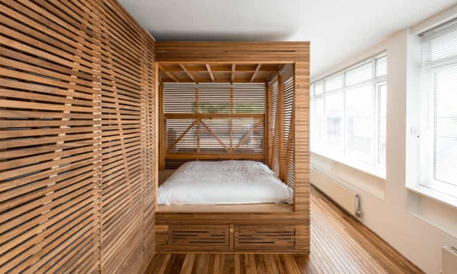
In the same way that a swaddle prevents a newborn baby from flailing its limbs, an intimate sleeping space returns adults to the sanctuary of the womb. In a studio flat, this might involve using a curtain to demarcate a corner of the space, while in a larger bedroom it could mean creating a canopy over the bed. I find it strange that the price of a hotel room usually correlates to its size. In my opinion, go for the smallest one – it’s not only the cheapest, but it gives you the most satisfactory sleeping experience.
Aim high
When trawling through property listings, carefully consider the natural attributes of each building. Flats on the lower-ground floor are nearly always cheaper, but that’s because they are less secure from intruders, closer to street-level pollution, and often suffer from a lack of light. I recommend going for something higher up if you can: the trade-off for a daily hike up the stairs is a life-affirming spillage of sunshine. If you can, it’s best to find a home with some semblance of separation from those around it, such as an end-of-terrace.
Take your time
It’s tempting to immediately purge your new home of its previous occupants using a sledgehammer and a vat of emulsion. While it’s certainly true that your space should reflect your own view of the world, think carefully before major interventions. Live in it for a while if you can, ideally for a full year, so that you get a sense of how best to utilise the space, and how the light moves through the day and the changing seasons. You might also gain respect for some of the existing materials. For example, that wooden floor you thought was a bit beaten-up when you moved in could start to take on some significance – its warmth beneath bare feet, or its ability to absorb the comings and goings of daily life.
Follow the rule of three
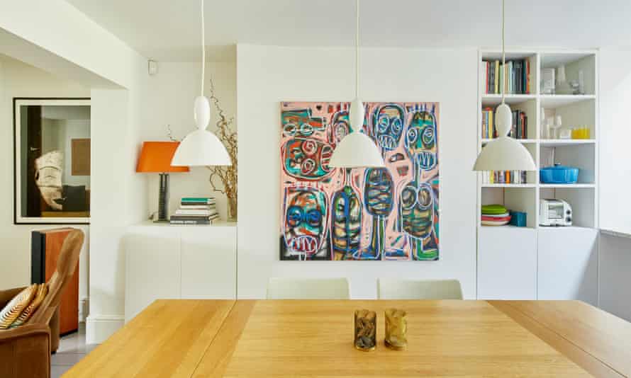
Next time you go to your favourite restaurant, have a look at the plate: it’s likely there will be three main ingredients grouped together in a harmonious way. If things are arranged asymmetrically, the eye is forced to move around them to fully absorb what it sees. In the home, this rule applies on every scale, so you might place a sofa and two chairs together, three pendant lights over a dining table, or a trio of ceramics on a tabletop.
Make space flexible
With their sliding partitions and room dividers, flats on modernist housing developments such as the Barbican Estate in London remind us of the value of flexible space. It’s useful to have a guest sleeping area or workspace that can be sectioned off for privacy, but contributes to the sense of expansiveness in the living room when not in use. A pocket door, glazed partition, bookcase on castors or a large plant can help the space adapt.
Don’t be afraid of the dark
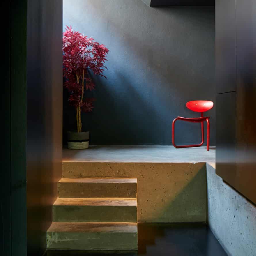
We should build in dark spaces for reading and thinking, acknowledging that the unfocused atmosphere of a dimly lit nook allows daydreams to take hold. Dining rooms are at their best when they exude the decadent fug of a gentlemen’s club. In Japan, darkness is part of the culture: houses have extended eaves, paper screens and deep alcoves that conjure the tranquillity of an ink-wash painting.
Create variety
Aim for as much spatial variety as possible: ceiling heights that change as you move through the home; a hidden door like something from a Scooby-Doo cartoon; an unexpected nook for a chair. Even a simple step within an open-plan space is a powerful psychological device, keeping the tide of children’s toys at bay, or acting as a symbolic shift from day to night as you step up to the sleeping area.
Open the windows
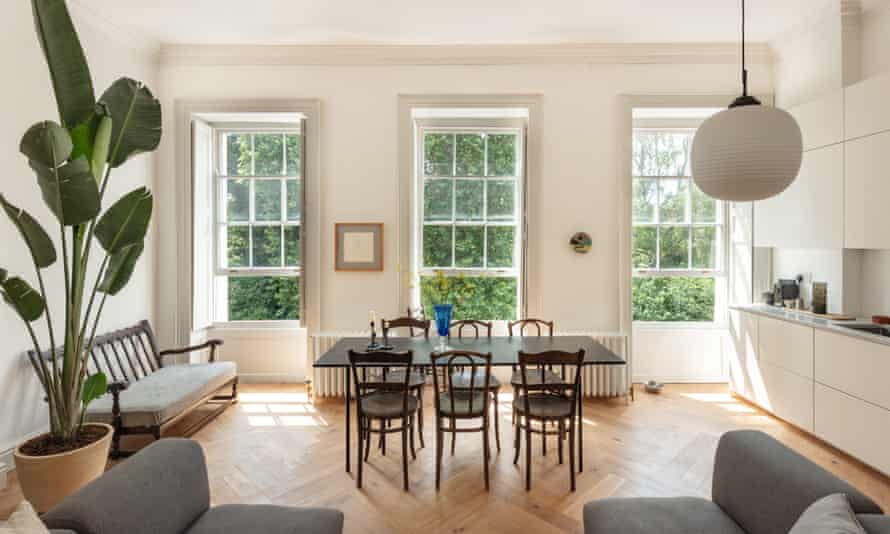
The materials we live with release fumes into the air without our knowing about it, like a flatulent uncle at Christmas. The latex backing and adhesive used to stick down carpets can continue to off-gas for years after installation. Open windows and doors for ventilation, add extractor fans, trickle vents and ceiling fans to encourage the flow of air, and use natural cleaning products.
Don’t forget the details
A simple way to transform an interior is to update the things that you come into physical contact with every day – not only the door furniture, but also the light switches, the loo seat, the kitchen worktop, and so on. Choosing tactile materials can have a significant effect on our experience.
Follow the sun
Many of us are still working from home for at least part of the week, so a simple but effective way to get more natural light is by placing a desk near a window. We should aim for as much light in the morning as possible, because it moves the circadian clock to an earlier time, ushering us into bed sooner and helping us achieve a longer sleep. A report in California showed that children are more productive, and even achieve better exam results, when they are able to work in a sunny space.
Avoid blinding lights
If you can look straight into the blinding filament of a lightbulb then it’s probably in the wrong place. The biggest scourge of modern interiors are spotlights in kitchens. Ceiling lights should be recessed so they are invisible, or surface-mounted and angled so they provide a wash of light across the walls or the corners of the room. Use wall sconces and plug-in lamps on five-amp circuits, and try to ensure every light is placed on a dimmer, so the atmosphere can be varied and the intensity managed.
Use colour in context
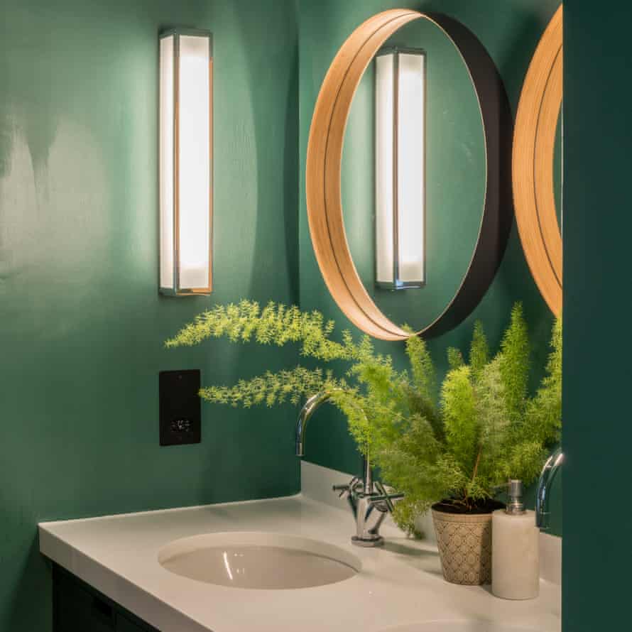
When poring over the paint chart, remember that light colours bring big rooms to life and dark colours enhance the intimacy of small ones. You can afford to be more daring in the spaces that are used less, such as spare bedrooms and cloakrooms. Use tonal changes to emphasise decorative features like panelling, cornices, fire surrounds and old doors.
Put radiators beneath windows
Placing a radiator under a window frees up valuable wall space for furniture and is more energy-efficient: induction causes the cold air coming through the glass to push the warm air from the heater into the room. Try not to sandwich a sofa or bundle a bed against a radiator because it will restrict the flow of heat. Just be sure to insulate windows.
Let go of perfection

The Japanese philosophy of wabi-sabi teaches us to accept transience and asymmetry, and find joy in weathered surfaces, mismatched materials and natural ageing. If we stop striving for perfection, everything becomes less anxiety-inducing. For example, choose a flooring that will weather gracefully and won’t show up every crumb. Serve dinner using mismatched plates and glasses, and forget about burnishing the cutlery – it looks much nicer when it’s a bit tarnished and neglected.
Embrace curves
“I am of the opinion that anyone who wants to rest his rear end on a rectangle adheres in his heart of hearts to a totalitarian creed,” said designer Josef Frank, who clearly wasn’t a fan of straight lines. One of the principles of biophilia is that sharp-angled objects stimulate the amygdala, the part of the brain associated with fear, whereas rounded forms are suggestive of life. Choose curvaceous sofas, plump vases and tables with rounded edges, and put pebbles, pine cones and shells on the mantelpiece.
Hang pictures low
Think about how pictures occupy the space, and their relationship to the floor and ceiling. The most common mistake is to place them too high. Use your eye to find what feels like the right place instinctively, then take it down by six inches. A picture hung too high looks bereft.
Finally … surround yourself with meaningful things
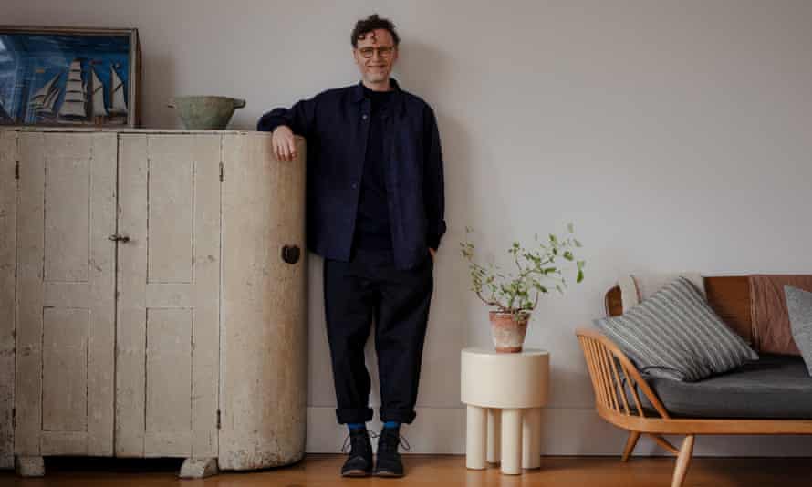
Avoid buying the on-trend furnishings that everyone seems to have on Instagram. Aesthetic preferences evolve, so stick with objects that are timeless and have the most emotional significance. In my case, that’s a lustreware jug held together with sticky tape which I inherited from my parents, and drawings, painted stones and pottery that my daughters have thrust into my possession over the years. Creating a home is a personal and heartfelt process. It is about building memories with the ones we love most.
A Modern Way to Live by Matt Gibberd is published on 28 October by Penguin Life
