
The Art Cellar: 2023 Design Trends – Colorful & Collected

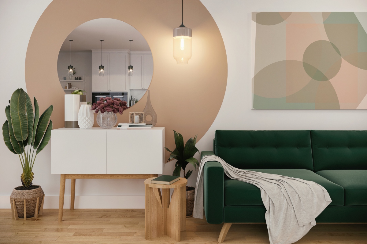
Many of us have spent the past few years redefining what “home” really means. Now, in a post-covid awakening, designers are moving past cold, modern, minimal spaces in favor of warmer hues, eclectic decor and cozy nostalgic furnishings.

Colors

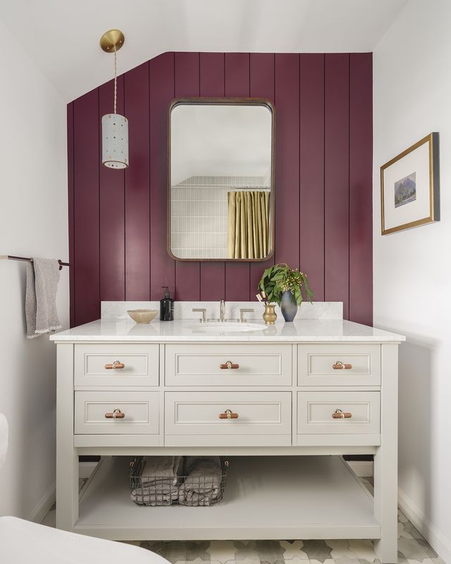
Think warm and natural. And yes, you may have heard that pink is all the way back in style as well as the natural wood finishes that were abandoned for painted and expoxied surfaces to fit the minimalist trends of the past several years. Sherwin Williams and Pantone even went as far to crown shades of pink as their colors of the year and it has our full support.

Maximalism

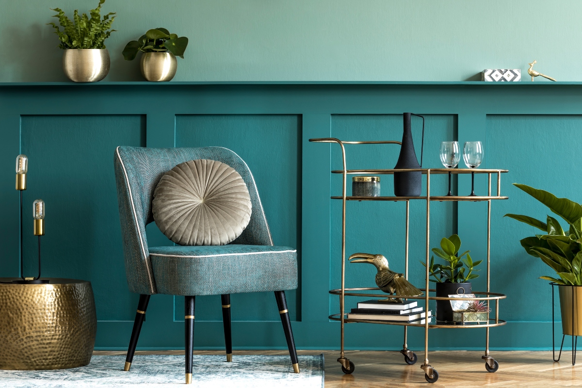
The days of fast furniture and sparse decor are over. Mixing metals, blending old with new and one-of-a-kind designs are here to stay. Original artwork and unique furnishing combinations are more important than ever. You can learn a lot about a person through their home. With social media influence, it is easy to get caught up in repetitive design. Showing off your creativity through your personally curated collections makes a space truly distinct. Salon-style walls are a fun way to minimize space with maximized collections.

What’s New in the Gallery

Salon Style: History of the Paris Salon, Salon-Style Hanging, & the rise of Maximalism

For much of history, the ability to walk into a gallery and view fine art was considered a luxury. Only reserved for royalty, the wealthy, and those with access to private collections. The exclusivity of art changed drastically in 1667 with the opening of the “Salon de Paris” established by King Louis XIV. The Salon, held at the French Royal Academy for Painting and Sculpture, became the defining force behind fine art in the 17th and 18th centuries. For 200 years, the Salon held regular exhibitions for artists which signified royal favor. Although not made public until 1737, the Salon established its influence as the premier annual art even in the Western World.

Exposition au Salon de 1787, etching by Pietro Antonio Martini published in “Aux arms et aux Art” by Adam Biro, 1988

What has become known as Salon-style, the tightly packed arrangement of paintings was born out of necessity, not design choice. The show eventually grew to accommodate over 5,000 works by 400 different artists which severely limited available wall space. The arrangements became a spectacle on its own. Art stretched from wall to wall with the smallest works at the bottom and the largest nearing the vaulted ceiling. A curator worked to find order somewhere within the chaos, balancing various frame styles with competing tones and subject matter. A far cry from modern galleries, where works get an entire wall to themselves to focus the viewers attention, the Salon-style still has a place in modern design.

As described in the ‘2023 Design Trends’, the scales have begun to shift away from the recent minimalist movements. Personal expression and originality are at the forefront of cultural trends as the world is itching to  break out of the cold and muted Covid winter. The Salon-style wall is the epitome of this internal need for self expression. It takes on a life of its own as a form of organized chaos, giving the curator complete autonomy over how it’s digested.

A Salon-style wall has the ability to turn a seemingly random collection of works into a unified narrative, allowing for each individual piece to contribute to a greater concept. Depending on the curation, each difference in color, style, subject, and frame acts as a different stroke of paint in the larger picture. Gone is the notion that to truly appreciate a work in its entirety, it must have its own wall with no other competing subjects. A Salon-style wall shows how art with seemingly zero complimentary features can come together to form a work of greater value.

https://artcellaronline.us7.list-manage.com/track/click?u=c19504a37871d41521e81ad05&id=27291e0614&e=05e1382fb7

https://artcellaronline.us7.list-manage.com/track/click?u=c19504a37871d41521e81ad05&id=46b3e9a0d9&e=05e1382fb7

Framer’s Corner: Alex, CPF

Modern Matting
Outdated Matting

The mats on your framed artwork can be an easy indicator that the materials in the frame package are not an ideal preservation environment. Out of style mats, usually brightly colored and stacked three to four deep can be an indicator that the frame is out of date. Also, look closely at the bevel (the angled cut in the window surrounding the artwork), if the bevel is brown and not bright white, this shows that your painting or print is in danger of acidification. Any other things like ripples, stains, water damage, etc. indicate that it’s time to bring it over to The Frame Shop.

Staff Picks

Brooke’s Pick
The Lemon
Noyes Capehart
Acrylic on Canvas
24″ high x 18″ wide
5,200
Morgan’s Pick
I Find Myself Again on the Road to Your House
Jason Hatcher

Oil & Cold Wax on Rag
18″ high x 13″ wide
$400
Lauren’s Pick
A Look Inside
Tyler Swain
Oil on Panel
11″ high x 14″ wide
1,050
Alex’s Pick
ZigZag Vase
Michael Hayes
Blown Glass
20″ high x 7″ wide
1,250
Inside the Art Deco Home Banner Day Interiors Made Their Office

designer clara jung

Clara Jung, Designer

Christopher Stark

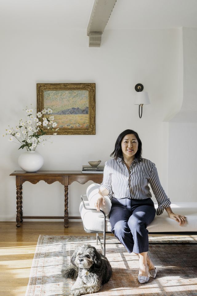
For some, the office unwittingly becomes a home away from home. For Clara Jung, principal designer and founder of Banner Day Interiors, that was always the intention. In the early days of the pandemic, the California native purchased a three-bedroom cottage in Oakland that would soon serve as her firm’s headquarters. The 1,800-square-foot former residence was built in 1932, one of the final years of Art Deco’s reign, and still features the design era’s unique characteristics. “We needed a larger office space and readily found that an open-concept office wasn’t necessarily conducive to productivity,” Jung says.

The home-turned-office quickly became a design laboratory of sorts, giving Jung the chance to experiment with prints, colors, and textures. “I thought this would be a great opportunity to renovate a space that would serve as a showcase of our work,” she explains. “All of the products and designs we implemented in our office represent the fixtures and furniture we often use in our clients’ spaces.”

From punchy floral wallpaper to checkerboard area rugs, Jung certainly didn’t hold back. In fact, save for a few original architectural details, she breathed a lot of new life into the space. “It had been a rental unit for quite a while, and it was well-lived in,” she remembers. “The house was ripe for a renovation by the time I was ready to tackle it.”


preview for Design School

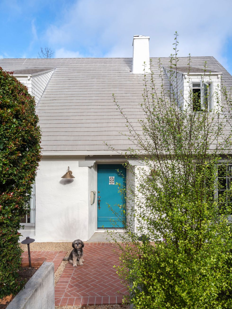
Like most decades-old homes, the bathrooms and kitchens were in dire need of an upgrade, but Jung adds, “The charm of the home was still there.” So, the designer used the home’s period details—arched doorways, expansive windows, and sloped ceilings—as the driving force behind what she calls a “cosmetic remodel.” One of Jung’s favorite original elements is the front door. “I wanted to take the exterior of the building in a more updated direction by painting the trim a warm gray and the door a blue-green blast of color,” she says. The designer infused that same sense of color throughout the rest of the quietly luxurious office—a move that Jung hoped would inspire clients. “The hope was that by showing clients our office in person, they would leave feeling emboldened to take more risks.”


Exterior

exterior

Christopher Stark

The former three-bedroom home in Oakland, California, was built in 1932. Jung opted for a cosmetic renovation, keeping several of the original architectural details, including the front door. Her pooch Morgan (“a combo platter, otherwise known as a mutt, the best kind,” says Jung) loves to come to work at the remodeled space.


Dining Room

before

Before

Courtesy of Clara Jung
after dining room

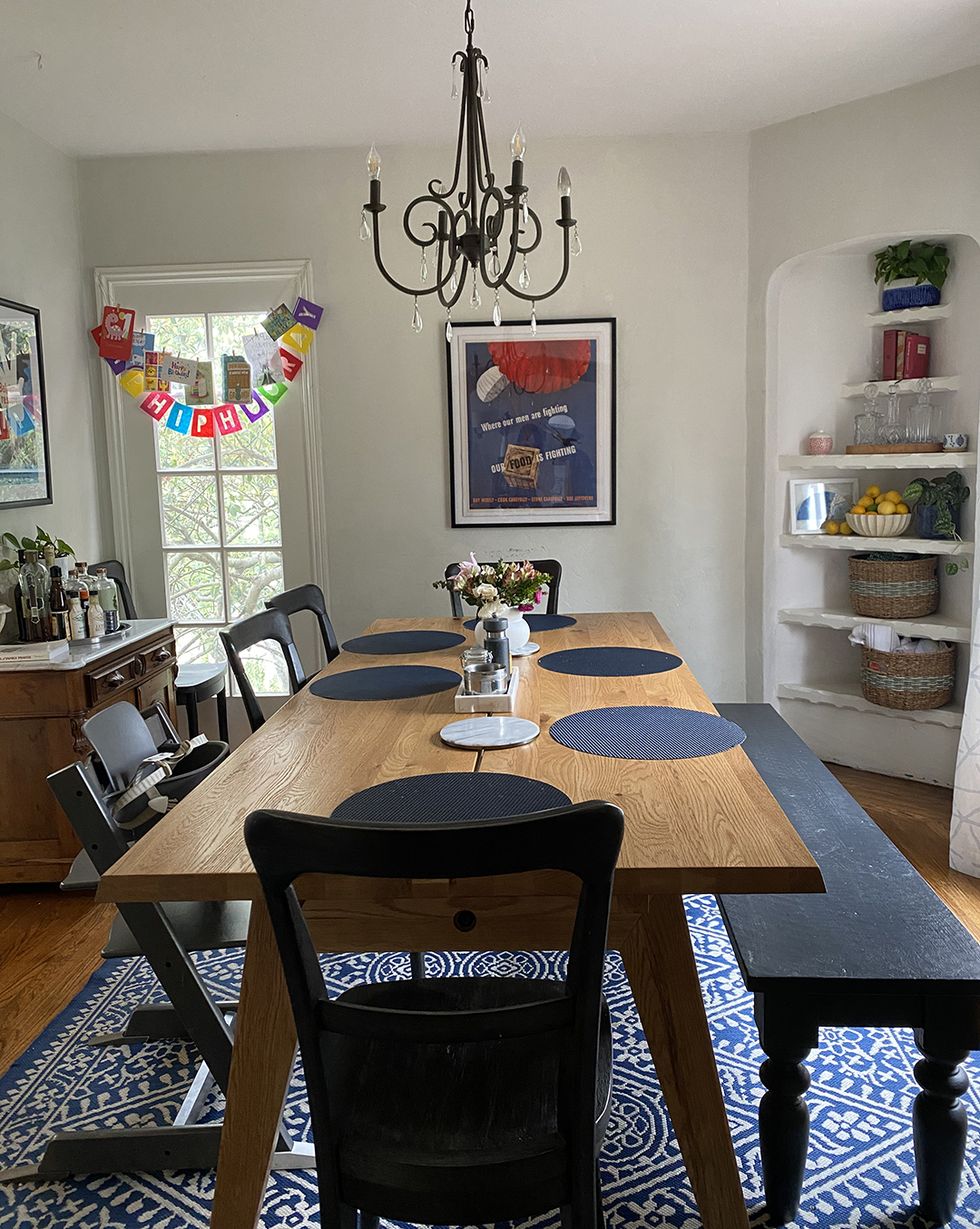
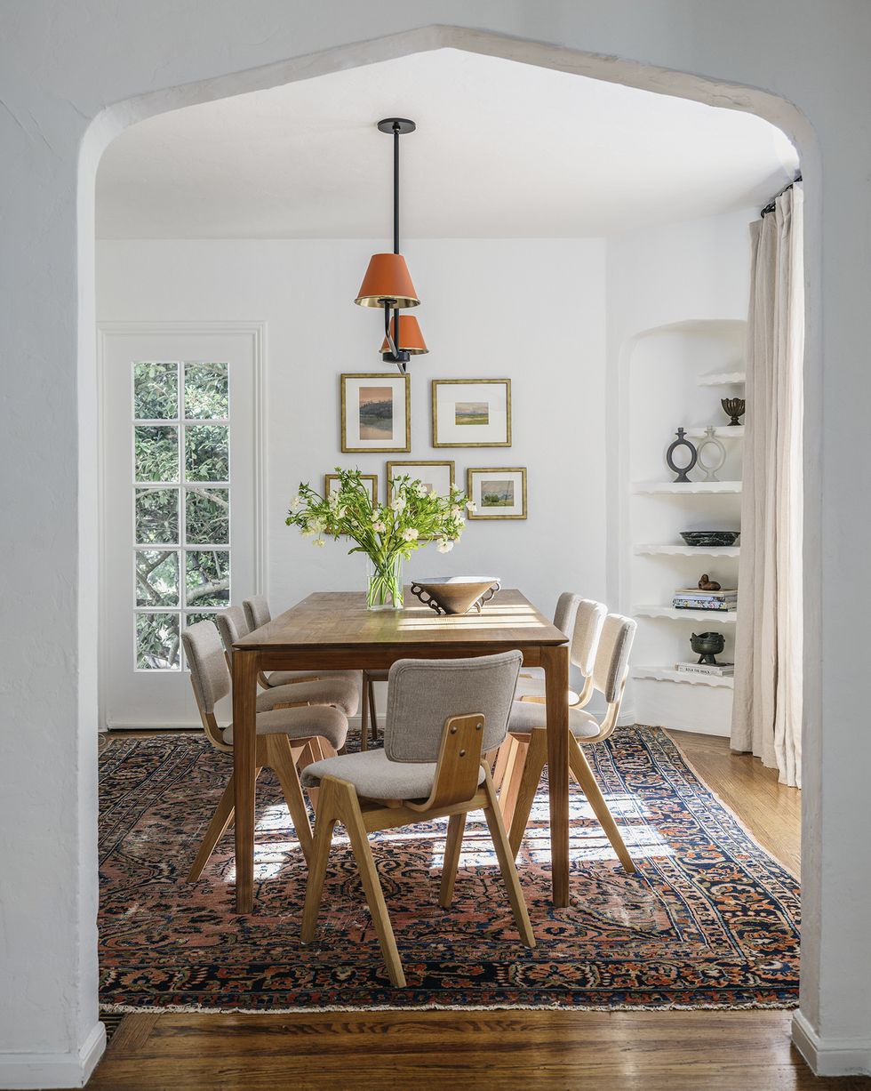
Before Jung took on the project, the interiors were “well-lived in,” she says. Case in point: the dining room. Now, complete with an Ethnicraft table surrounded by Industry West chairs, it’s light and airy. The vintage rug ties it all together.


Kitchen

kitchen

Christopher Stark

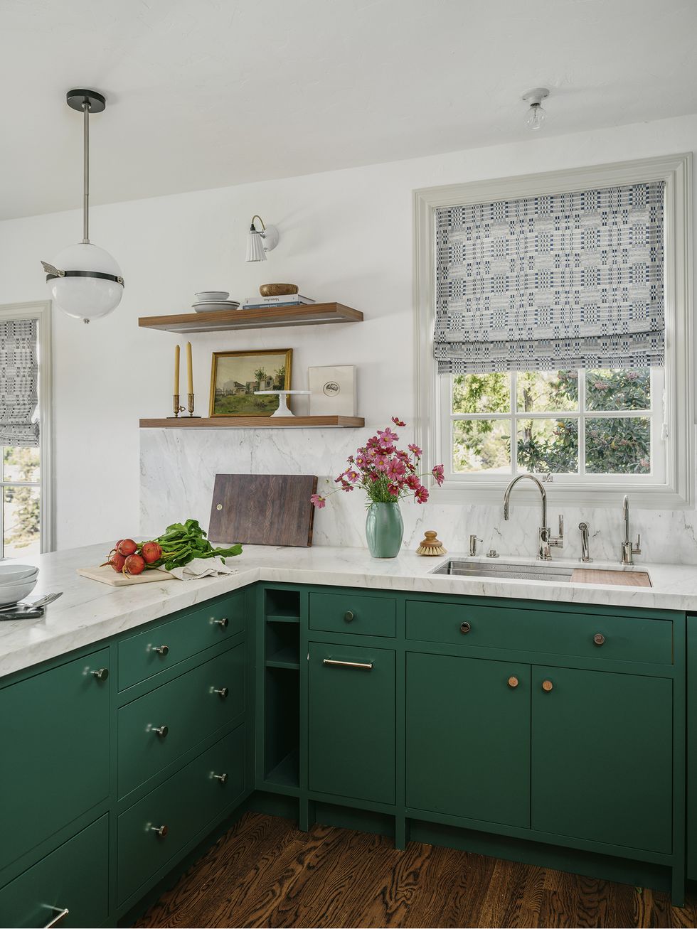
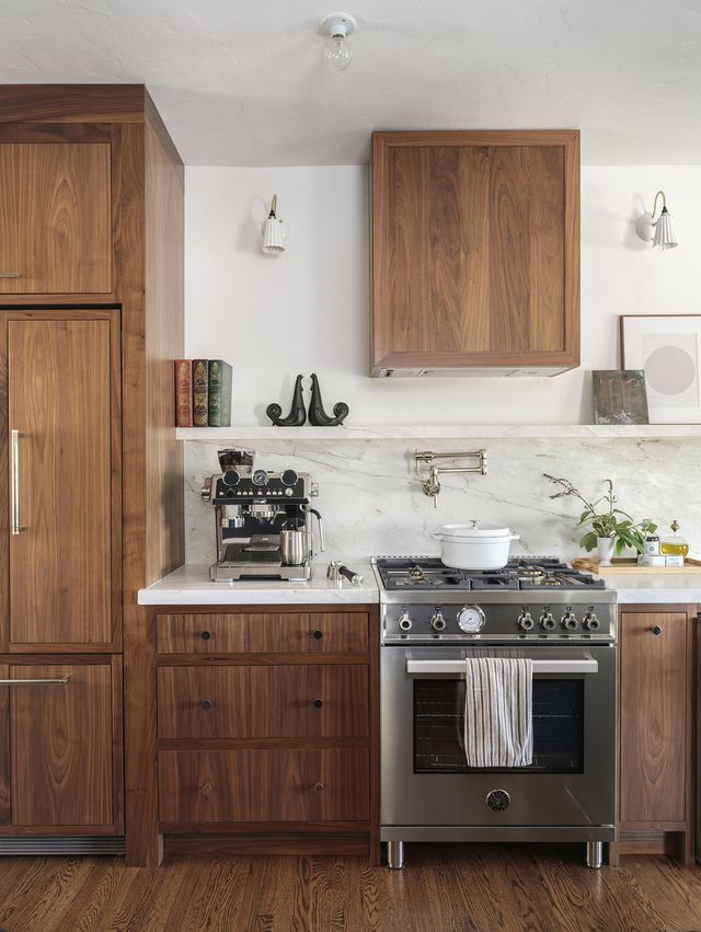
Jung took the kitchen down to the studs, building out new modern cabinetry, in both natural wood and a deep shade of green—Lafayette Green by Benjamin Moore. She kept overhead lighting simple with a pendant from The Urban Electric Co.

kitchen

Christopher Stark

“I love that brightness and color abounds in our office, but it all stays true to the character of the home,” Jung says.


Living Room

living room

Christopher Stark

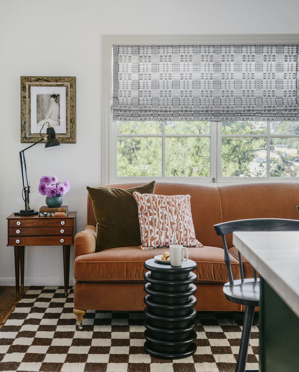
One of the most eclectic spaces in the newly revamped office is the living room, which Jung filled with a selection of vintage pieces, including the wood side table and checkerboard rug. “I designed this specific room to cultivate a hangout space for phone calls, chatting, or perhaps more laidback work with a laptop,” Jung explains. She completed the space with a side table and sofa from Mitchell Gold + Bob Williams.


Bedroom

bedroom

Christopher Stark

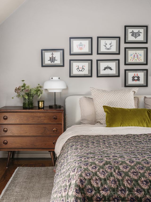
Gallery walls are always a good conversation starter, but this collection is extra interesting. “They’re vintage Rorschach tests by an unknown artist. They came in a bundle, and I thought it would be fun to have them framed,” the designer notes. The moody colors of the artwork complement the bedding, which is a mix of Parachute and CB2.


Bathroom

bathroom

Christopher Stark

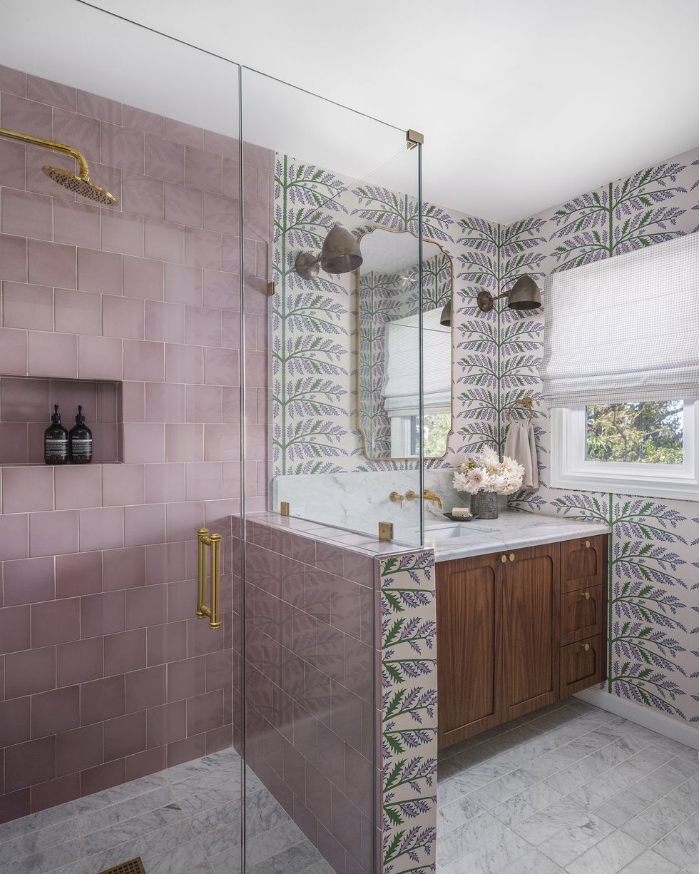
The office bathroom is another one of Jung’s color experiments. “I enjoy that it has feminine leanings, but still has mass appeal,” she says. “The inspiration was actually the pink Fireclay Tile, not the Schumacher wallpaper—although many people assume the reverse. I’ve been pitching this color tile to a couple of clients, and they always turned it down. I like nothing better than a challenge, and I wanted to show how it could work in a space that has longevity and charm.” Mission accomplished.

bathroom

Christopher Stark

Jung also used the bathroom to show the differences between custom and ready-made furniture. “We’re not necessarily pushing one over the other, although our clients often opt for custom vanities for several reasons, including quality, ability to eke more personalized usage, and the look.” Here, Jung chose a Pottery Barn vanity.


Q&A

House Beautiful: Did you encounter any memorable challenges or surprises during the project? How did you pivot?

Clara Jung: This was in the thick of the pandemic, and we suffered all the delays both in supply and labor that all our clients experienced.

HB: Where did the majority of the budget go?

CJ: The majority of the budget was spent on the kitchen and bathrooms. As is often the case, the scope increased to the exterior.

HB: How did you save money or get crafty?

CJ: Since this was an office kitchen, instead of spending money on a microwave drawer, we decided to do a cubby for a conventional microwave with a door. Additionally, in one of the bathrooms, I purchased the floor tile at a seconds sale for a highly sought handmade tile vendor and purchased the tile at a fraction of the original cost.


Follow House Beautiful on Instagram.

Jessica Cherner is House Beautiful’s associate shopping editor and knows where to find the best high-low pieces for any room.

Artist Jorge Pardo’s Sea View Home Reopens as an Art Gallery

LOS ANGELES — In 1993, the Museum of Present-day Artwork (MOCA) in Los Angeles offered Jorge Pardo an exhibition as component of its Concentration sequence. The youthful Cuban-born artist had started making a title for himself with objects that blurred the lines amongst art and design, but this would be his very first solo museum clearly show in LA, in which he had settled right after obtaining his BFA from Artwork Middle College of Layout in Pasadena in 1988. As a substitute of making pieces to display inside a museum, he conceived of an artwork that would exist solely outdoors of it. “I have a sloped whole lot and an concept for a house,” he advised Hunter Drohojowska-Philp in the Los Angeles Times in 1998. “How can I consider those ingredients and make them do a thing you wouldn’t expect?”

5 a long time later, Pardo’s exhibition opened on Sea Look at Lane, a dwelling conceived as both of those an artwork and residence perched on a hill in the neighborhood of Mount Washington. Every weekend for the run of the demonstrate, shuttle buses would ferry readers from MOCA’s downtown location to the web-site in Northeast Los Angeles. “It was an exhibition that could evaluate what the museum could cope with in terms of performing exercises its domain,” Pardo advised Hyperallergic earlier this week. “Where is the object? Is it the house? The artist’s life? The community?”

20-5 many years after the exhibition closed, elements of the dwelling are once again opening their doorways to the public — this time as a up to date artwork gallery. Previous weekend, Sea Look at opened its inaugural exhibition, River Styx, in a area of the developing that formerly housed Pardo’s studio. The project is the brainchild of Sara Lee Hantman, a former senior director at the LA gallery A variety of Smaller Fires who also co-founded a home furnishings organization, Prisma, in 2020. Hantman manufactured small interventions, incorporating a several partitions for expanded exhibition house but preserving in intellect the artist’s authentic eyesight.

Sea Watch (picture courtesy Tom Marble Architecture)

The gallery’s debut display, curated by Hantman and Brandy Carstens, is named for the route to the underworld in Greek mythology. “It’s about landscape as a ripe location to communicate about the psychological surroundings,” described Hantman. “The functions depict liminal areas. It is the antithesis to the pastoral.” These incorporate Kelly Akashi’s ephemeral glass and bronze sculptures Theodora Allen’s haunting symbolism Salvo’s spare, abstracted Venetian landscapes Elsa Munoz’s unnatural, moody seascapes and Dan Herschlein’s reduction paintings whose gnarled surfaces are crafted up from development supplies.

River Styx at Sea View, installation view with get the job done by Frank Walter & Mark Laver (photography by Wonderful Day Photo, courtesy Sea View)
River Styx at Sea Watch, installation perspective with work by Elsa Munoz and Erica Mao (images by Awesome Day Photo, courtesy Sea View)

Pardo’s dissolution of the borders among disciplines produced Sea Check out a persuasive gallery site for Hantman. “I’ve always been interested in that gray place among artwork, layout, and architecture,” she said, introducing that she views the project as section of the heritage of LA galleries in properties and domestic areas that can present for a far more welcoming, leisurely viewing experience than the traditional white cube.

“We have domestic architecture, but we never have the collections of the Metropolitan Museum of Artwork,” Pardo instructed the LA Occasions in 1998. “For me, what shaped my comprehending of house was dealing with rooms, spots, houses.”

Though it was ostensibly a house, Pardo approached the challenge from an inventive framework as opposed to an architectural just one. “He talked about it as a sculpture. He talked about lamps as paintings. Jorge was consistently making an attempt to redefine certain items,” Brian Butler, founder of Pardo’s longtime LA gallery 1301PE, informed Hyperallergic.

Sea Check out in 1998 (picture by Alex Slade, courtesy MOCA)

“I was abusing architecture to some diploma, utilizing it like you would a costume for an artwork,” Pardo spelled out. Pardo has no formal architectural coaching, and enlisted architect Mark McManus to support with the technological operate on Sea Look at.

Nevertheless, the project does engage with architectural features and tropes, sliding concerning continuation and rupture with precedent. Its cleanse, open up aesthetic demonstrates parallels with the household modernism of Rudolph Schindler and Frank Lloyd Wright, whilst its basic, redwood facade back links it to other homes nearby. Sea Check out is composed of several joined structures about a central courtyard, responding to the features of the site so that oddly shaped rooms unfold on multiple concentrations. A staircase doubles as a library and significant windows give light and a relationship to the landscape, but disregard the component that presents the avenue its title.

“What does it signify to not prioritize the sea view on Sea Look at Lane?” Pardo asks. “Most houses, they make these wonderful rooms with windows to see that small sliver of ocean. I did not want to have that income shot.”

Sea Perspective, 1998 (courtesy 1301PE)

When Sea See opened, the exhibition’s curator Ann Goldstein hung Pardo’s lamps in the most important house, remembers Butler. “Jorge responded by placing in a round noticed. He wanted to make positive persons did not assume about it as inside place, but as a sculpture.”

When the MOCA exhibition closed in November of 1998, Pardo moved into the home, where by he lived with his family members for the up coming 10 decades, even further complicating the barriers in between art, architecture, and domestic area. (The museum reportedly funded $10,000 of the task, even though Pardo estimates it charge him $350,000 to finish it.) He would integrate tiles remaining above from other initiatives at Dia Chelsea and the Mountain Bar, a famous gathering put for artists in Chinatown that Pardo opened in 2003, introducing added autobiographical layers.

In hindsight, Sea Watch the gallery could be considered as the newest chapter of a project that commenced 30 a long time in the past, undergoing numerous iterations as persons collaborate, intervene, and practical experience the area. “The troubles I was fascinated in had been sculptural, spatial challenges,” Pardo described. “How does an set up unfold? When does it tumble apart?”

Sea See is open up by appointment, Wednesdays via Saturdays.

River Styx at Sea Watch, installation look at with work by (clockwise from top rated remaining): Heidi Lau, Joseph Elmer Yoakum, Mark Laver, Erica Mao, Gretta Solie. (photography by Pleasant Day Picture, courtesy Sea See)
River Styx at Sea See, set up perspective with do the job by Dan Herschlein and Salvo (picture Matt Stromberg/Hyperallergic)
River Styx at Sea Watch, installation look at with operate by Heidi Lau and Joseph Elmer Yoakum (photograph Matt Stromberg/Hyperallergic)

The fine art of home decor

Article content

A department store serves as an unusual setting for Toronto art lovers

Advertisement 2

Article content

Like most brothers, Jamie and Andrew Metrick love a good family story. Especially the ones that tie the ancestors who started luxury home décor business Elte in 1919 to the rise of Toronto’s design and cultural scene.

Article content

As current co-presidents of the company, they brought some of those connections to the first in a series of fine-art exhibits to be held at the Ronald Avenue flagship store.

Called Abstracts at Home, it references a 1953 show of avant-garde art in the Simpsons department store in downtown Toronto. One of many familial echoes: sculptor Harold Town — who would join a group of painters who emerged from that show — went on to become one of ten Canadian artists Elte commissioned in the ’70s to create limited-edition textile panels.

Advertisement 3

Article content

The department store setting was unusual for Toronto art lovers. who were accustomed to going to “white-cube” galleries to look at “serious” art. Organizers wanted to inspire visitors to include contemporary art among their home décor and furniture, and to create a comfortable, lower-key environment in which to buy it.

Painter William Ronald (formerly a Simpsons window dresser) convinced the retailer to exhibit his own work, along with five other contemporary artists. Despite moderate sales, the show was a catalyst: a month later, Ronald invited a few others, including Harold Town, to meet the group. From that emerged a collective of abstract artists called Painters Eleven that would have a profound impact on the Canadian art scene.

Advertisement 4

Article content

Thoughtfully curated by Robert Wainstein of David Moos Art Advisory, the new show brought together five internationally-recognized abstract artists who, like the original group, share an emphasis on process, innovation, and surface.

Similarly, they work across disciplines and materials. Art was shown alongside exquisite furniture from Elte’s collection that connect to the themes.

Recruiting high-calibre artists meant “convincing them the work would be treated with respect and that we were committed to a serious art program —we wanted to work with artists interested in conversations between art and a larger aesthetic world of objects” says Wainstein.

The youngest was Chicago-based Tony Lewis, whose practice includes using graphite on paper to create large works. Wainstein describes the process. “It’s very active — he works on the floor, and he is wearing a mask and boots because there is graphite everywhere. You see his footprints, you very much see him in the work.” he explains.

Advertisement 5

Article content

Lewis’ theme is language – some of the elliptical shapes and lines are adopted from Gregg shorthand which is actually used by stenographers in courtroom. As a Black artist, suggests Wainstein, Lewis also reflects on the power wrapped into language.

The show’s elder statesman was 88-year-old Frank Bowling, who has been shown at Tate Britain, and exhibited at the AGO. Born in Bartica, Guyana, he moved to London in the ’50s to be a figurative painter before deciding he was actually an abstract painter. He moved to New York in the ’60s, where abstraction was the dominant form, and now inhabits the upper echelons of abstract painting, says Wainstein.

“He dedicated his life to exploring process and cascading colour and different material and techniques,” says Wainstein. “His innovations (included) using different mediums gel resin and acrylic paint, which were new forms of paint and materials at the time.” For more about the art and furniture in this show, go to www.aroundthehouse.ca

Advertisement 6

Article content

Because Elte is so focused on interior designers and architects, they wondered how a retail-oriented art program would be received. “But we were surprised by how excited they have been by this — a number of sales have been through the interior design community,” says Andrew.

Another exhibit will be held in spring of 2023. As the show closed in mid-December, the co-owners reflected on the experience. “For Andrew and me, it was partly about learning the business end,” says Jamie. “But it’s also a lot more than that—it’s continuing a legacy of bringing art and design into people’s homes.”

Vicky Sanderson is the editor of Around the House, www. aroundthehouse. ca. Check her out on Instagram@ athwithvicky, Twitter ATHwithVicky and or Facebook.com/ATHVicky.ca.

Advertisement 1

Comments

Postmedia is committed to maintaining a lively but civil forum for discussion and encourage all readers to share their views on our articles. Comments may take up to an hour for moderation before appearing on the site. We ask you to keep your comments relevant and respectful. We have enabled email notifications—you will now receive an email if you receive a reply to your comment, there is an update to a comment thread you follow or if a user you follow comments. Visit our Community Guidelines for more information and details on how to adjust your email settings.

How to Make Art Deco Interior Design Work in Your Space

Artwork deco inside structure flourished as an unconventional style aesthetic in the 1920s and 1930s. The style stood out amid the avant-garde traits at the time, by leaning into a additional simplistic and small visual solution. And as we enter a new period in home style, a resurgence of past influences is generating its way into our spaces. As a end result, owners are on the lookout for nostalgia and inspiration from past style and design designs.

So now, we’re diving into some of the vital elements of artwork deco decor. If you’re searching to take part in this vintage-encouraged development, in this article are six crucial elements to include in your area.

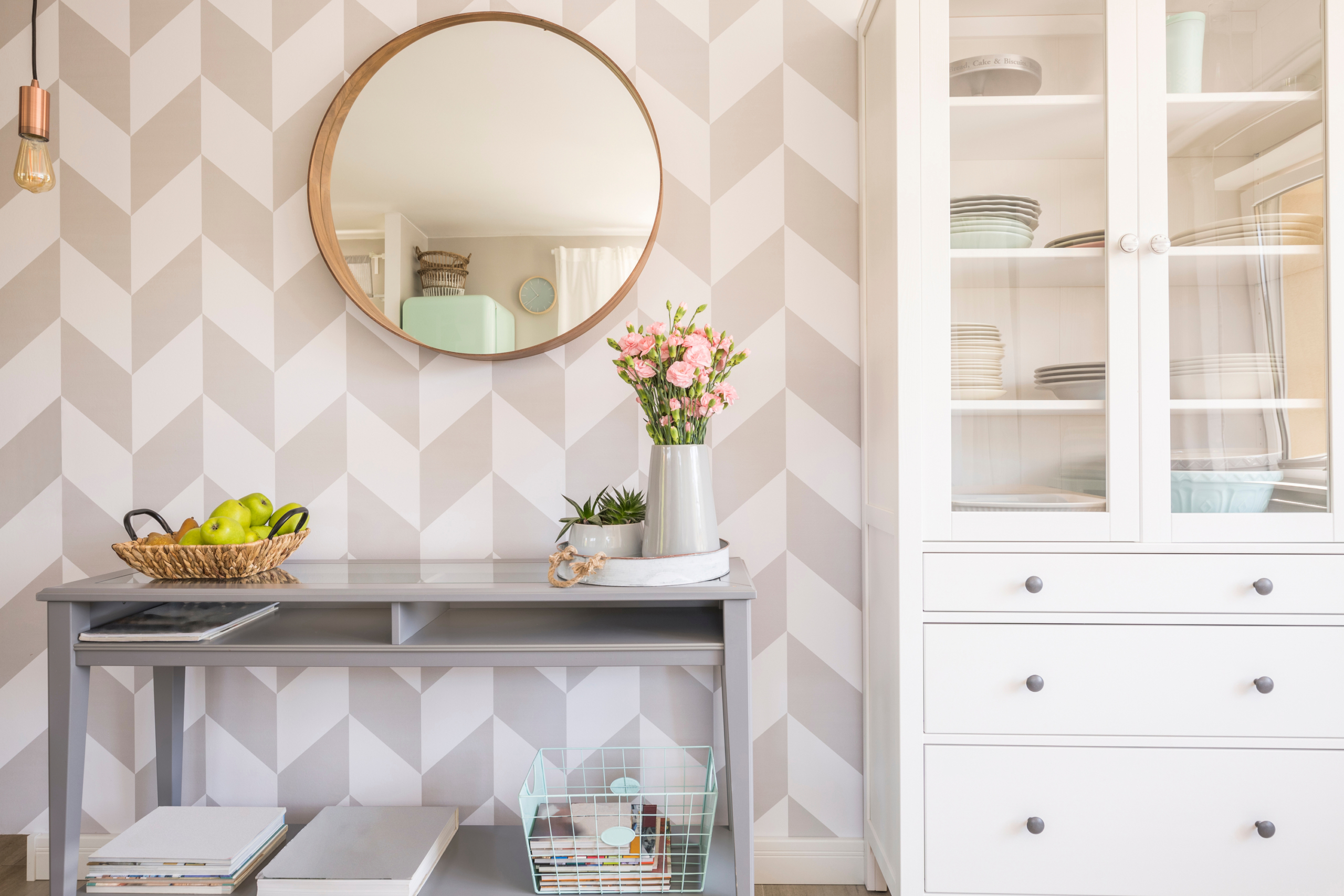
Geometric wallpaper with a console table

Use one of a kind shapes

When art deco entered house design, one of its crucial features provided special designs. Furnishings and decor that showcases sunbursts, stepped types, geometric swirls, daring arches, and sharp corners is a must-have in this design and style. When generating an art deco glimpse in your household, it is essential to contemplate how you can invite a lot more condition into the place.

We propose searching for lamps with a geometric sort, sunburst wall mirrors, or curved wingback chairs that make a exclusive sense of dimension in the room. Mix the curves with sharp edges to create heightened distinction.

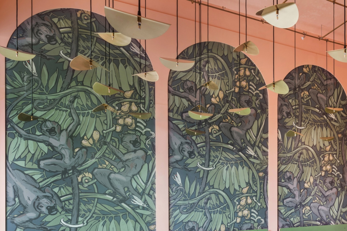
Nature-themed green wallpaper with pink background

Opt for geometric designs

Apart from special styles, you should also consider geometric patterns. Geometric styles — especially on textiles — can make the excellent art deco search. Chevron, triangles, repetitive feather or leaf kinds, trapezoids, and other angular shapes can produce far more visible fascination in the room.

Also, it’s totally wonderful to blend and match styles! Just be sure not to go overboard. For example, a patterned rug with rounded shapes and chevron curtains can make a grand assertion in a room. Just be guaranteed to preserve your wall styles minimal and decide for good tones in your home furniture.

Alternatively, you could look to insert geometric styles to home furniture and accent pillows although preserving the rug and curtains basic to develop a extraordinary however well balanced seem.

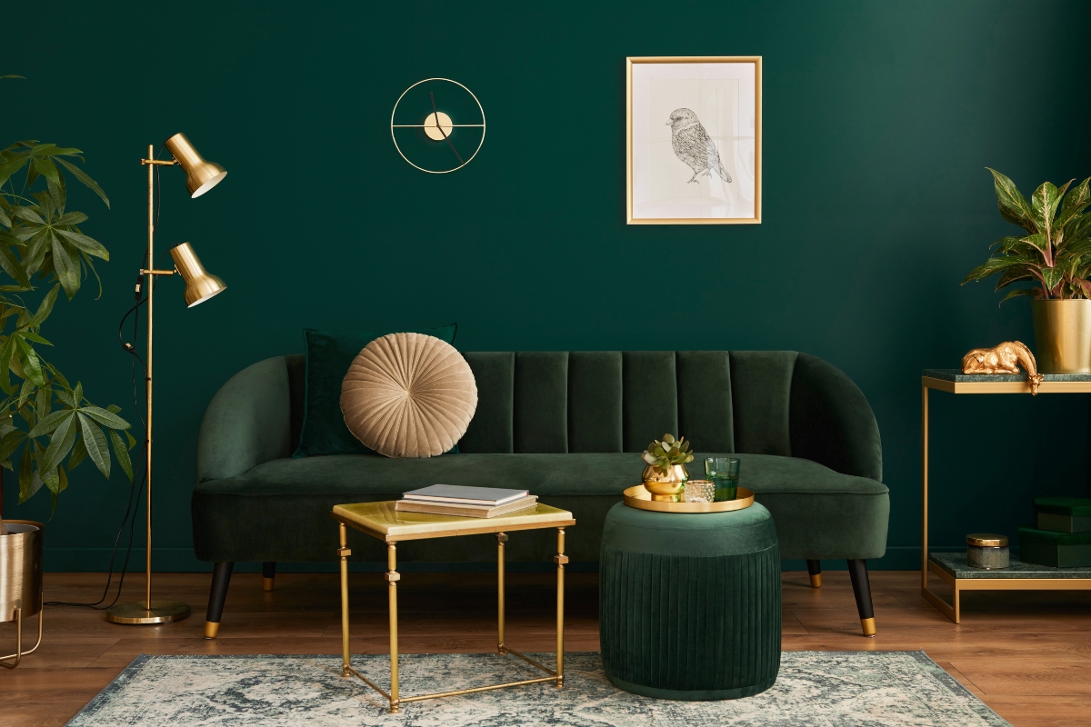
Dark green monochrome color palette for living room design

Pops of vivid hues are wonderful concepts

If you’re going for an artwork deco-influenced coloration palette, we advocate utilizing gentle pastels like product and pale pink with moodier jewel tones like plum or emerald. Use your neutral and pastel tones as a backdrop with moodier tones as your accents. Or, do just the reverse with a jewel-toned wall coloration and pastel accent tones!

One more critical design characteristic of the artwork deco model is the use of hugely contrasting shades. Just as pastels and jewel tones generate visible contrast, so does a simple black-and-white backdrop. In the long run, when creating an artwork deco palette, it’s very best to equilibrium your backdrop tones and your pops of coloration.

Fluted kitchen cabinet

Fluted and textured furnishings is a need to

Fluted furnishings is coming again into style, and whether or not you are aiming for that ideal art deco style or simply want to hop on a craze, fluted and textured furniture is anything you really don’t want to miss out on.

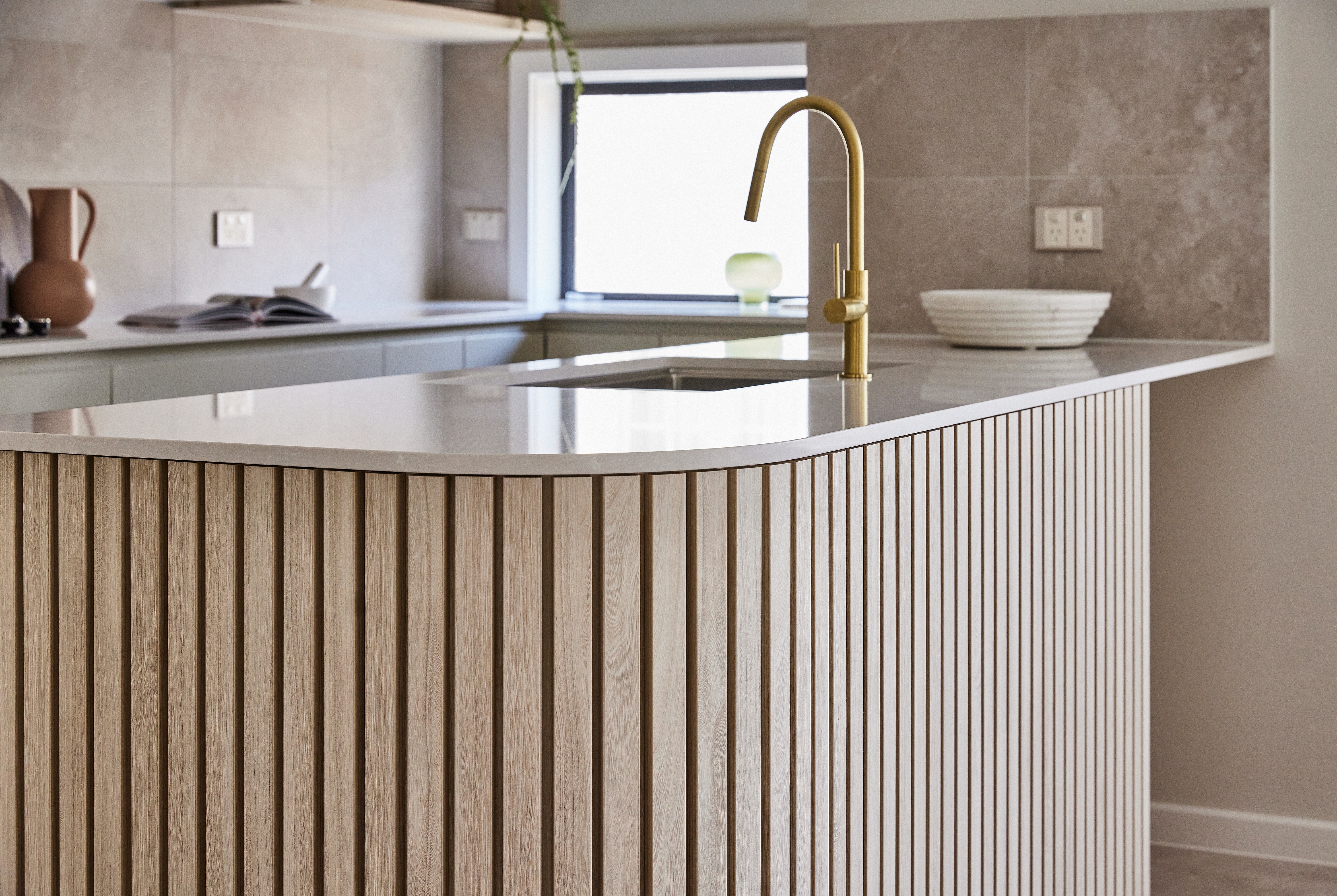
Fluted television consoles, aspect tables, dressers, entry tables, and espresso tables are a go-to when incorporating more dimension to an artwork deco-encouraged layout. You could possibly also take into consideration a fluted kitchen island or cabinetry if you want to put a modern-day spin on this timeless basic. Just continue to keep in mind that several fluted pieces are created of wooden, so it’s crucial to match your wooden tone to your existing palette. You could think about a lighter wooden to make a statement, if you have a darker palette. And vice versa.

Neutral and green color palette for living room design

Go for daring assertion items

The 20s and 30s were being all about grandeur. This period in record rests concerning two wars, when quite a few Individuals and Europeans sought layouts that radiated magnificence and luxurious. Daring assertion pieces did just that by generating a focal stage for the home that felt far more attractive than important.

A assertion curved chaise lounge or a grand sunburst mirror are great solutions for statement pieces. Even so, you could always decide for a geometric chandelier or a patterned wallpaper accent wall.

blue and turquoise room decor with metal details

Incorporate luxe merchandise for a complex seem

As we talked about previously mentioned, the art deco style and design was all about luxury. On the other hand, it was much less about the frills and glitz of the time and more about the artistic use of shape and type. Velvet sofas with rounded or sharp edges, smooth metal accents, ornate shell-formed wall sconces, abundant and intricate geometric patterned wallpapers, and plush white chairs are all illustrations of the lavish decor merchandise that emerged from this aesthetic.

It is vital to permit your furnishings items discuss for by themselves. Enable their unique shapes, hues, and textures to make a bold still streamlined aesthetic. There is no require to overdecorate or deal with your furniture in compact decor items. Retain a small technique and use statement parts to boost the class of your layout.

As you lean into a more art deco-motivated interior, it is vital to try to remember that the design and style is all about simplicity, shape, type, pattern, and class. Try out not to get too carried away with styles, layered rugs, tons of throw pillows, or frilly decor products. Decide for negligible furniture and decor that tends to make a bold assertion in the area. And really do not be fearful to blend patterns, use metallics, and choose for one of a kind items.

Editors’ Recommendations


Should you hang art above your bed? 5 things to consider when decorating with art |

A lot of interior designers agree that artwork plays a key position in a successful inside scheme. Considerably additional than just a finishing touch, it has the energy to change a room and is the best way to inject temperament into each space.

Whether or not it can be 1 massive statement piece or a sequence of decorative objects introduced back again from travels, artwork can provide soul to basic areas and helps change a dwelling into a dwelling.