Inside the Art Deco Home Banner Day Interiors Made Their Office
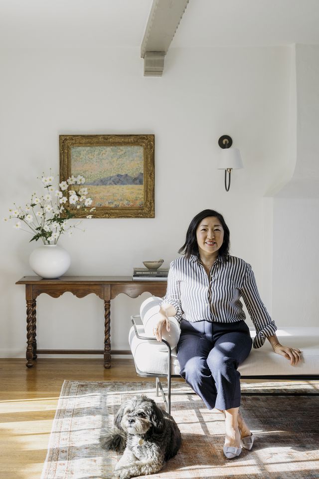
For some, the office unwittingly becomes a home away from home. For Clara Jung, principal designer and founder of Banner Day Interiors, that was always the intention. In the early days of the pandemic, the California native purchased a three-bedroom cottage in Oakland that would soon serve as her firm’s headquarters. The 1,800-square-foot former residence was built in 1932, one of the final years of Art Deco’s reign, and still features the design era’s unique characteristics. “We needed a larger office space and readily found that an open-concept office wasn’t necessarily conducive to productivity,” Jung says.
The home-turned-office quickly became a design laboratory of sorts, giving Jung the chance to experiment with prints, colors, and textures. “I thought this would be a great opportunity to renovate a space that would serve as a showcase of our work,” she explains. “All of the products and designs we implemented in our office represent the fixtures and furniture we often use in our clients’ spaces.”
From punchy floral wallpaper to checkerboard area rugs, Jung certainly didn’t hold back. In fact, save for a few original architectural details, she breathed a lot of new life into the space. “It had been a rental unit for quite a while, and it was well-lived in,” she remembers. “The house was ripe for a renovation by the time I was ready to tackle it.”
More From House Beautiful

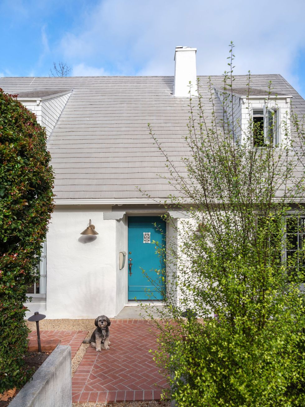
Like most decades-old homes, the bathrooms and kitchens were in dire need of an upgrade, but Jung adds, “The charm of the home was still there.” So, the designer used the home’s period details—arched doorways, expansive windows, and sloped ceilings—as the driving force behind what she calls a “cosmetic remodel.” One of Jung’s favorite original elements is the front door. “I wanted to take the exterior of the building in a more updated direction by painting the trim a warm gray and the door a blue-green blast of color,” she says. The designer infused that same sense of color throughout the rest of the quietly luxurious office—a move that Jung hoped would inspire clients. “The hope was that by showing clients our office in person, they would leave feeling emboldened to take more risks.”
Exterior
The former three-bedroom home in Oakland, California, was built in 1932. Jung opted for a cosmetic renovation, keeping several of the original architectural details, including the front door. Her pooch Morgan (“a combo platter, otherwise known as a mutt, the best kind,” says Jung) loves to come to work at the remodeled space.
Dining Room
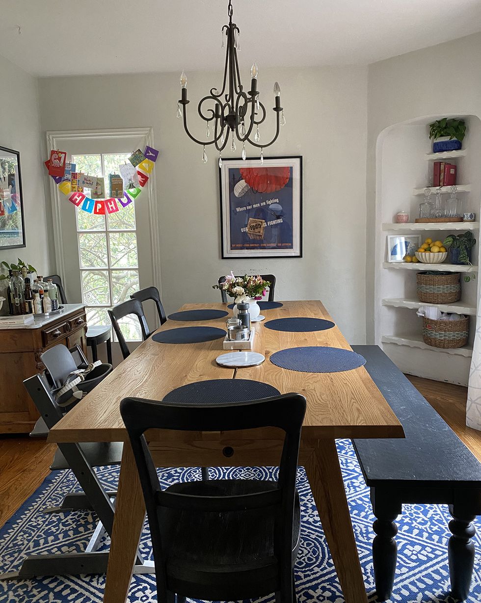
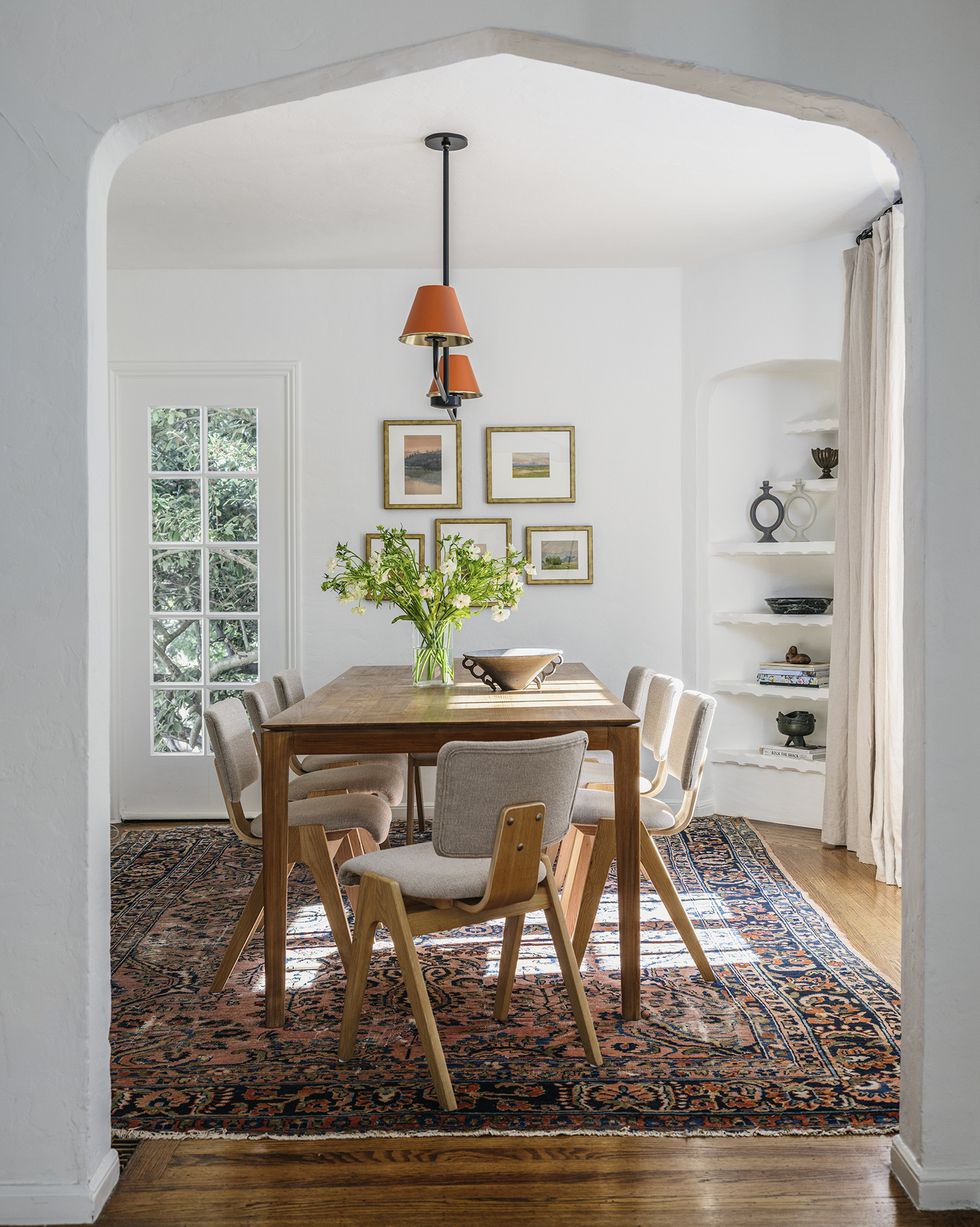
Before Jung took on the project, the interiors were “well-lived in,” she says. Case in point: the dining room. Now, complete with an Ethnicraft table surrounded by Industry West chairs, it’s light and airy. The vintage rug ties it all together.
Kitchen
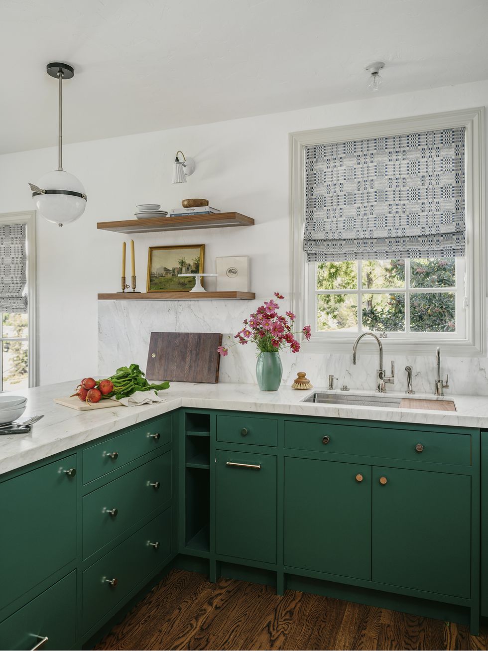
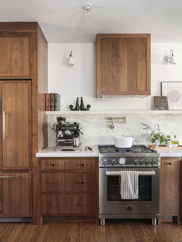
Jung took the kitchen down to the studs, building out new modern cabinetry, in both natural wood and a deep shade of green—Lafayette Green by Benjamin Moore. She kept overhead lighting simple with a pendant from The Urban Electric Co.
“I love that brightness and color abounds in our office, but it all stays true to the character of the home,” Jung says.
Living Room
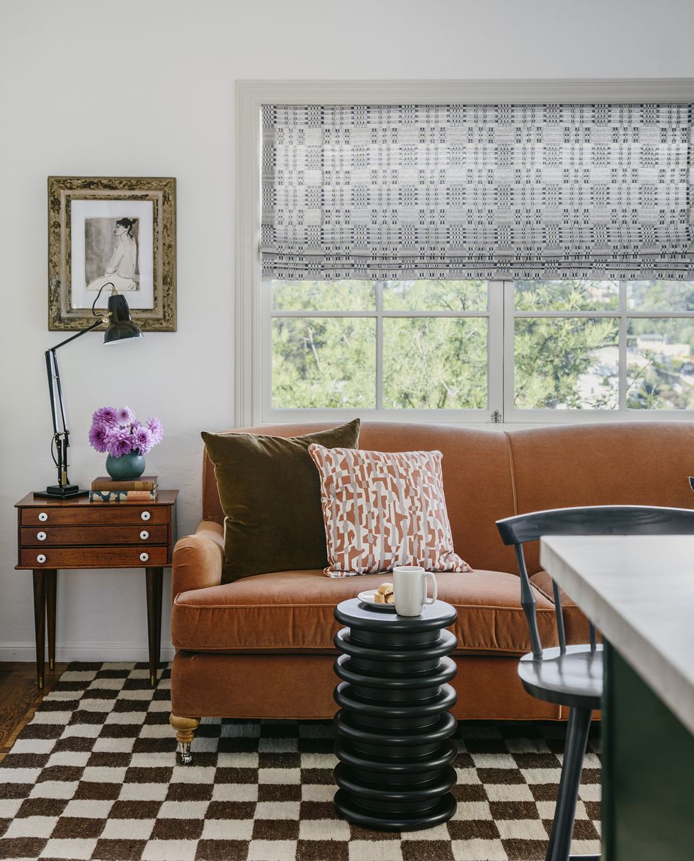
One of the most eclectic spaces in the newly revamped office is the living room, which Jung filled with a selection of vintage pieces, including the wood side table and checkerboard rug. “I designed this specific room to cultivate a hangout space for phone calls, chatting, or perhaps more laidback work with a laptop,” Jung explains. She completed the space with a side table and sofa from Mitchell Gold + Bob Williams.
Bedroom
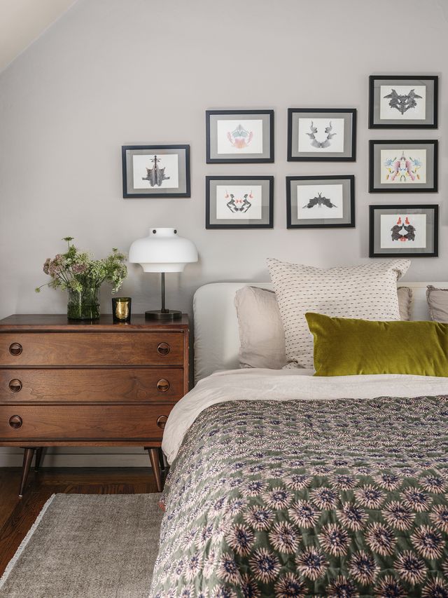
Gallery walls are always a good conversation starter, but this collection is extra interesting. “They’re vintage Rorschach tests by an unknown artist. They came in a bundle, and I thought it would be fun to have them framed,” the designer notes. The moody colors of the artwork complement the bedding, which is a mix of Parachute and CB2.
Bathroom
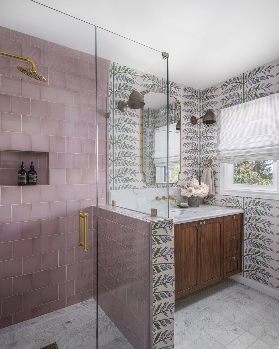
The office bathroom is another one of Jung’s color experiments. “I enjoy that it has feminine leanings, but still has mass appeal,” she says. “The inspiration was actually the pink Fireclay Tile, not the Schumacher wallpaper—although many people assume the reverse. I’ve been pitching this color tile to a couple of clients, and they always turned it down. I like nothing better than a challenge, and I wanted to show how it could work in a space that has longevity and charm.” Mission accomplished.
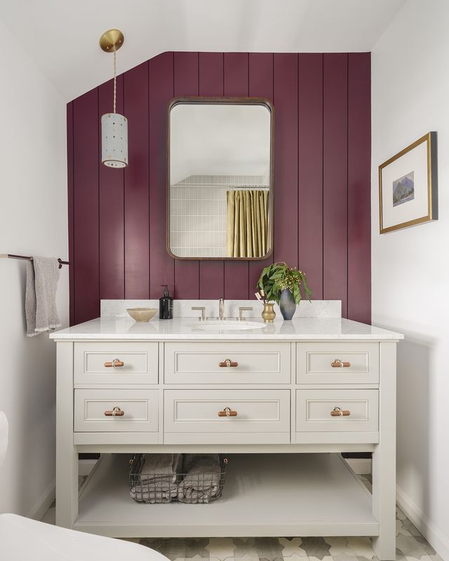
Jung also used the bathroom to show the differences between custom and ready-made furniture. “We’re not necessarily pushing one over the other, although our clients often opt for custom vanities for several reasons, including quality, ability to eke more personalized usage, and the look.” Here, Jung chose a Pottery Barn vanity.
Q&A
House Beautiful: Did you encounter any memorable challenges or surprises during the project? How did you pivot?
Clara Jung: This was in the thick of the pandemic, and we suffered all the delays both in supply and labor that all our clients experienced.
HB: Where did the majority of the budget go?
CJ: The majority of the budget was spent on the kitchen and bathrooms. As is often the case, the scope increased to the exterior.
HB: How did you save money or get crafty?
CJ: Since this was an office kitchen, instead of spending money on a microwave drawer, we decided to do a cubby for a conventional microwave with a door. Additionally, in one of the bathrooms, I purchased the floor tile at a seconds sale for a highly sought handmade tile vendor and purchased the tile at a fraction of the original cost.
Follow House Beautiful on Instagram.
Jessica Cherner is House Beautiful’s associate shopping editor and knows where to find the best high-low pieces for any room.

