
Humans may share a universal sense of beauty in color combinations

Art does more than enrich life. It influences everything, from consumer product choices to stress levels to recovery after surgery. But what makes a piece of art pleasing? 

On one hand, evaluating art seems to be, well, more of an art than a science. After all, galleries have been tricked into showcasing work by a toddler, and people have paid thousands of dollars for art made by chimpanzees

Still, we know that pleasing aesthetic experiences engage regions of the brain including emotional and self-referential processing centers. Research also suggests that people are universally drawn to certain patterns, special layouts, and conventions such as fractals and symmetry. This may be because such patterns are found in nature or because they signal health

Yet surprisingly little is known about how colors influence aesthetic experiences. So Shigeki Nakauchi led a team from Japan and Portugal to evaluate whether certain color combinations in art are universally pleasing to people.

Preference for individual colors 

Nearly all prior research on color preference has focused on individual hues. Some findings suggest a universal preference for variations of blue, perhaps because this color conveys biologically important or positive information (such as clean water or the sky). 

However, preference for individual colors varies a lot from person to person, culture to culture and perhaps even season to season. For example, women prefer red-purple hues more often than blue ones. And in Western countries like the United States, white is often associated with purity and cleanliness, but in China it is associated with death. 

Culture can even change people’s color preferences, and quickly. For example, college students like their university colors more than other people do — and their affinity for those colors increases the more they like their university.  

Moreover, preferences for a single color have very little effect on how much someone likes a whole art piece. In other words, just because your favorite color is blue doesn’t make you more likely to enjoy a piece of art that incorporates a lot of blue. 

Color combinations

Art, of course, usually integrates multiple colors. Yet surprisingly few studies have assessed how people judge different color combinations. 

A few studies do suggest that something about color combinations might be important. For example, one recent computational study suggested that the average value of low-level features such as color and contrast predict art ratings. Another series of studies found that people tend to like original pieces of art, rather than the same pieces of art that have had their colors rotated or scrambled.

The question remains to be asked, though: Is there a universal appeal to certain color combinations in art?

Nakauchi and his team set out to answer that question within differing cultural contexts. Do preferences vary substantially among people and between cultures, like they do with individual colors? Or do humans universally prefer certain chromatic combinations? They carried out a series of studies.

Study 1: Original versus rotated colors  

Ninety Japanese and Portuguese participants viewed a range of figurative and abstract paintings by Japanese and Western artists. They viewed four versions of each painting: the original, and three versions where the painting’s colors had been rotated (explanation below). Without knowing which painting was the original, they then chose which one of the four versions they most preferred.

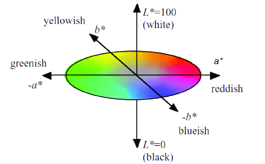
To rotate color composition, a computer program shifted each painting’s colors in the CIELAB color space. This tool expresses color along dimensions of red, green, blue, yellow, white, and black. For every painting, the researchers rotated each pixel of color around the color plane by 90, 180, or 270 degrees. 
Diagram
Description automatically generated

(Image showing the color gamut defined by the International Commission on Illumination, also called the “CIELAB color space.” From Khajehdizaj, Taghizadeh, & Nobari, 2014)

A collage of flowers
Description automatically generated with low confidence

(Example of an original and color-rotated painting. Original art by Masayoshi Nakamura, late twentieth century. From Nakauchi et al., 2022 Figure 2.)

Japanese and Portuguese participants shared a strong preference for the original paintings. Japanese participants preferred the original color composition slightly more than Portuguese did, but both groups chose the original paintings more than 60 percent of the time, whereas they chose one of the color-rotated versions less than 20 percent of the time.  

Study 2: Ruling out the influence of objects

One possible explanation for Study 1’s findings is that some of the original paintings included objects that are associated with certain colors — for instance, green flower stems or blue skies. People might have preferred the original painting simply because the colors matched their objects, and not because of some overarching preference for certain color combinations. 

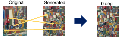
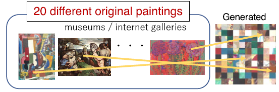
Study 2 therefore manipulated spatial composition as well, creating three new types of paintings. (Images pulled from Nakauchi et al., 2022, Figure 3):

  • “Scrambled” paintings: Each original painting was divided into small squares (10 percent of the painting’s height). The squares were then randomly mixed up to create a new painting.
A picture containing text
Description automatically generated
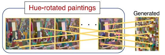
  • “Patchwork” paintings: Each patchwork painting randomly combined 100 small square pieces from multiple original paintings.
A picture containing diagram
Description automatically generated
  • “Random” paintings: Each random painting was a combination of small square pieces from a single painting that had been color-rotated multiple times. 
A picture containing text
Description automatically generated

Each of these rearranged paintings was then color-rotated by 90, 180, or 270 degrees. 

Just as in Study 1, Japanese and Portuguese participants alike strongly preferred the original paintings over those that had simply been color-rotated. They chose original paintings around 70 percent of the time, while choosing each of the color-rotated paintings less than 20 percent of the time. 

Smarter faster: the Big Think newsletter

Subscribe for counterintuitive, surprising, and impactful stories delivered to your inbox every Thursday

When the spatial composition was scrambled, participants still preferred the paintings with the original color combination. They chose the scrambled paintings with the original color combination more than 50 percent of the time, while choosing the rotated scrambled paintings around 20 percent of the time. This suggests that people prefer the original color palette even when objects in the image are unclear. 

Perhaps most surprisingly, participants also strongly preferred the patchwork paintings prior to color rotation. That is, even when a painting was made by randomly mixing together pieces from multiple other paintings, people preferred the original colors to the patchwork’s color-rotated versions. Approximately 60 percent chose the original colors, versus less than 20 percent who chose the color-rotated images. 

Indeed, the only time participants did not prefer the original paintings was when the paintings were random — that is, when they comprised pieces from paintings that had already been color-rotated. 

What this says about color combination preference 

In short, people from both Japan and Portugal preferred the color combinations used in original paintings. This was not simply because the colors matched the objects in the painting. Rather, the preference holds up even when the paintings are scrambled to make the objects depicted in them unclear. It even holds when pieces of different paintings are mixed together. 

So what is it about original color combinations that is so appealing? 

One possibility is that people like certain statistical relationships or patterns in color distribution — for example, combinations of similar colors, or of colors that are spaced in certain ways.  However, since the color rotation preserved lightness, saturation, and the relationships between the individual colors, this is unlikely. 

Perhaps likelier is that artists and regular viewers alike are drawn to certain color combinations that are found in nature. Indeed, prior analyses found that art paintings and natural scenes included a yellow-blue color dimension bias. One recent study showed that people liked images more when they were perceived as more “natural.” 

Another interpretation is that people simply prefer the most commonly used colors

Further research is needed to replicate these findings in other groups and across different types of art —  such as architecture — and to pinpoint exactly what makes color combinations universally preferred. 

But the take-home message is remarkable: Independent of cultural background, people share a sense of what makes certain color combinations aesthetically pleasing. These findings may shed light on why some art is so moving. They may also help scientists understand how and why people developed color vision.   

Connecting humans with nature: Trees serve as trophies in green design

Article content

Growing up in the rugged landscape of northern California gave David Montalba a deep appreciation of nature. Today, he practices architecture out of semi-arid Santa Monica, where the scenery, geography and climate are distinctly different.

Advertisement 2

Article content

Montalba has equal respect and affection for both. It’s that awareness and appreciation of the natural world, he says, that grounds his interest in biophilic architecture — design centred on connecting humans with nature.

“It’s an acknowledgement of our place in the built environment,” he told me in an email interview, adding that one of the pillars of his practice is the notion of shared landscape — exterior or interior.

Biophilic architectural or interior design, he says, doesn’t always mean stereotypical lush, plant-laden green spaces. “It can be materials and surfaces that extend connected spaces, sometimes natural, sometimes man-made. Often we see these elements intertwined with natural light and how (they) affect movement and flow.”

Advertisement 3

Article content

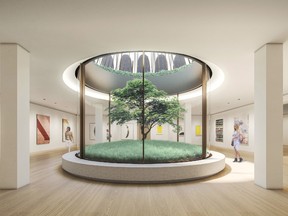
Those elements include Montalba’s use of the “trophy tree”— a single sculptural tree that’s also an architectural gesture. He likes courtyards to “fold into the home” with cascading greenery or a solitary tree, which he thinks can sometimes have more impact.

A striking public example of this is a sunken garden concept he created at the entrance to the Wilshire Boulevard building, designed by New Formalist architect Edward Durell Stone.

Montalba’s firm was chosen to restore the façade, lobbies and common areas of the eight-story commercial structure, an attractive stack of airy white arches sitting on slim legs at ground level.

Dropping the tree into the basement, says Montalba, “invigorated it with natural light and a strong connection with nature.”

Advertisement 4

Article content

That’s not to say Montalba doesn’t incorporate massed plants into his design. He placed a living wall above a reflecting pool in a long, rectangular open-air courtyard in one residence, and lined them up neatly next to outdoor stairs. Because there’s a degree of maintenance that comes with living spaces, Montalba says it’s important to match plantings to specific location conditions so that they’ll thrive without too much fuss.

Such features will become common as climate change forces society to reduce its footprint and address sustainability in both existing and new buildings, says Montalba. As an added challenge, we’ll need to counter the damage climate change has already done.

Montalba is hoping more independent and off-grid structures, reutilization systems (such as greywater), self-cleaning coverings/surfaces, and zero-energy consumption buildings will spur a new kind of architecture that’s in harmony with the environment.

Advertisement 5

Article content

Montalba turns the idea of the basement inside-out.
Montalba turns the idea of the basement inside-out. Photo by Supplied

The biggest obstacle to change, he says, may be a risk-averse building and construction industry. “It takes clients with high aspirations and resources to push beyond what is standard in the industry. Frankly, we also need more support from government and major tax incentives to really have a substantive impact,” he says.

These kinds of shifts are happening on a civic scale. Take Singapore, a low-lying city that will particularly feel the effects of climate change. It recently launched a plan that includes setting aside 200 hectares for park — an environmental initiative that will also ensure that every family lives within a 10-minute walk of a natural setting.

The move comes with a commitment to plant one million trees and a requirement that new developments must include elements like green roofs, cascading vertical gardens or verdant walls. For more on that, go to www.aroundthehouse.ca

In any home, biophilia can be expressed by extending the natural landscape or contrasting it, says Montalba, as long as what’s done has an essential link to the Earth and its well-being.

“Whether that’s incorporating landscape into an urban environment or lessening indoor footprint for more outdoor space,“ says Montalba, “it’s about finding these connections in every project we do.”

This interview was edited for length and clarity.

Advertisement 1

Comments

Postmedia is committed to maintaining a lively but civil forum for discussion and encourage all readers to share their views on our articles. Comments may take up to an hour for moderation before appearing on the site. We ask you to keep your comments relevant and respectful. We have enabled email notifications—you will now receive an email if you receive a reply to your comment, there is an update to a comment thread you follow or if a user you follow comments. Visit our Community Guidelines for more information and details on how to adjust your email settings.

Humans building beaver-like ‘leaky dams’ to help protect millions from flooding | Climate News

A “leaky dam” is not one thing I’d read of just before coming to Broughton Corridor Estate in North Yorkshire, but, as I uncovered, it truly is quite aptly named.

Leaky dams have been created in streams throughout the estate as portion of a all-natural flood management job.

The “leaky” part is pretty deliberate.

An inspiration from nature

Images sent by Eden Rivers Trust
Leaky Dams 
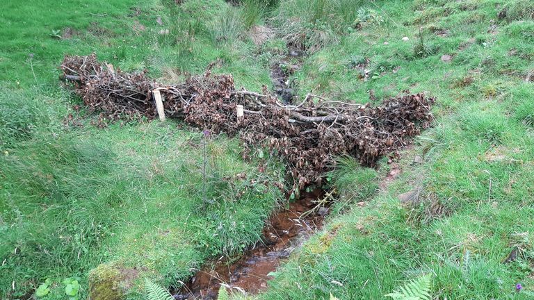
 . These are all man-made leaky dams which aim to slow the flow and temporarily hold water back… much like a beaver dam would do but they don’t look the same
MUST CREDIT - Eden Rivers Trust
Impression:
‘Leaky dams’ like this acquire inspiration from buildings developed by beavers. Pic: Eden Rivers Believe in

These dams, built from twigs, leaves and natural particles, take care of the flow of h2o downstream although however permitting fish to go.

Slowing the move of water by the estate allows to protect against flooding in communities in close by decrease-lying land.

Some thing identical to these leaky dams would normally be carried out by beavers, but you is not going to uncover them at Broughton these days, they were being hunted to extinction in Yorkshire in the sixteenth century.

Beavers could be reintroduced into English countryside for environmental positive aspects right after 400 a long time

EMBARGOED TO 0001 WEDNESDAY AUGUST 25 File photo dated 30/01/20 of an adult beaver released back into the wild. Beavers will be released into the wild under Government proposals to support a "cautious" return of the semi-aquatic mammals to English rivers. The native animals are also set to be given legal protection in England, making it an offence to deliberately capture, kill, disturb or injure them, or damage their breeding sites or resting places, as part of efforts to support their recovery.
Image:
Beavers’ were hunted to extinction hundreds of years ago

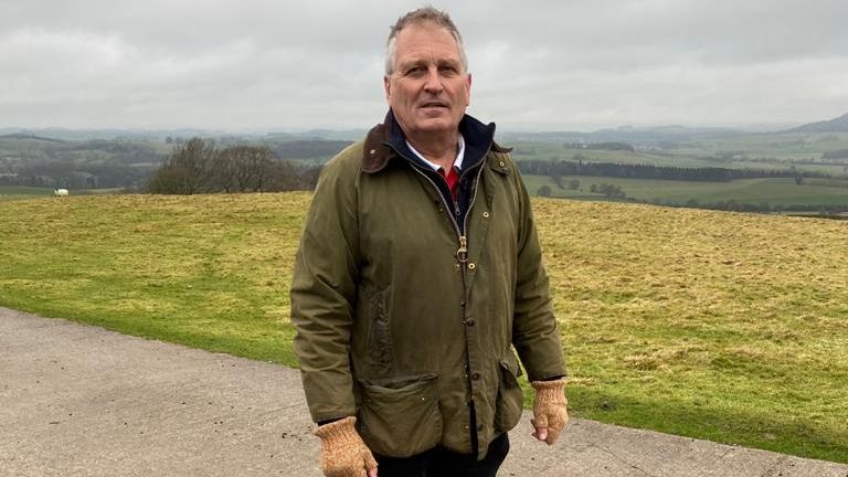
Replicating their endeavours is element of a much larger venture on the estate staying overseen by Professor Alastair Driver – an specialist on conservation and rewilding.

He said: “If you roughen up the landscape with a huge rewilding task and you put into practice these pure flood administration interventions you are going to make a major variation.”

Professor Alastair Driver is helping build 'leaky dams'
Graphic:
Professor Alastair Driver is aiding develop ‘leaky dams’

A history of floods

The methods they are employing listed here to deal with drinking water stream are major for people residing in spots bordering the River Aire, particularly Leeds.

In 2015 Leeds, and other sections of the North of England, professional catastrophic flooding. The Leeds Flood Alleviation Scheme is a £160m project developed to secure 1,048 residences and 474 companies from long run flooding.

FILE PIC Flood water outside a co-operative supermarket in Hebden Bridge in West Yorkshire, where flood sirens were sounded after torrential downpours.
Impression:
In 2015, flood waters caused millions of kilos of harm in Yorkshire and the north of Terrific Britain

Broughton is a sprawling and gorgeous estate within just the Yorkshire Dales.

The operate there forms section of that scheme, partly by building absolutely sure drinking water has extra room to stream on the estate right before it hits city regions like Leeds. This consists of “daylighting” h2o that has, for numerous several years, been flowing by pipes beneath the estate’s fields.

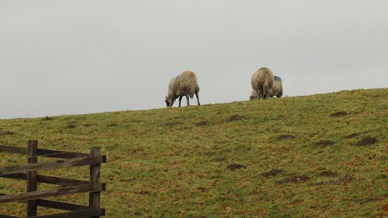
Broughton Corridor has been owned by the exact family members for virtually 1,000 decades, and sheep farming has been a lengthy-running aspect of the estate’s history.

There are even now sheep in this article today but the land is now currently being applied for other reasons to serve the ecosystem and surrounding communities much more efficiently.

The grounds of Broughton Hall have been used for sheep farming for hundreds of years
Picture:
The grounds of Broughton Hall have been used for sheep farming for hundreds of several years

Professor Driver claims that the water pipes beneath the fields were in all probability created to absolutely free up space previously mentioned floor for grazing.

Searching across this “daylighted” stream, the drinking water seems totally free to obtain its have system.

Professor Driver claims when he final came to see the development of the stream a heron flew out of it. That minute felt symbolic, it reminded him of the importance of the “back again to character” approach they are getting at Broughton.

They are also planting hundreds of hundreds of trees here. Not only will trees enable to minimize the danger of flooding by slowing the circulation of rainwater – they also store carbon.

Water is now allowed to find its own way through the landscape
Picture:
Drinking water is now permitted to uncover its possess way through the landscape

Much more to be carried out to counter local climate transform

Combatting local weather adjust is a vital element of the do the job they’re executing on the estate and exhibits how flood management techniques can have other critical gains like lowering emissions.

“We need to be pondering about the wider natural environment, local weather transform, biodiversity, people’s well being and properly remaining. All of these other added benefits need to have to be section of that,” says Professor Driver.

But of study course, there have to have to be incentives for farmers throughout the nation who depend on sheep to make a living.

Subscribe to ClimateCast on Spotify, Apple Podcasts, or Spreaker

The governing administration needs farmers to apply for subsidies less than a scheme intended to allocate “community revenue for community goods”, which means they are going to be paid out to use their land to supply environmental rewards.

This is intended to prevent farmers from getting a economic hit from getting to be much more eco-friendly. Professor Driver claims this scheme is desired, but a lot of farmers want to see assurances about lengthy expression funding so that landowners can have self-assurance in investing in more eco-helpful methods and technologies.