

Humans may share a universal sense of beauty in color combinations
Art does more than enrich life. It influences everything, from consumer product choices to stress levels to recovery after surgery. But what makes a piece of art pleasing?
On one hand, evaluating art seems to be, well, more of an art than a science. After all, galleries have been tricked into showcasing work by a toddler, and people have paid thousands of dollars for art made by chimpanzees.
Still, we know that pleasing aesthetic experiences engage regions of the brain including emotional and self-referential processing centers. Research also suggests that people are universally drawn to certain patterns, special layouts, and conventions such as fractals and symmetry. This may be because such patterns are found in nature or because they signal health.
Yet surprisingly little is known about how colors influence aesthetic experiences. So Shigeki Nakauchi led a team from Japan and Portugal to evaluate whether certain color combinations in art are universally pleasing to people.
Preference for individual colors
Nearly all prior research on color preference has focused on individual hues. Some findings suggest a universal preference for variations of blue, perhaps because this color conveys biologically important or positive information (such as clean water or the sky).
However, preference for individual colors varies a lot from person to person, culture to culture and perhaps even season to season. For example, women prefer red-purple hues more often than blue ones. And in Western countries like the United States, white is often associated with purity and cleanliness, but in China it is associated with death.
Culture can even change people’s color preferences, and quickly. For example, college students like their university colors more than other people do — and their affinity for those colors increases the more they like their university.
Moreover, preferences for a single color have very little effect on how much someone likes a whole art piece. In other words, just because your favorite color is blue doesn’t make you more likely to enjoy a piece of art that incorporates a lot of blue.
Color combinations
Art, of course, usually integrates multiple colors. Yet surprisingly few studies have assessed how people judge different color combinations.
A few studies do suggest that something about color combinations might be important. For example, one recent computational study suggested that the average value of low-level features such as color and contrast predict art ratings. Another series of studies found that people tend to like original pieces of art, rather than the same pieces of art that have had their colors rotated or scrambled.
The question remains to be asked, though: Is there a universal appeal to certain color combinations in art?
Nakauchi and his team set out to answer that question within differing cultural contexts. Do preferences vary substantially among people and between cultures, like they do with individual colors? Or do humans universally prefer certain chromatic combinations? They carried out a series of studies.
Study 1: Original versus rotated colors
Ninety Japanese and Portuguese participants viewed a range of figurative and abstract paintings by Japanese and Western artists. They viewed four versions of each painting: the original, and three versions where the painting’s colors had been rotated (explanation below). Without knowing which painting was the original, they then chose which one of the four versions they most preferred.
To rotate color composition, a computer program shifted each painting’s colors in the CIELAB color space. This tool expresses color along dimensions of red, green, blue, yellow, white, and black. For every painting, the researchers rotated each pixel of color around the color plane by 90, 180, or 270 degrees.
(Image showing the color gamut defined by the International Commission on Illumination, also called the “CIELAB color space.” From Khajehdizaj, Taghizadeh, & Nobari, 2014)
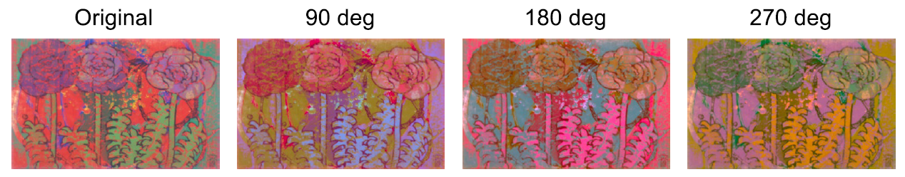
(Example of an original and color-rotated painting. Original art by Masayoshi Nakamura, late twentieth century. From Nakauchi et al., 2022 Figure 2.)
Japanese and Portuguese participants shared a strong preference for the original paintings. Japanese participants preferred the original color composition slightly more than Portuguese did, but both groups chose the original paintings more than 60 percent of the time, whereas they chose one of the color-rotated versions less than 20 percent of the time.
Study 2: Ruling out the influence of objects
One possible explanation for Study 1’s findings is that some of the original paintings included objects that are associated with certain colors — for instance, green flower stems or blue skies. People might have preferred the original painting simply because the colors matched their objects, and not because of some overarching preference for certain color combinations.
Study 2 therefore manipulated spatial composition as well, creating three new types of paintings. (Images pulled from Nakauchi et al., 2022, Figure 3):
- “Scrambled” paintings: Each original painting was divided into small squares (10 percent of the painting’s height). The squares were then randomly mixed up to create a new painting.
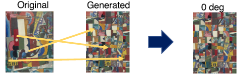
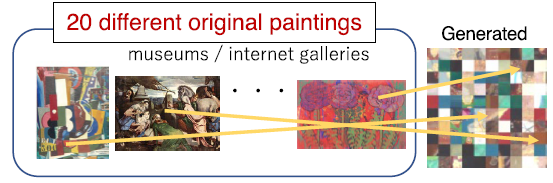
- “Patchwork” paintings: Each patchwork painting randomly combined 100 small square pieces from multiple original paintings.
- “Random” paintings: Each random painting was a combination of small square pieces from a single painting that had been color-rotated multiple times.
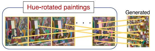
Each of these rearranged paintings was then color-rotated by 90, 180, or 270 degrees.
Just as in Study 1, Japanese and Portuguese participants alike strongly preferred the original paintings over those that had simply been color-rotated. They chose original paintings around 70 percent of the time, while choosing each of the color-rotated paintings less than 20 percent of the time.

Subscribe for counterintuitive, surprising, and impactful stories delivered to your inbox every Thursday
When the spatial composition was scrambled, participants still preferred the paintings with the original color combination. They chose the scrambled paintings with the original color combination more than 50 percent of the time, while choosing the rotated scrambled paintings around 20 percent of the time. This suggests that people prefer the original color palette even when objects in the image are unclear.
Perhaps most surprisingly, participants also strongly preferred the patchwork paintings prior to color rotation. That is, even when a painting was made by randomly mixing together pieces from multiple other paintings, people preferred the original colors to the patchwork’s color-rotated versions. Approximately 60 percent chose the original colors, versus less than 20 percent who chose the color-rotated images.
Indeed, the only time participants did not prefer the original paintings was when the paintings were random — that is, when they comprised pieces from paintings that had already been color-rotated.
What this says about color combination preference
In short, people from both Japan and Portugal preferred the color combinations used in original paintings. This was not simply because the colors matched the objects in the painting. Rather, the preference holds up even when the paintings are scrambled to make the objects depicted in them unclear. It even holds when pieces of different paintings are mixed together.
So what is it about original color combinations that is so appealing?
One possibility is that people like certain statistical relationships or patterns in color distribution — for example, combinations of similar colors, or of colors that are spaced in certain ways. However, since the color rotation preserved lightness, saturation, and the relationships between the individual colors, this is unlikely.
Perhaps likelier is that artists and regular viewers alike are drawn to certain color combinations that are found in nature. Indeed, prior analyses found that art paintings and natural scenes included a yellow-blue color dimension bias. One recent study showed that people liked images more when they were perceived as more “natural.”
Another interpretation is that people simply prefer the most commonly used colors.
Further research is needed to replicate these findings in other groups and across different types of art — such as architecture — and to pinpoint exactly what makes color combinations universally preferred.
But the take-home message is remarkable: Independent of cultural background, people share a sense of what makes certain color combinations aesthetically pleasing. These findings may shed light on why some art is so moving. They may also help scientists understand how and why people developed color vision.