Humans may share a universal sense of beauty in color combinations

Art does more than enrich life. It influences everything, from consumer product choices to stress levels to recovery after surgery. But what makes a piece of art pleasing? 

On one hand, evaluating art seems to be, well, more of an art than a science. After all, galleries have been tricked into showcasing work by a toddler, and people have paid thousands of dollars for art made by chimpanzees. 

Still, we know that pleasing aesthetic experiences engage regions of the brain including emotional and self-referential processing centers. Research also suggests that people are universally drawn to certain patterns, special layouts, and conventions such as fractals and symmetry. This may be because such patterns are found in nature or because they signal health. 

Yet surprisingly little is known about how colors influence aesthetic experiences. So Shigeki Nakauchi led a team from Japan and Portugal to evaluate whether certain color combinations in art are universally pleasing to people.

Preference for individual colors 

Nearly all prior research on color preference has focused on individual hues. Some findings suggest a universal preference for variations of blue, perhaps because this color conveys biologically important or positive information (such as clean water or the sky). 

However, preference for individual colors varies a lot from person to person, culture to culture and perhaps even season to season. For example, women prefer red-purple hues more often than blue ones. And in Western countries like the United States, white is often associated with purity and cleanliness, but in China it is associated with death. 

Culture can even change people’s color preferences, and quickly. For example, college students like their university colors more than other people do — and their affinity for those colors increases the more they like their university.  

Moreover, preferences for a single color have very little effect on how much someone likes a whole art piece. In other words, just because your favorite color is blue doesn’t make you more likely to enjoy a piece of art that incorporates a lot of blue. 

Color combinations

Art, of course, usually integrates multiple colors. Yet surprisingly few studies have assessed how people judge different color combinations. 

A few studies do suggest that something about color combinations might be important. For example, one recent computational study suggested that the average value of low-level features such as color and contrast predict art ratings. Another series of studies found that people tend to like original pieces of art, rather than the same pieces of art that have had their colors rotated or scrambled.

The question remains to be asked, though: Is there a universal appeal to certain color combinations in art?

Nakauchi and his team set out to answer that question within differing cultural contexts. Do preferences vary substantially among people and between cultures, like they do with individual colors? Or do humans universally prefer certain chromatic combinations? They carried out a series of studies.

Study 1: Original versus rotated colors  

Ninety Japanese and Portuguese participants viewed a range of figurative and abstract paintings by Japanese and Western artists. They viewed four versions of each painting: the original, and three versions where the painting’s colors had been rotated (explanation below). Without knowing which painting was the original, they then chose which one of the four versions they most preferred.

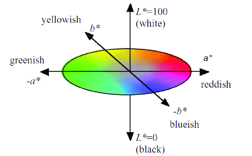
To rotate color composition, a computer program shifted each painting’s colors in the CIELAB color space. This tool expresses color along dimensions of red, green, blue, yellow, white, and black. For every painting, the researchers rotated each pixel of color around the color plane by 90, 180, or 270 degrees. 
Diagram
Description automatically generated

(Image showing the color gamut defined by the International Commission on Illumination, also called the “CIELAB color space.” From Khajehdizaj, Taghizadeh, & Nobari, 2014)

A collage of flowers
Description automatically generated with low confidence

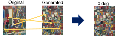
(Example of an original and color-rotated painting. Original art by Masayoshi Nakamura, late twentieth century. From Nakauchi et al., 2022 Figure 2.)

Japanese and Portuguese participants shared a strong preference for the original paintings. Japanese participants preferred the original color composition slightly more than Portuguese did, but both groups chose the original paintings more than 60 percent of the time, whereas they chose one of the color-rotated versions less than 20 percent of the time.  

Study 2: Ruling out the influence of objects

One possible explanation for Study 1’s findings is that some of the original paintings included objects that are associated with certain colors — for instance, green flower stems or blue skies. People might have preferred the original painting simply because the colors matched their objects, and not because of some overarching preference for certain color combinations. 

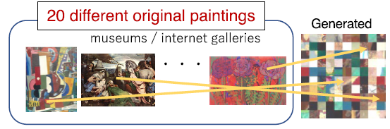
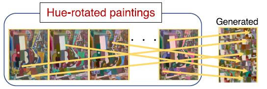
Study 2 therefore manipulated spatial composition as well, creating three new types of paintings. (Images pulled from Nakauchi et al., 2022, Figure 3):

  • “Scrambled” paintings: Each original painting was divided into small squares (10 percent of the painting’s height). The squares were then randomly mixed up to create a new painting.
A picture containing text
Description automatically generated
  • “Patchwork” paintings: Each patchwork painting randomly combined 100 small square pieces from multiple original paintings.
A picture containing diagram
Description automatically generated
  • “Random” paintings: Each random painting was a combination of small square pieces from a single painting that had been color-rotated multiple times. 
A picture containing text
Description automatically generated

Each of these rearranged paintings was then color-rotated by 90, 180, or 270 degrees. 

Just as in Study 1, Japanese and Portuguese participants alike strongly preferred the original paintings over those that had simply been color-rotated. They chose original paintings around 70 percent of the time, while choosing each of the color-rotated paintings less than 20 percent of the time. 

Smarter faster: the Big Think newsletter

Subscribe for counterintuitive, surprising, and impactful stories delivered to your inbox every Thursday

When the spatial composition was scrambled, participants still preferred the paintings with the original color combination. They chose the scrambled paintings with the original color combination more than 50 percent of the time, while choosing the rotated scrambled paintings around 20 percent of the time. This suggests that people prefer the original color palette even when objects in the image are unclear. 

Perhaps most surprisingly, participants also strongly preferred the patchwork paintings prior to color rotation. That is, even when a painting was made by randomly mixing together pieces from multiple other paintings, people preferred the original colors to the patchwork’s color-rotated versions. Approximately 60 percent chose the original colors, versus less than 20 percent who chose the color-rotated images. 

Indeed, the only time participants did not prefer the original paintings was when the paintings were random — that is, when they comprised pieces from paintings that had already been color-rotated. 

What this says about color combination preference 

In short, people from both Japan and Portugal preferred the color combinations used in original paintings. This was not simply because the colors matched the objects in the painting. Rather, the preference holds up even when the paintings are scrambled to make the objects depicted in them unclear. It even holds when pieces of different paintings are mixed together. 

So what is it about original color combinations that is so appealing? 

One possibility is that people like certain statistical relationships or patterns in color distribution — for example, combinations of similar colors, or of colors that are spaced in certain ways.  However, since the color rotation preserved lightness, saturation, and the relationships between the individual colors, this is unlikely. 

Perhaps likelier is that artists and regular viewers alike are drawn to certain color combinations that are found in nature. Indeed, prior analyses found that art paintings and natural scenes included a yellow-blue color dimension bias. One recent study showed that people liked images more when they were perceived as more “natural.” 

Another interpretation is that people simply prefer the most commonly used colors. 

Further research is needed to replicate these findings in other groups and across different types of art —  such as architecture — and to pinpoint exactly what makes color combinations universally preferred. 

But the take-home message is remarkable: Independent of cultural background, people share a sense of what makes certain color combinations aesthetically pleasing. These findings may shed light on why some art is so moving. They may also help scientists understand how and why people developed color vision.   
Temporary pause on large-scale solar makes sense

Revealed: 2/22/2022 2:02:48 PM

Modified: 2/22/2022 2:02:25 PM

When the Amherst City Council convenes on Feb. 28, the fate of a short term moratorium on big-scale photo voltaic will be resolved. The moratorium will suspend the progress of any floor-mounted photo voltaic bigger than 250 kilowatt for the following 14 months, unless a photo voltaic bylaw, governing massive scale solar improvement, is designed before then.

Amherst should really be commended for going ahead diligently. Together with the site and probable dimension of new arrays, we are entering a new era in Amherst for industrialized solar. Amherst’s earlier photo voltaic projects had been mostly sited on open up land, neither forest nor farmland. The disorders bordering the advancement of solar arrays like the a person close to Cherry Hill and the just one across from Atkins Sector were being solely different. Neither one particular expected distinct reducing 45 acres of forest land.

Exactly where solar really should be, in Amherst and the area, is the significant problem. How much ought to the town’s Learn System, which phone calls for maintaining vital tracts of the optimum good quality habitats undeveloped and permanently guarded, tutorial our choices? Furthermore, the Learn Strategy calls for the identification and long lasting protection of lands buffering Amherst drinking water source, wells and reservoirs from growth. Can it be finished?

For Amherst, a photo voltaic siting assessment operating group is currently being produced to wrestle with these central inquiries. The doing the job team will be billed, in portion, with examining the impacts of substantial-scale photo voltaic enhancement, together with battery storage, on our community and non-public h2o supplies on wildlife on erosion on hearth and hazardous material run off problems.

The siting examine will discover possibilities for solar all through the neighborhood: in the developed surroundings — on roof tops, parking lot canopies and in the all-natural landscape. With any luck ,, it will compute the duty that the faculties and college need to bear in carrying out their component. This will be an outstanding group to direct the way to liable progress of photo voltaic energy. Why would we want to let assignments to shift ahead until eventually we complete this examine?

By using the time that a moratorium offers, we can find out a great deal from other cities. The consequences of unsuccessful setting up and judgment can be critically essential classes uncovered. We have styles of what not to do. The ecological and environmental repercussions of misplaced solar can be disastrous. Just glimpse at what happened in Williamsburg and in Conway to see the effects of failed scheduling, which brought on irreparable destruction to bordering neighbors and neighborhoods in these cities.

What do we achieve by having the time that a short term moratorium presents, time taken by cities like East Longmeadow, Charlton, Blanford, Granby, Athol, Wendell and other individuals?

The present of time that we grant ourselves presents us the prospect to measure challenges and added benefits absolutely comprehend differing scientific views on siting solar understand the recommendations of Amherst’s Learn Strategy and at the same time interact the town to completely comprehend what it values when siting huge arrays. We have a excellent opportunity in advance to gain from other towns’ heritage with massive-scale photo voltaic from the skills the operating group will carry to the method and from the voices of the local community.

As has been explained by many others at several general public meetings, why would not we have a short-term moratorium to just take this reasonably quick pause to get this proper? We have so a lot to attain!

Eric Bachrach life in Amherst.

For La Prairie, 2021 Was Defined by the Beauty of Art Collaborations and a Sense of Blue

Clearly, La Prairie’s patronage of the arts is much more than skin-deep. In 2021, the luxury Swiss skincare brand supported a range of cultural initiatives; from New York and Miami to London and Switzerland, each was as memorable as the next.

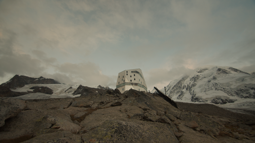
In May, when Frieze made its return to New York for the first time since 2019, La Prairie teamed up with Hong Kong and Berlin–based new media artist Carla Chan, whose practice explores the notion of time, inviting viewers to palpably witness and reflect on its passage. Her contemplative Frieze New York commission, Space Between The Light Glows, was inspired by the ever-changing sunlight during her recent stay at the Monte Rosa Hut, La Prairie’s very first residency, situated in the heart of the Swiss Alps.

The Monte Rosa Hut, La Prairie's new art residency in the Swiss Alps. Courtesy of La Prairie.

The Monte Rosa Hut, La Prairie’s new art residency in the Swiss Alps. Courtesy of La Prairie.

“I am interested in creating a feeling of ambiguity, which allows the audience to wander in their own thoughts and imagination,” Chan said in a statement from the brand. “In this particular piece for La Prairie, I try to play with light and shadow, to fill in the imaginative space between the lights to leave a trace of nature.” The video installation recalled sun-dappled Swiss landscapes; without a clear sense of space or time, it created a much-needed moment of respite for fairgoers.

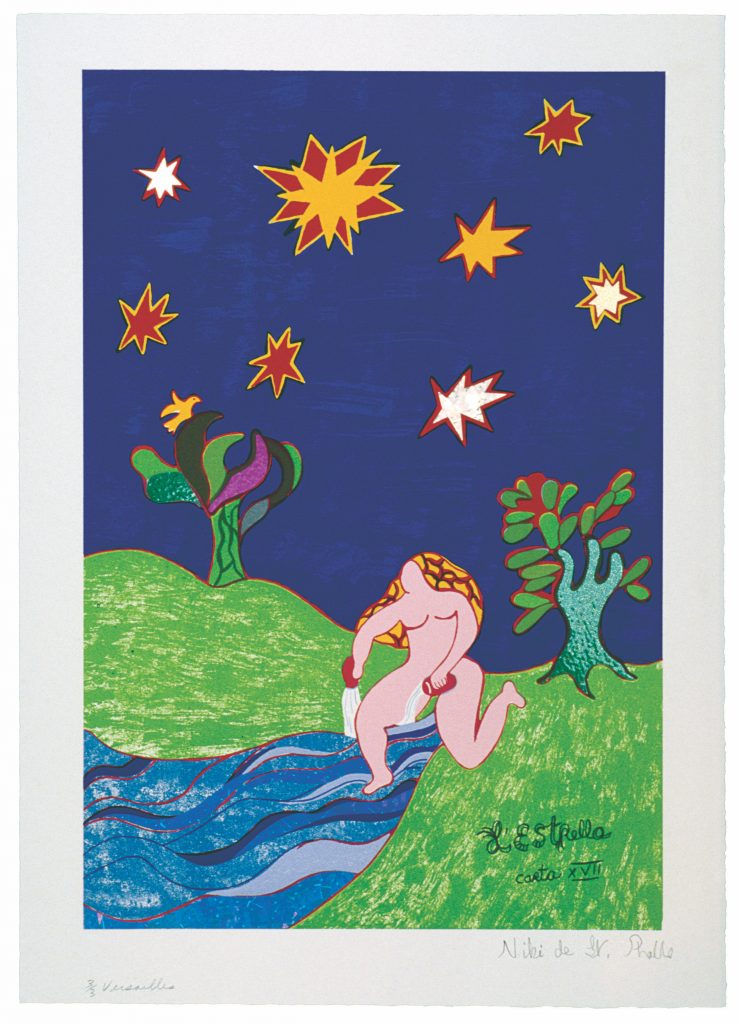
In the meantime, across town, one of MoMA PS1’s most adored exhibitions of the year came to life with integral support from La Prairie. “Niki de Saint Phalle: Structures for Life” brought together more than 200 works from the legendary French-American multimedia artist. With its diverse array of sculpture, drawings, videos, and paintings, the retrospective stood out as an overdue look at her highly influential and ahead-of-its-time oeuvre.

Niki de Saint Phalle, <i>L'Estrella Carta No. XVII (The Star)</i>, 1997. © 2021 Niki Charitable Art Foundation.

Niki de Saint Phalle, L’Estrella Carta No. XVII (The Star), 1997. © 2021 Niki Charitable Art Foundation.

“Several years ago, I was doing research on women artists who made large-scale work and realized that Niki de Saint Phalle was really one of the first women artists to embark on such a monumental scale,” said the show’s curator, Ruba Katrib, in an interview with La Prairie. “Looking into this aspect of her practice further, I learned more about her ground-breaking strategies for realizing her artistic visions, all of which require a holistic approach between concept and the modes of production.”

“Structures for Life” showcased de Saint Phalle’s steadfast attempts to spark joy, despite her traumatic upbringing and an adult life marked by emotional turmoil. The artist’s works elicit a duality that honors the importance of playfulness, while also drawing attention to social and political issues.

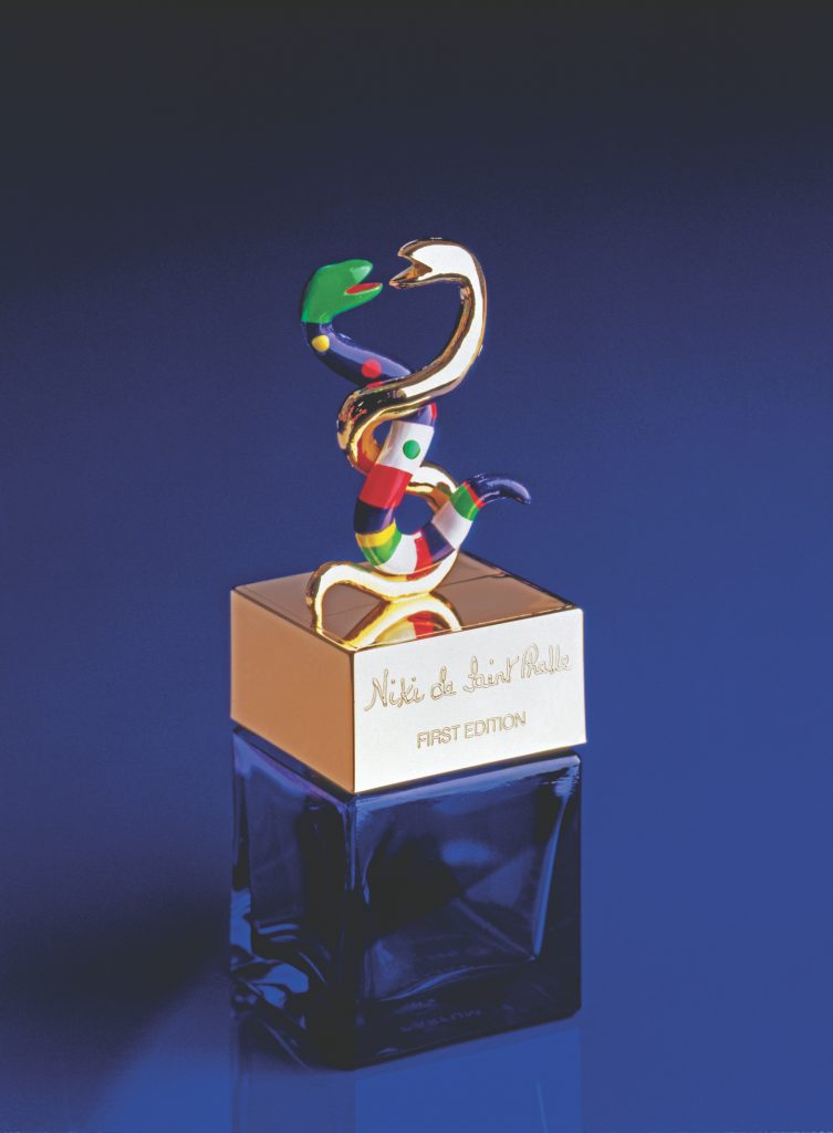
Niki de Saint Phalle, <i>Flaçon de parfum</i>, 1982. © 2021 Niki Charitable Art Foundation.

Niki de Saint Phalle, Flaçon de Parfum, 1982. © 2021 Niki Charitable Art Foundation.

A cunning businesswoman, de Saint Phalle funded her practice through many out-of-the-box enterprises. One such initiative proved highly influential for La Prairie: the artist’s own perfume, Flacon de Parfum. Set in the same cobalt blue that graces many of de Saint Phalle’s works, the bottle’s color was the direct inspiration for the design of La Prairie’s Skin Caviar collection.

Meanwhile, since 2017, La Prairie has lent its platform to emerging artists at Art Basel fairs around the globe. This year, the house staged activations during the Basel, Switzerland and Miami editions.

The Skin Caviar collection uses the cobalt blue that graces many Niki de Saint Phalle artworks, also the inspiration for Maotik's recent La Prairie commission. Courtesy of La Prairie.

The Skin Caviar collection uses the cobalt blue that graces many Niki de Saint Phalle artworks, also the inspiration for Maotik’s recent La Prairie commission. Courtesy of La Prairie.

For the Basel fair in September, as well as Frieze London the following month, French digital artist Mathieu Le Sourd—also known as Maotik—was tapped to create Sense of Blue, an immersive installation that plummeted viewers into the dark of night. Using the same cobalt blue made famous by de Saint Phalle and adopted by La Prairie, Maotik’s virtual and augmented reality work allowed viewers’ movements to alter their environment through a shifting façade of light.

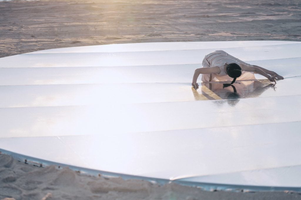
And this month, at Art Basel Miami Beach, La Prairie hosted its latest artist commission—Wen Chi Su’s Moving Towards the Horizon, which the Taiwanese dancer, choreographer, and new media artist performed on the sands of Miami Beach.

Wen Chi Su, <em>Moving Towards the Horizon</em>, commissioned by La Prairie for Art Basel Miami Beach. Courtesy of La Prairie.

Wen Chi Su, Moving Towards the Horizon, commissioned by La Prairie for Art Basel Miami Beach. Courtesy of La Prairie.

Su’s performance, which took place as the sun set over the Atlantic Ocean, encapsulated the effect of light against water. Inspired by a trip she took in the summer of 2021 to study lakes across La Prairie’s home country of Switzerland, the artist physically embodied the natural elements, creating a sense of “liquidity” through her dynamic movements.

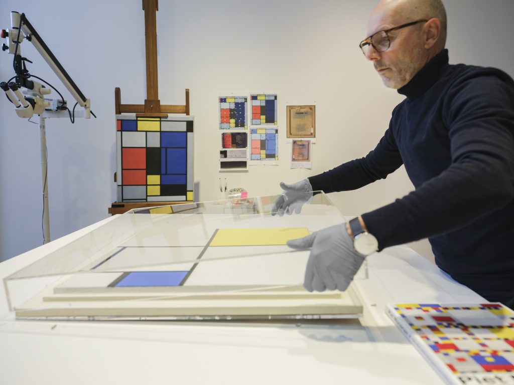
Many of La Prairie’s artistic endeavors have lives that extend beyond one-time experiences. Such is the case in their ongoing conservation project with Fondation Beyeler, Switzerland’s most visited museum, to restore four seminal works by Piet Mondrian, created between 1921 and 1938: Tableau No. I; Composition with Yellow and Blue; Composition with Double Line and Blue; Lozenge Composition with Eight Lines and Red.

With Switzerland's Fondation Beyeler, La Prairie has supported the restoration of fourPiet Mondrian masterpieces. Courtesy of La Prairie.

With Switzerland’s Fondation Beyeler, La Prairie has supported the restoration of fourPiet Mondrian masterpieces. Courtesy of La Prairie.

With La Prairie’s support, the institution has employed a renowned team of researchers, scientific experts, and Mondrian scholars from the Kunstmuseum in The Hague, which houses the world’s largest collection of the Dutch painter’s works. The project began in 2017 and will culminate in a major retrospective of the Mondrian masterpieces at Fondation Beyeler next year.

Markus Gross, the institution’s chief conservator, said in an interview with La Prairie, “This unique opportunity to give something back to the world of art and culture, and also pay homage to the brand’s artistic heritage—greatly inspired by Mondrian’s minimalist aesthetic, geometric precision, and purity of form—is unrivaled.”

Just as Mondrian daringly explored the fundamental elements of art, the emerging artists that La Prairie champions today are also fearless innovators in their fields. With its ongoing efforts to help push the boundaries of culture, the brand promises to broaden and bolster the canon for years to come.

Follow Artnet News on Facebook:


Want to stay ahead of the art world? Subscribe to our newsletter to get the breaking news, eye-opening interviews, and incisive critical takes that drive the conversation forward.