Artist Kerri Rosenthal’s Connecticut Home Is a Neutral Backdrop for Her Art
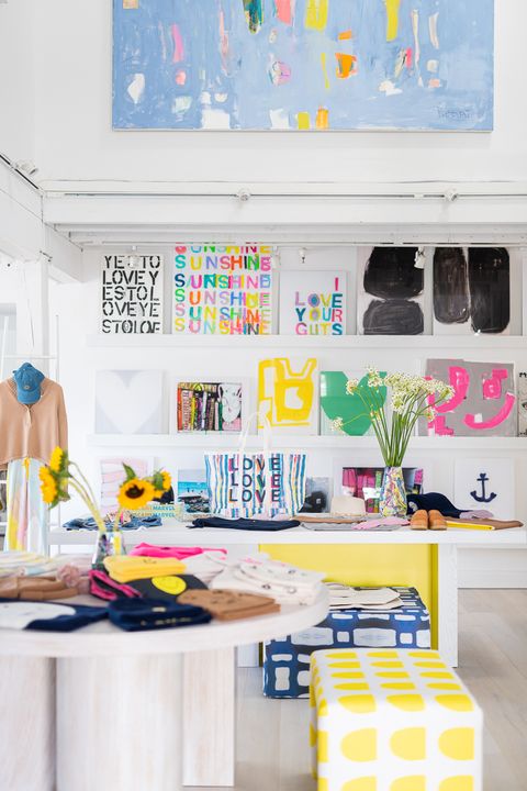
Anyone who knows Kerri Rosenthal’s art—or her cheerful shop in Westport, Connecticut—might expect her home to be busting with color. But, despite the bold hues favored in her creative work, Rosenthal’s family home goes neutral, relying on texture and light to bring coziness and warmth. “For me, my business world is all about color—our business model is a happy chaos, but it feels chaotic—so when I go home I need to chill out,” Rosenthal says. “I need my home to be as neutral as possible.”
The other benefit of a neutral backdrop? “It allows me to paint whatever paintings I want and hang them up,” says the artist. “I’m not a believer in matching your art to your interior—but when your home is neutral, the sky is the limit. So that allows me to change things out whenever the mood strikes me.”
And that strike happens often—the Rosenthal home is somewhat of a revolving gallery space, with artwork (as well as remnants of whatever project Rosenthal may be working on) rotating constantly. “Either I’m in the mood to change it or something sells,” Rosenthal explains.
She and her husband and kids moved into the home a little over 5 years ago…and faced some much-needed renovation. “It had been built in 1995 and had never been updated,” Rosenthal says. When she first saw the home, “my first reply to my husband was ‘no way,’” laughs the designer. She had just opened her first retail store and didn’t think she could take on a Reno at the same time. But the home’s layout was promising, so, “we made it happen,” says Rosenthal.
That meant not tackling everything at once: “We made a very achievable priority list and did things that were more of a surface renovation than a gut,” she reveals. “The floors were stripped—we triple-bleached the red oak and got them down to the purest of pure oak we could possibly and did a natural matte coat. That was a game changer. Then we put white paint everywhere so we had a clean canvas.”
But finding the right white was a project in itself. “I don’t like too much yellow and I don’t like stark, cold white either,” Rosenthal says. “When the sun hits it, you want it to warm up. I find that with Farrow & Ball paints especially, so I tend to use those.” She opted for All White throughout most of the home (“It has a real warmth to it,” she explains), then switched to Wimborne in the dining room. “When the sun hits it, it glows,” she says of the color. “It feels like a New York apartment white, but it worked with the oak table.”
For her bedroom, she selected a mix of Pointing and All White, and for her daughter’s room went with Cornforth White, which was also used for the trim throughout.
With the base set, Rosenthal filled the home with textural elements that invite coziness. Take the full tour below.
Entry
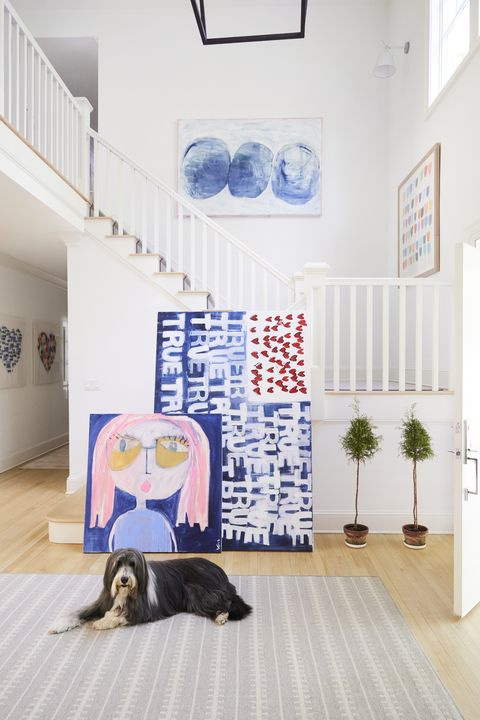
Though the home’s double-height entryway has a minimal palette, there’s always a slew of artwork propped against the walls. “That’s my hub, my Grand Central,” Rosenthal says of the space. “I have art going out to customers that ends up there for my messenger to pick up—I have new art that’s going to be scanned and added to my print collection, art that’s going to my shop. So a lot just ends up leaning there.”
Kitchen
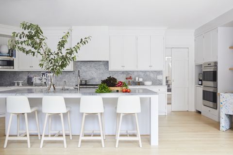
Though the kitchen “needed more of a gut” when the family first moved into the house, Rosenthal found a way to (partially) hack it: “We worked with the cabinetry and just turned doors around, so the shaker was inside” for a more minimalist look. Then, they added a few new drawer fronts, new appliances, quartzite countertops, and changed the shape of the island. “We gave it a fresh look that maybe took three weeks,” Rosenthal says.
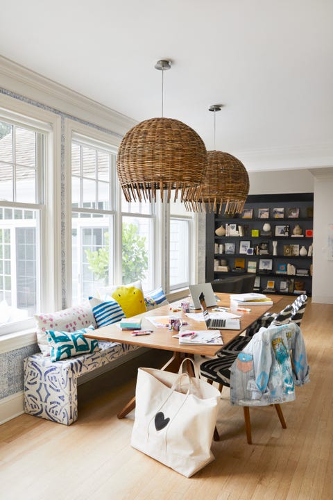
Meanwhile, a table and banquette serve as a work and homework station, dining table, or crafts center, depending on the day. “I loved bringing in richer colors with the walnut table and the mix of pillows on my Frederico bench,” says Rosenthal.
Living Room
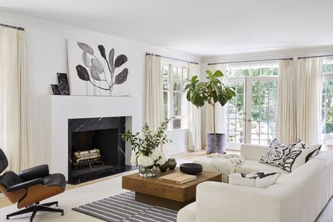
In this all-white room, it’s all about texture. “You have to know when to have the right balance with what I call the earth wind and fire,” Rosenthal says of balancing different neutral hues and textures. “When it’s out of whack you feel off.” But here, she finds a mix that adds depth: “The sectional is a crushed velvet that’s very white, mixed with a Belgian linen couch from a previous house that works together, with an oyster-colored wool rug, and then lots of wood, and even the little vintage Lucite coffee table,” she says. “With the stone around the fireplace and some trees for greenery—there’s your balance.”
Family Room
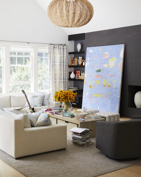
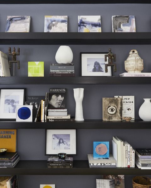
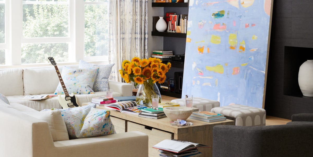
“It can’t always be white, and even darker colors are neutrals,” points out Rosenthal. In the family room, that comes in the form of dark cabinetry. “I still have my grays and my woods and my taupes, but the house came with these amazing built-ins with this slate backdrop and I really liked it—so as soon as I whited out the rest, I felt like this was the inspiration for the rest of the room,” she explains. “I did add curtain panels in one of my fabrics, but they’re indigo and oyster linen, so still neutral.” The family’s books and collectibles add character to the shelves. The room’s smartest feature, though, may be Rosenthal’s use of a large-scale painting to conceal the TV.
Primary Bedroom
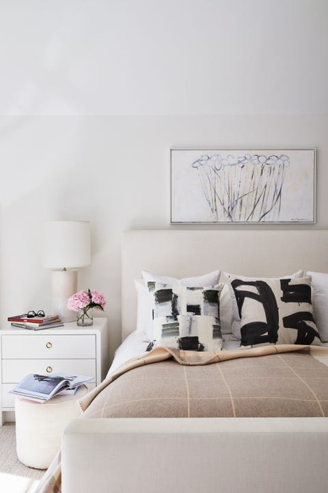
“I wanted the walls to be warmer, so I mixed two Farrow & Ball colors to create a very warm feel,” Rosenthal reveals. She opted for plenty of gray furniture and warmed things up with a rug. “I love a wall-to-wall rug in my bedroom—all the bedrooms have it,” she says. “Ours is kind of tweedy, which makes you feel cozy.”
Daughter’s Bedroom
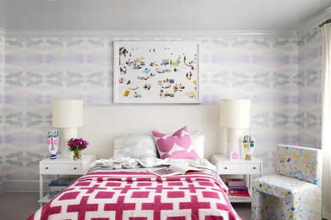
For her daughter’s bedroom, Rosenthal went bolder with a pink bedspread, which pops against a wallpaper from Rosenthal’s own line. But the loudest elements are removable, so her daughter can redesign as she gets older.
Studio
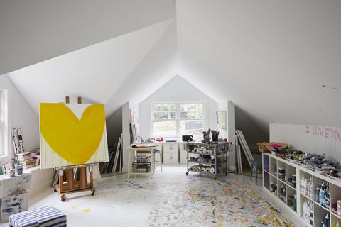
Rosenthal creates her colorful work in the home’s sunny upstairs studio. “The selling point of this house was that it had a space I could use as a studio,” she says. Like the rest of the house, she painted the space white when she moved in—but five years of work has resulted in a rainbow of splatter on the floor, a motif that Rosenthal actually turned into a fabric pattern. “The life in the room are the paintings and my table filled with all my materials,” she says. “It’s my favorite place.”
Patio
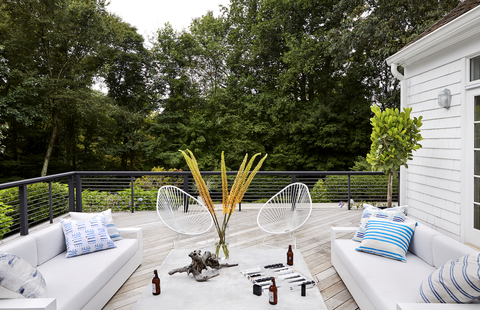
When they moved in, the patio was angled—”and I don’t like anything angled,” Rosenthal reveals. “We squared it off, painted it black, and then stripped the wood decking and let it do its natural thing, so it’s graying beautifully.” She outfitted it (along with the veranda that runs around the house) with comfortable outdoor furniture. “We had so much fun designing a space that felt like it was an extension of what was happening inside—just as cozy,” she says. “We use that space so much. We sit there at the end of the day during the summer and see the sunset. It’s just a great perch.”
Follow House Beautiful on Instagram.
This content is created and maintained by a third party, and imported onto this page to help users provide their email addresses. You may be able to find more information about this and similar content at piano.io

