Fall Home Design: 20 memorable NW Living moments (plus 5 bonus bathtubs!)
THEY FLASH LIKE FIREFLIES: vivid, unbidden, briefly flitting mini-memories — sometimes individually, sometimes in a swarm, always somewhat magically.
Out of the dim twilight of that nowhere bridging Right This Second and Some Other Time, they materialize: a home. A room. A setting. A conversation.
All originate from one dusty-but-apparently-not-totally-rusty attic of the past: NW Living, the architecture and design feature that was a weekly staple in these pages for decades.
It makes sense, I guess, that those stories, and places, and memories, would linger. When people invite you into their homes — whether it’s through a tattered screen door at Grampa’s lopsided fishing cabin or a mahogany masterpiece framed in stately brick — it’s a big deal. Our homes are our personal sanctuaries, our family hubs, our communal holders of our accumulated stuff, our (“Oof!” and “Yay!” combined) modern-day workspaces.
Over the decades, NW Living writers and photographers were warmly welcomed into, easily, hundreds and hundreds of distinctly designed local homes. From my time in the guest chair (fall 2015 until we retired the feature in June 2020), I toured more than 200, and met even more inspired and inspiring architects, interior designers, DIY-ers, builders and homeowners (plus oodles of kids and critters). (Please note that we’re not naming the homeowners this time around, in case they no longer live where they did.)
So, yeah: I saw (still “see”) some memorable things.
Which is one key reason (another one — ahem — rhymes with veronacyrus) for this year’s special Fall Home Design issue, a Vintage Pacific NW collection of 20 of those most insistently memorable NW Living moments. And, to add to the assets of our memory bank, we’ve invited along a truly retro entry from 1968 by the incomparable Margery Phillips that makes an impression even from the outside, more than 50 years away.
Welcome back in.
1. Woods of the World
Feb. 15, 2020; Lake Forest Park
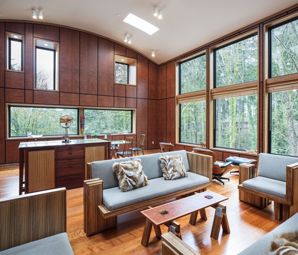
How much wood could just one room hold, if one room could hold much wood? Well, here is what’s in the majestic great room (just the great room) of the contemporary, distinctly curvy home that architect Roger Wallace designed among some seriously towering trees: The walls are Waterfall Bubinga, from Africa. (Originally, that is. Wallace got his from Edensaw Woods in Tacoma.) The floor: curly cherry, from Maine. The sofas and chairs Wallace designed as a graduate student — and then ended up building, with his carpenter friend Brian Gregory — are Paldao (from Indonesia and New Guinea), with African Zebrawood trim. The ottomans at the feet of the shiny Eames Lounge chairs are of Santos Palisander, from South America. The legs of the stunning dining table are African mahogany, with midcentury chairs in rosewood. Cabinets by Ross Day are Jatoba, from South America, and Western Tiger maple, with smaller accessories in walnut burl and teak. And tying it all together, all through the house: “Just a normal cherry,” says Wallace.
2. A Tree-Hugging Home
May 5, 2016; Beaux Arts Village
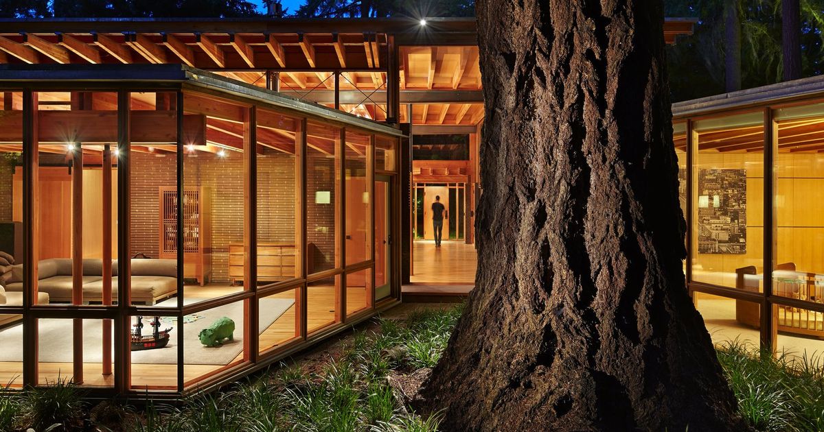
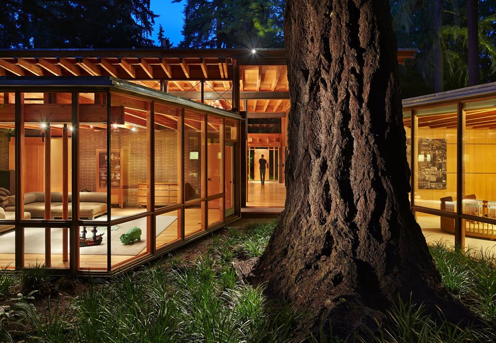
This magnificent, way-more-than-a-cabin “treehouse” was envisioned, designed, built and inhabited to wholeheartedly embrace the site’s seven old-growth Douglas firs and all they so stately stand for. “The trees were such a gift that we organized the building around the experience of the trees,” says architect Jim Cutler of Cutler Anderson Architects. “How could you not love this presence? It’s like a relation or an ancestor, like having your grandfather in the room all the time.”
3. Paneling That Pops
Dec. 7, 2018; Anacortes
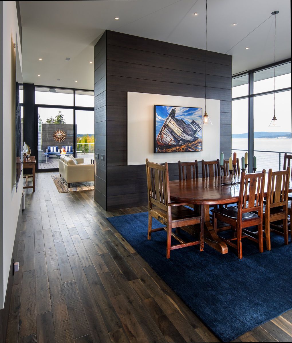
Everything about The Cliff House, a one-of-a-kind inhabitable observatory more than 50 dramatic feet above the Guemes Channel, stands out: so much so, the home won two awards from the Skagit/Island Counties Builders Association, including Project of the Year, in 2018. But that paneling! The word sounds so standard, but this is anything but. This is a laminate manufactured in Italy by CLEAF that “comes in giant sheets,” says architect Brooks Middleton, who worked with Strandberg Construction. It coats the walls with the richness of hot fudge. It fronts the kitchen cabinetry in melty French vanilla mixed with just one dollop of hot fudge. It’s warm and really, really cool, and you can’t not touch it. And then — surprise! — it takes on a whole new dimension when Sheetrock pops out to frame the homeowners’ art pieces.
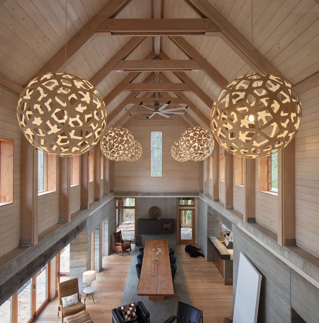
4. Extra-Bright Shades of Green
May 11, 2017; Bainbridge Island
Heron Hall, designed by Jason F. McLennan of McLennan Design, is a genuinely groundbreaking tribute to regenerative design, local materials, salvaged treasures and bespoke green products and techniques — one of the most advanced buildings ever and “completely solar-powered and completely off the water grid,” says McLennan, who worked with general contractor Smallwood Design & Construction and a bevy of contributors and craftspeople. Two-foot-thick rammed-earth walls start at the entry gate, rise two stories through the powerful central stair tower and ground the entire home with what McLennan calls “a literal stabilizing presence.” “We wanted Heron Hall to be timeless, for generations,” he says. “We hope it’s the kind of house that 100 to 200 years from now, families will be in it, loving it and using it.”
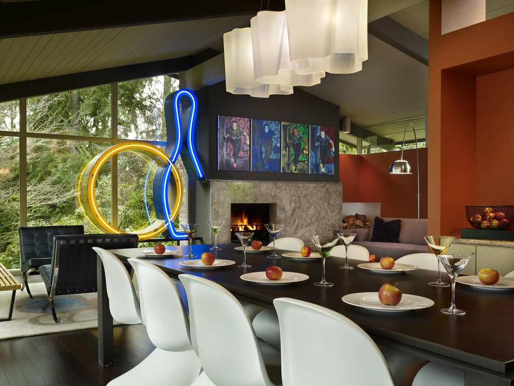
5. Whimsy to Spare
Aug. 19, 2016; Enatai
A giant neon bowling-alley sign is the shining North Star of the neighborhood. (As in, “Hang a left after the giant neon bowling-alley sign.”) You can see how that might happen: The thing is 8 feet tall, 6 feet wide, nice and high in the living-room window and — repeated for emphasis — neon. It’s also the whimsical kingpin of this strikingly renovated midcentury-modern home, a veritable gallery of singular finds artfully united and sited by interior designer Hilary Young of Hilary Young Design Associates. That giant sign (neon; did we mention?) ties together the whole airy living/dining area. “Not many houses can handle it,” Young says, “but this house is perfect.” Just a 7-10 split away, over the fireplace and its original surround, hangs a series of Warhol-ized official White House photos of Richard Nixon. He. Is. Bowling.
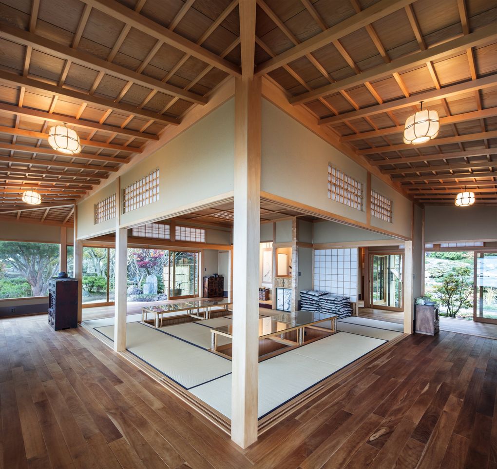
6. Masterful Craftsmanship
May 10, 2020; Shoreline
Makoto Imai is a true master craftsman of traditional Japanese woodworking and construction. He uses no nails, no bolts, no screws — just precisely aligned, gorgeous joinery, and hand tools carrying 8,000 years of history that he brought from Japan. Over his 50-year career, Makoto (he’d prefer we call him Makoto) has designed and built homes in Japan, in California, on the East Coast and in Washington — including this one-bedroom Japanese Sukiya Guesthouse, designed with Cardwell Architects “primarily as an entertaining space” and situated on a serious 100-foot-high bluff overlooking sparkling Puget Sound, amid Zen gardens and a languid pond. Typical of Makoto’s work, the materials are natural: clay tile, concrete foundation, Japanese clay plaster walls. And the wood, of course, is perfection: Alaskan yellow cedar posts, Western red cedar beams, entry stairs with bamboo insets — with all wooden joints shaped by hand, by Makoto.
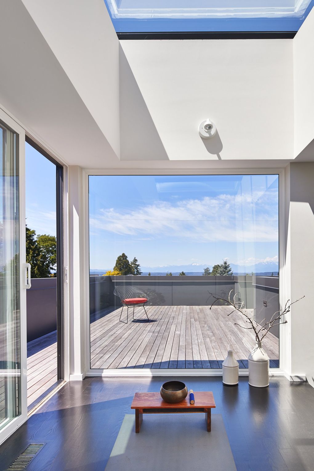
7. Stretch Higher!
Nov. 4, 2016; Magnolia
“[One of the homeowners] needed to stand on his hands.” Jill Rerucha, of ReruchaStudio, tosses out that statement from the skylighted yoga studio that pops atop this sparkling home almost as if it’s a design requirement she hears all the time: “We’d like natural materials; an awesome indoor-outdoor connection; and, you know, plenty of overhead (overfeet) clearance.” Turns out, a daily handstand also worked as a metaphor for the entire home-design and -building experience. “It really was a balancing act,” Rerucha says — of processes, and of options. “With a modest budget, you choose selectively. It’s like an outfit. Prada shoes and a Gap T-shirt are just fine. You do not need all Prada.” But this transitional, transformative, upside-down space really was a must.
8. A Surprisingly Artsy Attic
March 8, 2019; Queen Anne
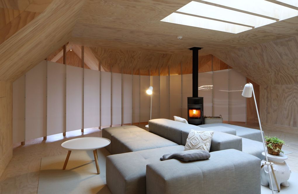
In the top-to-bottom remodel of this 1915 Tudor Revival home, you will not see THIS top coming — which is the whole idea. The classic/modern mishmash starts right inside the formal entry and progresses — gradually, intentionally, surprisingly — as you climb. You might have to seek out the plywood stairs to the attic (they’re hidden behind what looks like a closet door), but — ohmygosh. Find the stairs. Climb them. Pick up your jaw from the plywood floor. Then follow the bright, barely stained plywood up the walls and onto the ceiling, as it defines angles, shadows, spaces … and perhaps the most unexpected element of all: a curved, supercool translucent wall. “In the attic … there was just this amazing shape,” architect John DeForest says. “As soon as we tried a rectangular wall up there, it detracted from the roofline, so we inscribed this elliptical shape in creating all these different, interesting spaces that are surprising, not conventional.” Along the attic edges, a guest bedroom, a bathroom, nooks and crannies tuck along squeeze-through, watch-your-head passageways — “all these ins and outs, a whole network of spaces,” DeForest says. They are not easy to navigate. Also not an accident. The experience, it turns out, is the ultimate intent.
9. One Highly Designed Driveway
Dec. 9, 2016; Innis Arden
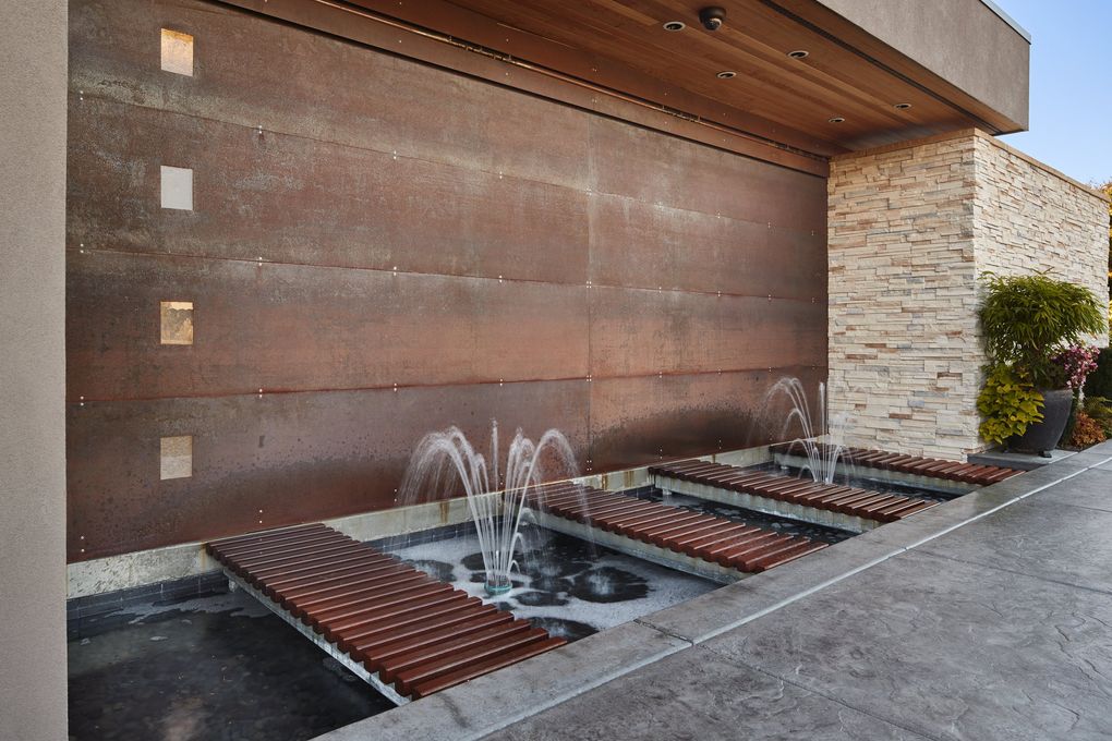
Typically, as its name so aptly implies, a driveway simply gets you to a house. Right? Drive (this) way! Keep it between the lines. There; you made it. So let’s not call the artful entrance to this home a driveway, K? This brief stretch of deep imagination, this unexpected collection of textures, features and materials, carries far more than the random sedan: It embodies the entire aesthetic of the equally inspired home it leads to. This driveway is designed. There is grass. There are pavers. Lights. Fountains. There is a moat. People! A moat. You must cross it, on custom ramps, to reach the gorgeous garage. When the homeowners decided to remodel this solid circa-1946 specimen of Paul H. Kirk architecture — with Rainier Custom Homes and architect Darrin Petersen (Bjorn & Poulsen Fine Home Design) — they really did not want “the whole house to look like a garage” from the street. Now, even the garage doesn’t look like a garage from the street.
10. DADU to the Rescue
Oct. 12, 2019; Ravenna
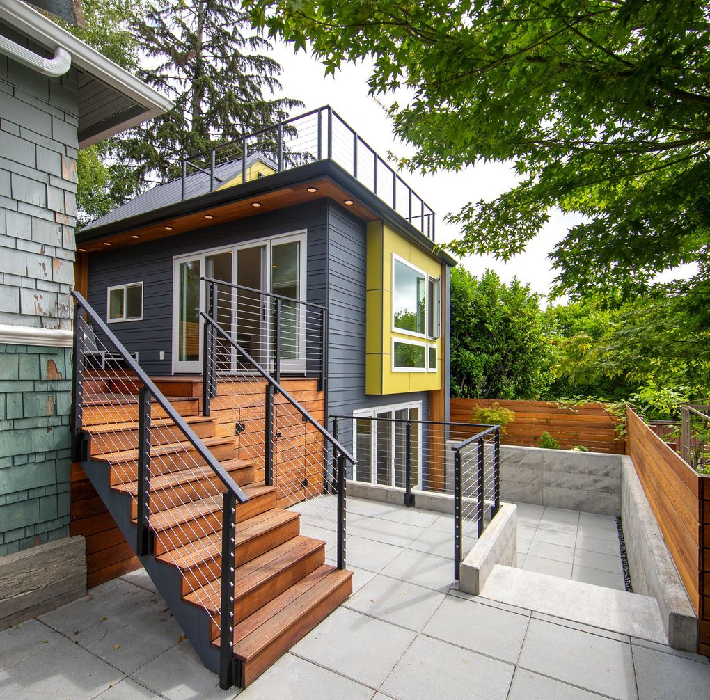
This mighty little DADU has saved the day, in so many ways. Before it existed — before its existence even was conceived — a family of four (plus two pets) was contending with seriously confined quarters in their century-old Craftsman bungalow. Every option seemed too complicated, too disruptive, too not quite right. To the rescue came Living Shelter Architects, along with Mighty House Construction and Entero Design, with an especially inspired out-of-the-bungalow idea: a detached accessory dwelling unit (DADU). It made sense, and it also could make history: This backyard cottage is designed to be one of the first carbon-neutral DADUs in the country, says Living Shelter founder and principal architect Terry Phelan. The 620-square-foot DADU is a mini-marvel of energy- and space-saving ingenuity, plus gigantic fun: A custom foldaway staircase leads to an upper-level light-shelf/loft space and a rooftop deck with spectacular views.
11. Gorgeously Green
Jan. 15, 2016; Madison Park
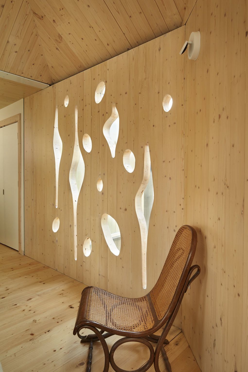
Architect Susan Jones of atelierjones LLC said this home was the first permitted building in Seattle, and one of the first multistoried structures in the country, to use cross-laminated timber (CLT), highly energy-efficient, layered engineered wood panels oriented at right angles and glued into bigger, stronger structural panels. All told, 67 prefabricated CLT panels were delivered from British Columbia; they act as both structure and interior wall finish. The home’s exterior is strikingly charred shou-sugi-ban Douglas fir; inside, it’s luminously light and open. The white pine CLT is raw, textured and only slightly whitewashed, and upstairs, sunlight slices through two CLT panels where the manufacturer carved a design Jones created to evoke the wood’s pine knots; the result is both natural and somewhat nautical. “The first thing is to let the wood speak for itself,” Jones says. “We wanted to express the volumes of the wood, to let the grain move with the space — not decorate it, just let the light fall across it.”
12. Elevated Stairs
Oct. 19, 2017; Washington Park
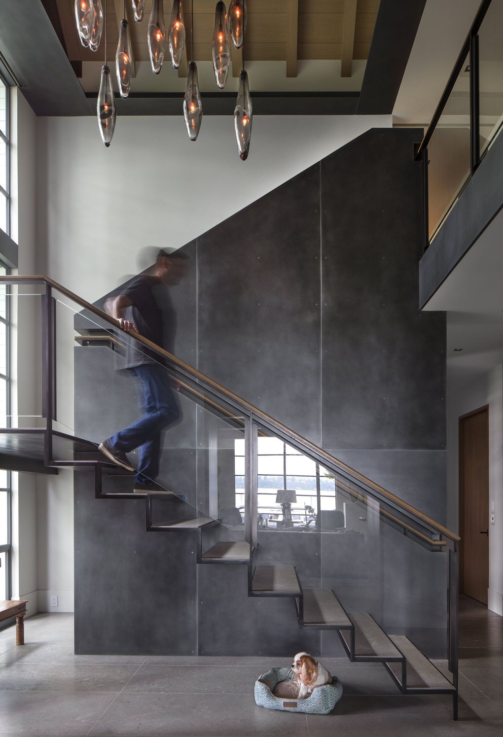
In a gleeful expression of collaboration, Stuart Silk Architects (principals Silk and Mike Troyer, and project manager Michael McFadden) teamed with builder Schultz Miller, interior designer Amy Baker and a passel of craftspeople to create this gleaming, gabled, contemporary-yet-traditional waterfront home. The blended delight continues right inside with a dramatic staircase backed by a towering, textured steel wall crafted by Decorative Metal Arts. Says Silk: “We always wanted a center spine of steel, so the stair was floating and kind of wrapped up and around that. The embedded stair detail is pretty memorable. That was, I thought, a really great way to bring another level of detail to the wall.”
13. Cutting-edge Glass
April 7, 2017; Kirkland
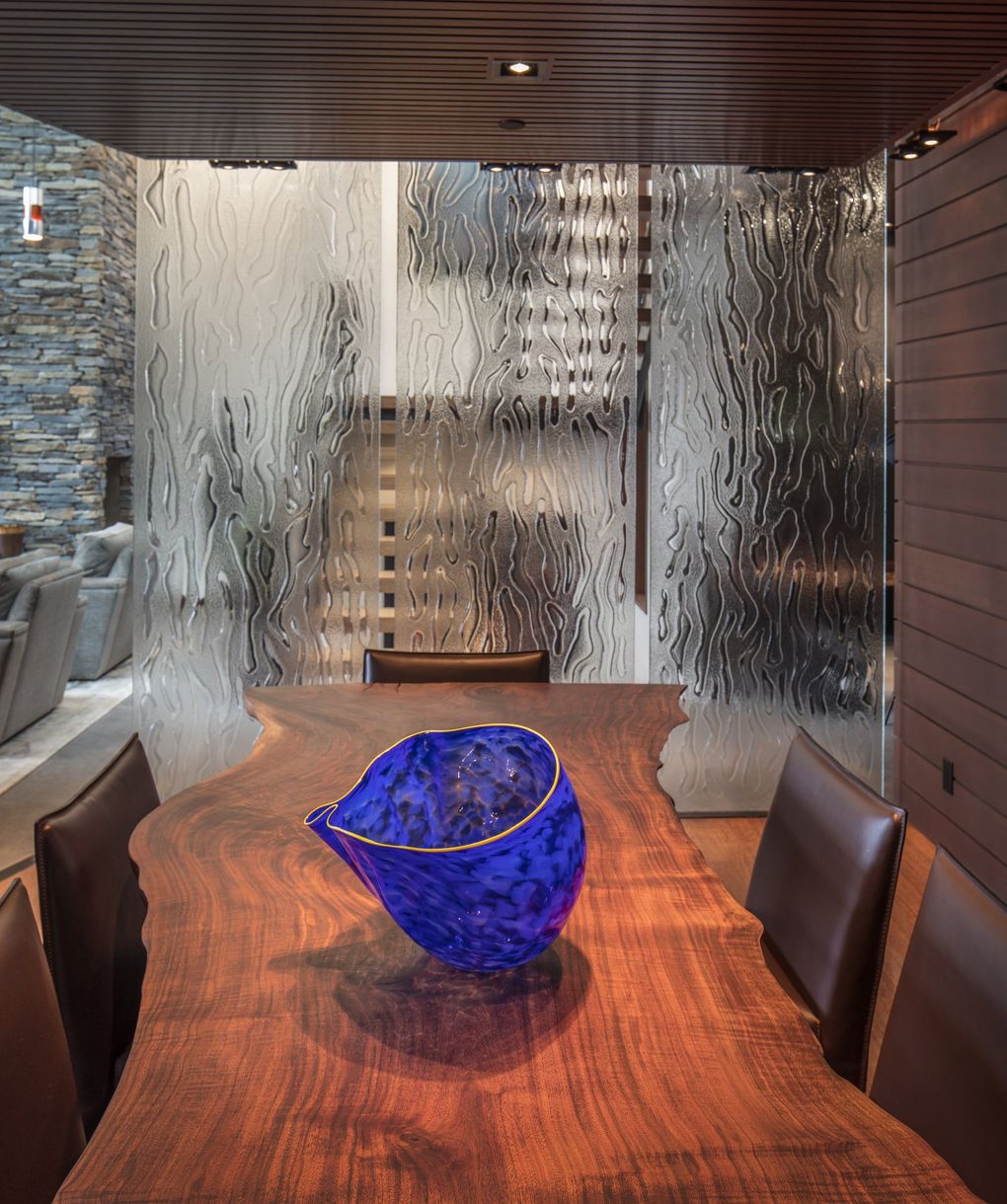
The glass masters at Glassworks, a Seattle company that designs and creates custom architectural glass, crafted a massive wall that elegantly divides the dining area and the entry of a cool and contemporary home designed by architect Rick Chesmore of Chesmore|Buck Architecture. “That wall … you wouldn’t have thought: ‘What keeps it there?’ ” says Steve Shahbaghlian of Glassworks. “The only thing for us was: ‘Can we do that?’ We came up with the idea and took exact measurements. Everything’s very specific.”
14. Which Way Is Up?
Nov. 11, 2016; Hood Canal
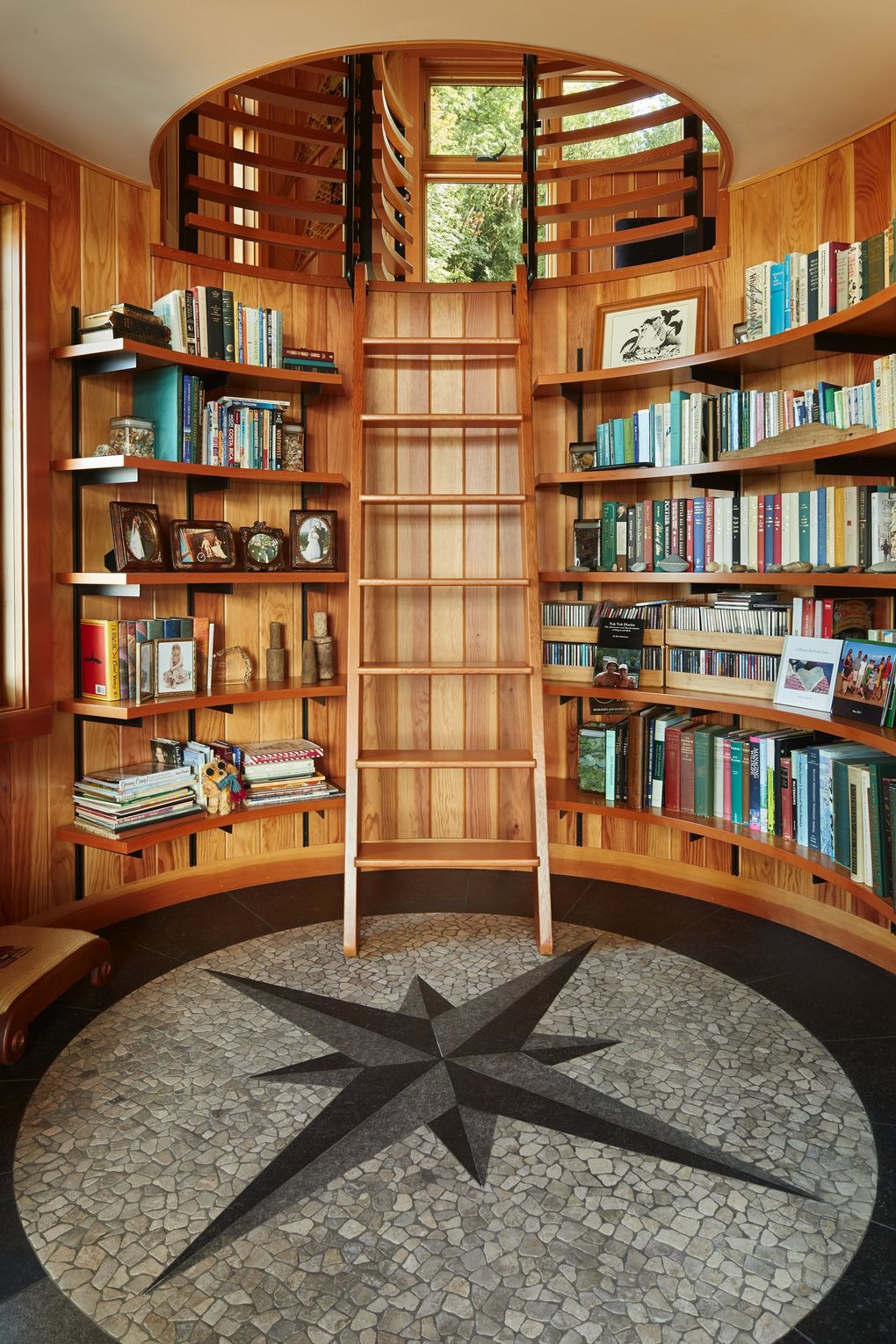
There are two mariners compasses embedded in this views-for-nautical-miles waterfront home along Hood Canal. One is big and bold and plain as day: the tiled focal point on the floor of the exquisitely circular library. (The other is easier to miss, on the stone porch.) “We wanted a place to discover, especially for the kids,” says architect Greg Belding of Rice Fergus Miller, who teamed with Steve Rice. So the lower shelves in the cozy library hold kids’ books and a stuffed animal near an heirloom rocking/reading chair. A ship’s ladder rises to a streetside loft, with a metal-spring bed from the site’s original cabin, a porthole for waving a flag to Grandpa as he works in the hobby shop/garage across the street, plus sleeping bags tucked into a hidden storage nook.
15. C’mon In/Down for a Swim!
Oct. 5, 2019; Capitol Hill
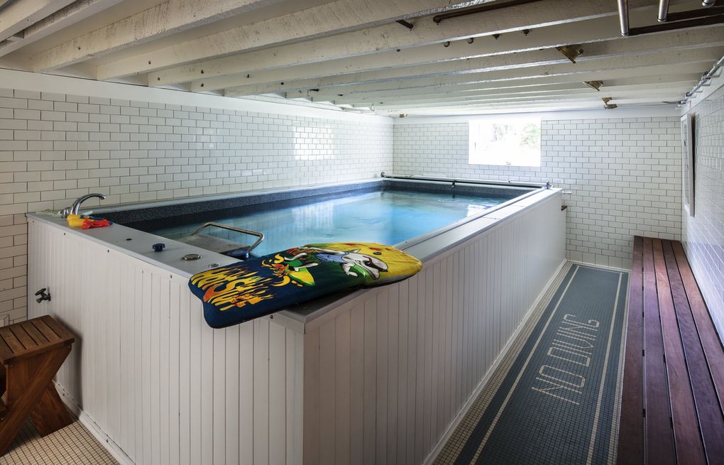
When the team at JAS Design Build — including creative director Kim Clements, project architect Nick Robertson and designer Kaitlin Tripp-Addison — updated the majestic 1904 Bordeaux House, the overall mission was to bring its 20+ rooms to a more personal scale and to honor the legacy of all the families who lived here before — along with the existing pool on the lower level. This historic home encompasses 8,000 square feet over five levels, so it takes 50 cardio-hardy steps to ascend from the main-level kitchen to the tippy-top-floor media room — and that’s not even counting the other stairs down to this fabulously fun pool room. And those stairs really count. Because: fabulously fun pool room.
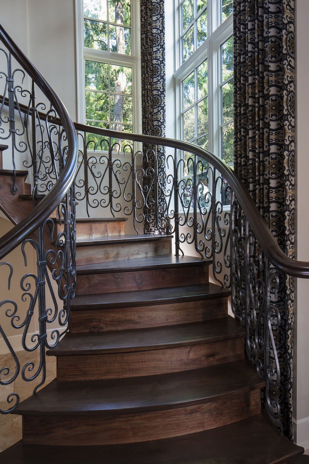
16. A Grand Entrance
March 24, 2017; Bellevue
Informal and formal, Old World and state-of-the-art, this luxuriously romantic stone home on Lake Washington succeeds grandly on many levels — literally, many, many levels: “three floors with half-levels in between, to get the hillside to work with the house,” architect Tom Kuniholm says. All those levels require a lot of stairs, as you might imagine — with one almost-unimaginably OMG stairway in the entry: locally milled walnut treads, risers and stringers bracketed by meticulously hand-wrought iron. “It’s the tour de force,” says Kuniholm. That could be an understatement. “All the steelwork is hand-forged, with a hand-shaped, carved railing,” says artisan fabricator Nathie Katzoff, of NK Woodworking & Design. “Each piece is unique in geometry and 100{6d6906d986cb38e604952ede6d65f3d49470e23f1a526661621333fa74363c48} custom.” The elaborate handrail is held together by just two or three fasteners, he says; otherwise it’s all wood joinery. “It’s really traditional, 2,000-year-old techniques. It was a fair amount of work.” That could be another understatement. Katzoff crafted the staircase in the shop and installed it in pieces. All told, he says, it required 3,000 hours of labor.
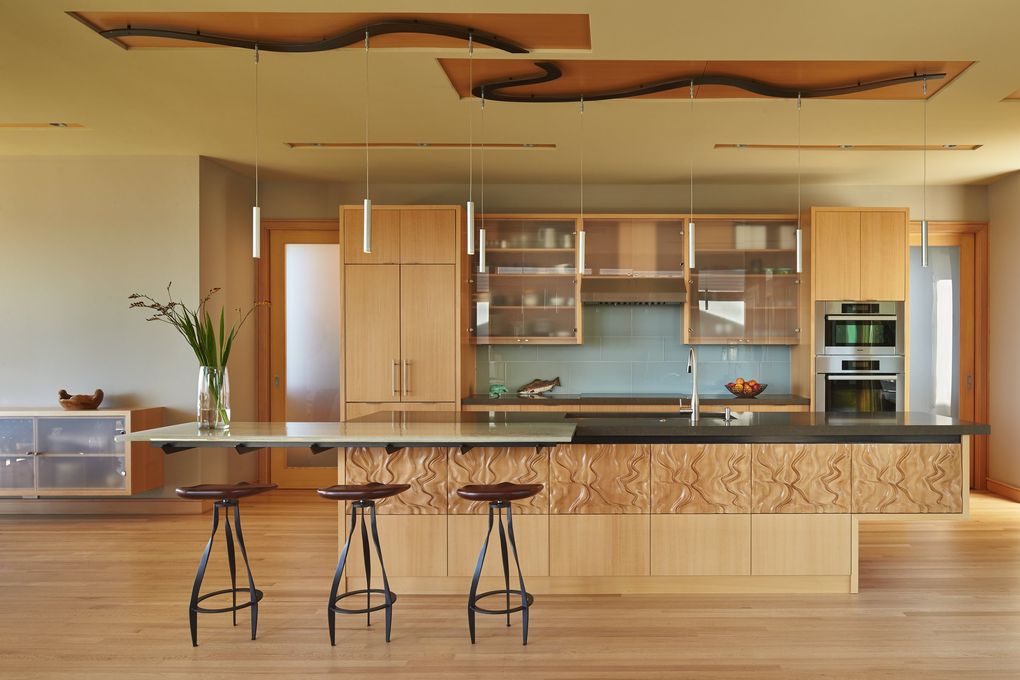
17. Hands-on Craftsmanship
May 5, 2016
On one hand, architect Nils Finne embraces state-of-the-art design machinery, like super-sophisticated CNC routers and extra-large industrial water-jet cutters. On the other hand … well, the other hand is kinda busy sketching those designs, thank you very much, with a good old inkbrush, on good old paper. In one giant design high-five, it all comes together in the touchable, true craftsmanship throughout The Elliott Bay House. “The human hand drives the machine,” says the namesake of FINNE Architects — and crafted modernism results. “Crafted modernism brings back the idea you can use natural materials and machine them to suggest natural patterns. Technology allows us to bring a level of craft to the design of the home that is unheard of.”
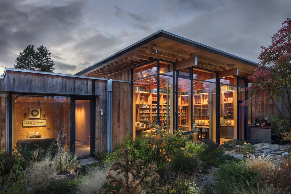
18. An Oooh and Ahhh Oasis
Dec. 1, 2017; Seattle
Design principal Jim Olson, of Olson Kundig, and the homeowner have been friends-that-feel-like-family most of their lives, and this glorious super-sustainable retreat in Seattle — Olson calls it “City Cabin” — certainly benefited from interpersonal inspiration. The owner envisioned sun-worshipping clerestories and windows, along with a nothing-fancy-please common area, two separate bedrooms and a private connection to nature — all on an ordinary city lot. So Olson maximized the anything-but-ordinary home’s 2,400 square feet, working to “get as much as you can out of as little space,” he says. Its fabulous, functional design organizes around a brilliantly bright, high-ceilinged great room, with two extending wings (one the master suite, and the other a guest room and storage) and soothing garden views from every single room.
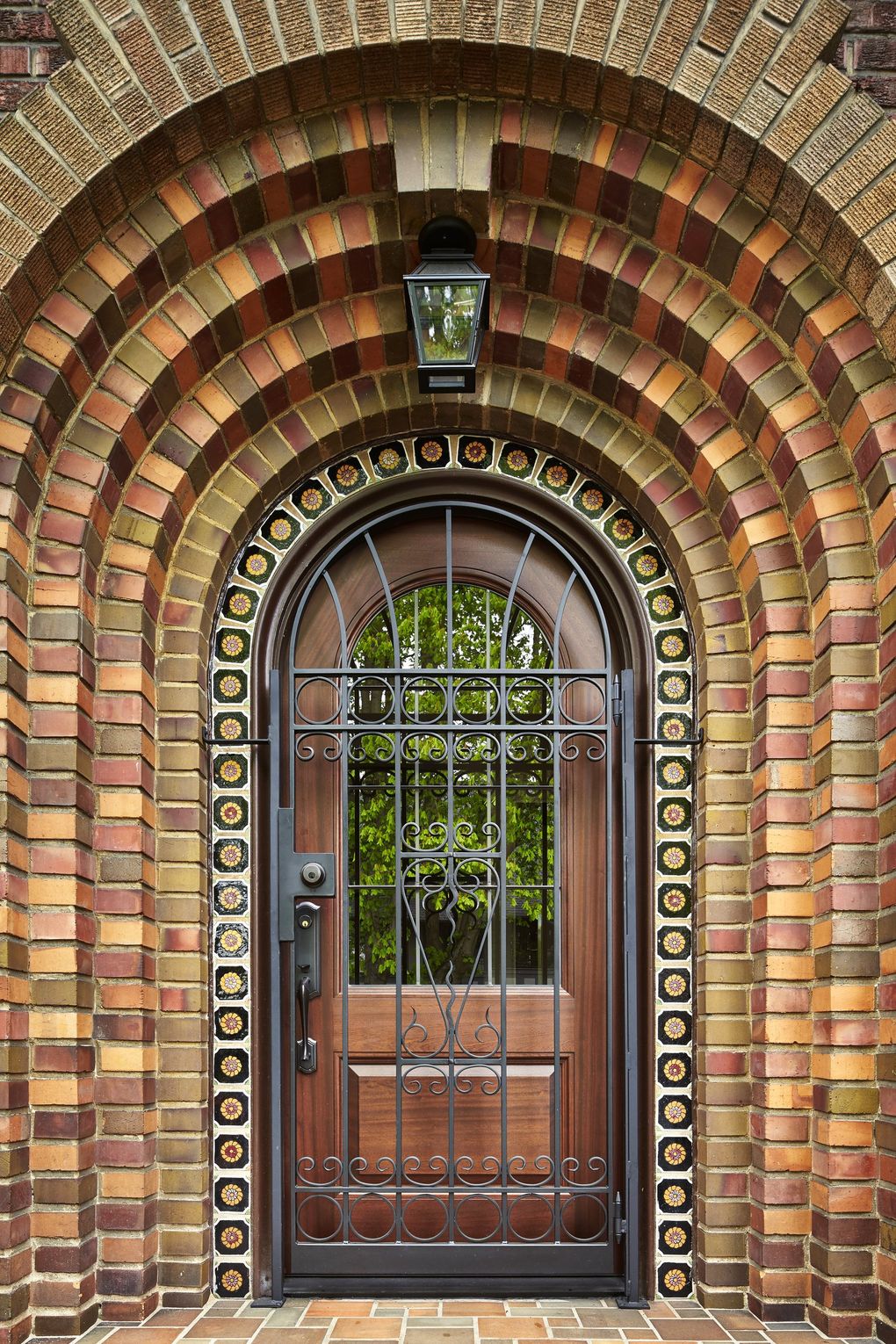
19. Quite a First Impression
Oct. 7, 2016; Capitol Hill
“This brick is special,” architect Eric Gedney says of this classically elegant 1929 home. “The character of it is so strong.” As Gedney expanded, preserved and updated the home, artisan mason Todd Taylor of Ernest Construction counted bricks to see how many could be salvaged or restored. Bricks were removed, matched and reinstalled, and now original bricks, found bricks and re-created bricks coexist, seamlessly. At the entry, the intricately carved original door was solid mahogany (except for a Speakeasy door) and solidly dark. The new handmade door keeps the mahogany and the original shape (and the dramatic brick frame), but adds glass. “There’s a lot to figure out in its character,” Gedney says. “Do you know it’s not original? No.”
20. An Excellent Use of Space
Dec. 8, 2017; Central Washington
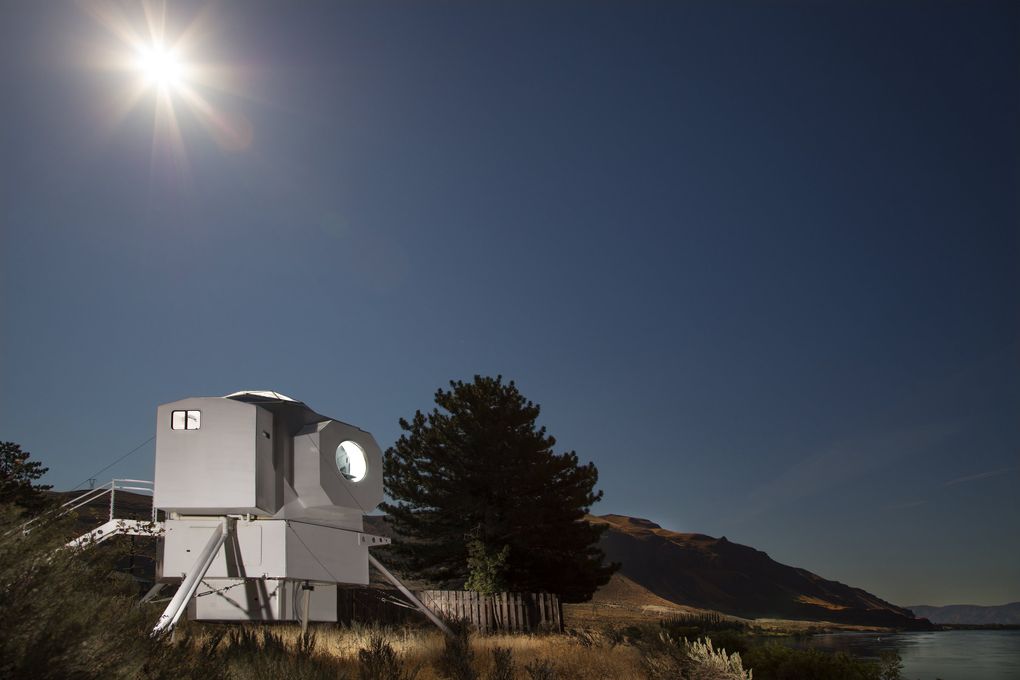
Houston, we have a project. Technically, it is not a starship, but it certainly has proved quite the enterprise. Its DIY commander, naval architect Kurt Hughes, systematically designed and built this livable, lovable lunar lander, securely perched on an acre of peaceful riverfront terrain. It is out-of-this-world spectacular. And this is no tiny house that vaguely resembles something space-y, fellow Earthlings. This is a “retrofuturist” and officially permitted lunar-lander tiny house (total weight, less than 3,000 pounds; total square footage, 250). It kind of stands out. “There are four sides and four truncations — it’s technically a hexagon,” Hughes says. “The intent is that it’s cool from every side.” Mission accomplished.
Bonus Bathtubs!
I must be drawn to baths (ha!), because each of these serene soaking sites is deeply seared into my memory.
1b (for bathtub!). June 27, 2018; Mercer Island.
Interior designer LeeAnn Baker, LeeAnn Baker Interiors, with architect Craig Stillwell of Stillwell Hanson Architects and Joseph McKinstry Construction Company.
2b. Oct. 25, 2018; Ellensburg.
Principal designers Jeff Bates and Trevor Lunde (GLY Construction); builder: Town & Country Homes; landscaping: Central Valley Nursery; interior design: homeowner.
3b. Sept. 15, 2016; West Seattle.
Architect Tom Lambright (Lambright Design Group).
4b. Nov. 16, 2019; Clyde Hill.
Principal architect Paul Michael Davis and a team from Paul Michael Davis Architects, Boom Builders, art adviser Lele Barnett and Dan Di Zazzo Landscape Architecture.
5b. Oct. 25, 2018; Mazama.
Architecture: Dan Nelson, Designs Northwest Architects, principal architect, and Matthew Radach, project architect; general contractor: Impel Construction; landscaping and plantings: Goat Wall Landscaping; interior design: homeowner.
