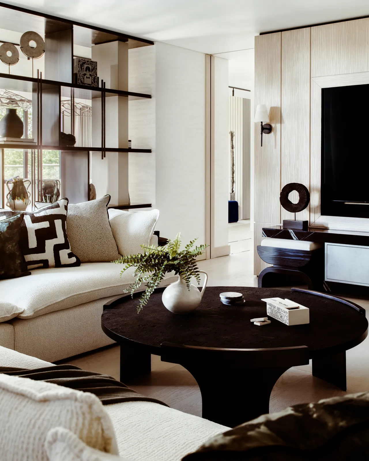
Landlords look away — this one is for your tenants who want to decorate and get their security deposits back.
If you are a renter, chances are you know the struggle of plain white walls, static-looking appliances and maybe even lack of personality when it comes to your decor. For fear of losing your hefty security deposit or making your landlord upset, many don’t bother with decorating, painting or trying to turn their rented house into a home.
2022 is the time to change all that, as we have been spending far too much time in the house for it not to feel homey. While it can be temping to just drill a few holes and paint and forgo your fee, taking the time to research the best renter-friendly products will save you the headache later. Especially when it’s time to move out and you are looking for a new paint job and spackling when all you want to do is move on.
To help save time on the research front, we rounded up all the best renter-friendly and landlord-approved ways to transform your space, including options for shelving, wallpaper, decor and more. Read on for our list and then get your DIY on worry-free.
Paint is messy and traditional wallpaper is so hard to apply. Try this peel and stick paper instead, sold in a variety of stunning floral patterns from Rifle Paper Co. Patterns start at $60 but the feeling of totally transforming a space is priceless. Plus, once you get tired of the design, simply remove and try something fresh and new.
Want a fresh start with minimal effort? The removable wallpaper from The Happy Planner is just what you need. Choose from an array of simple and elegant patterns and colors, cut to size and then stick to the wall or flat surface. You can easily remove or reposition, taking the stress out of home design and decor.
Why should the walls have all the fun? Check out Chasing Paper for their peel and stick removable flooring tiles. They come in all different colors and patterns, including classic tile designs, marble and more.
Upgrade your backsplash or kitchen accent wall with these easy-to-apply tiles from Wayfair. They come in blue, white, gray and taupe, sold by the square foot to fit any space you are trying to transform.
Transform your wall, fridge or any other surface into an interactive chalkboard with this peel and stick paper. Sold at West Elm, the wallpaper is a fun and creative way to change your space up and also never forget the grocery list or chore chart again.
No nails and no hassle. These floating shelves only require some self-adhesive strips, easily found on Amazon, and a bit of patience. Then, enjoy hole-free walls and beautiful shelves that can hold 1.5 pounds of knickknacks, photos and more.
Stick on Wall Toilet Paper Holder and Hook, $5.98
Amazon
When redoing the bathroom, don’t drill any more holes into your wall than you have to. This toilet paper holder and matching hook are both peel and stick-friendly, with the option for small nails as well, if approved by your landlord, of course. The hook can also be used in any other room in the house for hanging dish towels, keys or anything else.
Don’t be in the doghouse for any repairs. These magnetic hooks are super heavy duty, holding up to eight pounds each. Stick them to any magnetic surface like the fridge or other appliances and store oven mitts, utensils or even pots and pans to save space.
Wekity Wall-Mounted Toothbrush Holder and Bathroom Storage, $19.99
Amazon
Get all the clutter off of your bathroom sink and add some storage while you are at it. This toothbrush organizer mounts to the wall with suction cups, not leaving any marks or scuffs. Then, load up the toothpaste and the brushes, serving as a toothpaste dispenser and a holder at the same time. The contraption also has a pull out drawer and storage above as well, making your bathroom a DIY sanctuary.
Picture this: tons of beautiful framed art in your home, but with no nails or residue on your walls. That can be accomplished with Mixtiles, the peel and stick art prints that are easy to stick to any wall and just as easy to remove or reposition. Make an account and check out their bestselling prints and photos for every room in the house.
Murals aren’t just for the outdoors anymore. Install your very own work of art with a peel and stick mural from the artists at Society6. They have a huge range of designs, images and patterns and the best part is that you can change them up whenever you want, leaving no mess behind.
Hang beautiful curtains and even tapestries without leaving any marks from hooks or nails with a tension rod. All you need are two walls over a window alcove and you are good to go, as nothing but the curtain rod is required.
DAYBETTER Led Strip Lights 100ft Smart Lights, $29.99
Amazon
Set the mood with these Bluetooth enabled lights, which can be easily hung with the self-adhesive backing. These don’t require any hooks or nails and can then be controlled with a handheld remote or via an app on your phone, making ambient lighting a breeze.
Another great idea to transform a space is by tweaking the little things, like adding a fun outlet cover over your light switches and other hardware. This wavy one from Urban Outfitters is super cute and also comes in green and light-purple, plus more options on their site.
When you can’t be bothered to find studs and hang a heavy mirror, go for an easier option, like this triptych mirror that can easily be propped up on a vanity or cabinet. It will transform your space and make getting ready in the morning a luxurious moment, plus, no scratches or strain on your walls.
It’s not uncommon to see housing complexes integrate commercial spaces at the ground level, but the challenge of mediating between the private and public realm on a smaller scale, especially with the rise of the home office, has forced architects to explore all aspects of the structure, from the topography it sits on, to the direction of light and wind, to the design and organization the domestic space. This interior focus explores different design solutions that show how architects and interior designers transformed their projects from a living space into a mixed-use typology, taking into account privacy, flexibility, functionality, and predefined spatial requirements.
+ 28
Towards the end of 2021, the global workforce experienced what is now known as the Great Resignation, which saw millions of employees aged between 30-45 dropping out of their jobs, a 20{6d6906d986cb38e604952ede6d65f3d49470e23f1a526661621333fa74363c48} increase compared to last year. The rate comes as no surprise though, since evident changes in traditional work environments have been observed all throughout the past decade, and were greatly accelerated following two years of confinement and remote work. The pandemic highly influenced the way employees value their physical, mental, and emotional wellbeing, and inspired them to look into environments that promote “open communication and free-flowing creativity”.
With that, the world saw the emergence of the “startup culture”. Regardless of their age group or experience, people no longer relied exclusively on their 9-to-5 jobs to be secured financially, especially if medical, academic, and time-off benefits were limited. Instead, they monetized their hobbies and passions, and transformed parts of their houses into private workspaces. In other cases, business owners found it more adequate to “move into” their workplace, dedicating a specific area in their office/shop for housing. Depending on the type of work and its spatial requirements, architects and interior designers introduced different configurations, separating the workspace from the rest of the house, yet providing facilitated circulation for its residents and visitors.
Related Article
Home Office Desks: 10 Examples for a Professional and Personal Workspace
Read on to explore 15 projects that show how architects reimagined their residential quarters as coffee shops, libraries, ateliers, and design studios, to name a few.
The client of this 1850’s 45 sqm apartment wanted to generate a new space that contains at least one bedroom, a bathroom, a kitchen, storage space, and a workspace, without subdivisions and walls to make the most of the south orientation of the balcony. Seeking to multiply the possibilities in a reduced spatial area, the architects used “adaptability and flexibility” to define the different functions of the space through the installation of mobile partitions. The partitions reconfigure the original spatial division, leaving only the structural envelope as a base, and allowing the bedroom to be transformed into a work area whenever needed.
The project was designed for a designer couple who wanted their workplace to be an integral part of their daily routine. Catering to the two functions, a home office is located on the ground and semi‐basement floor, whereas the residential area is placed on the level above it. In the residential part of the volume, the building is further divided into 2 large areas: a semi‐private area which includes a living room and dining room placed at the front side of the house, and more private area which includes the bedrooms placed at the back side of the building. These two building masses are separated by a dry garden that offers ventilation, natural lighting, and tranquility to all interior spaces.
Hae-mut-je House and Office / Architecture Studio YEIN
Hae-mut-je, which translates to a small house on a seaside land in Korean, began with the purpose of building a guesthouse for the architect’s interns who visit from overseas, as well as a base for cultural activists that can revive the neighboring village. To be able to accommodate both, the volume is divided into two parts: the residential part and the office for cultural activists, divided by a small open courtyard and rainwater pool. The office is placed facing the corner of the road to create a dynamic atmosphere with the narrow alley, and ensure that the residential area is protected from the noise and passersby.
Design Studio
House and Design Studio in Kortrijk / Devolder Architecten
The house is conceptualized as a “closed wooden box” in a landscape of large trees. Structurally, the building was designed to serve double functions: living and working, which forced the architects to define the spaces through two staircases. This duality offered the residents the benefit of being able to circulate easily within the house in a loop-like circulation, as well as reconfigure the office space into a “kangaroo house”, a debated typology in Belgium and the Netherlands.
The studio was designed for an artist who wanted a living and working space with no visual or physical interruptions to ensure total concentration. Since the height of the ceiling was at 5 meters, the architects added a second level for the bedroom, dedicating the first level for the main working space, as well as a mini-kitchen, a bathroom, and storage. Following the client’s request of no visual interruptions, the entire space was painted white with minimal black interventions, and housed minimum amount of furniture to allow the owner to have maximum free space to carry out his creative work.
For the Sonastério music studio, Joao Diniz Arquitetura combined geography, sound, architecture, and creative conviviality in one geometric structure. The architects wanted to ensure a dialogue between the spatial requirements of an acoustic studio and Morro do Chapéu’s unique architectural context, so they created a floating concrete structure with interlocking volumes and floor-to-ceiling glass facades that integrate with the surrounding landscape and offer a private performing and recording studio. The sound insulation qualities of concrete and scenic views allow for a secluded and calm residential environment.
Atelier / Workshop
Lara Rios House & Atelier / F451 Arquitectura
Lara Rios House & Atelier / F451 Arquitectura. Image Courtesy of F451 ArquitecturaLara Rios House & Atelier / F451 Arquitectura. Image Courtesy of F451 Arquitectura
The project merges two typologies: the modern house and the industrial shed through a program of 4 autonomous but interrelated units – house, guest apartment, atelier, and garage. In this particular project, landscape integration was heavily influential on how the space was designed. The architects took the slope from the surrounding terrain to define where they wanted to integrate both types into a single volume: the house mimics the topography and changes functions as the plan progresses. The volume emerges from the land in one of the extremes, aligns the structure with the garden in the central area, and then detaches itself in the western side. An open hallway is placed in the central area where the house and the atelier merge, then becomes a roofed exterior transitional space that serves as a focal point and climatic regulator. The merging of both functions gives every space a double orientation and sufficient lighting and ventilation.
10M4D combines a house and two workshops for an embroider mother and her ceramist daughter. The architects represented the “multiplicity of life” by merging three different spaces: a spacious ‘Madang’ (an outdoor space that has specific programmatic and climatic functions), a naturally-ventilated workspace, and a comfortable residential space. The programs were organized around an elevated Madang, which is enclosed by a long portico that functions as the front façade of the building. This portico serves as a buffer zone between the studios and the streets, ensuring the privacy of the clients while they’re working. The embroidery studio sits in a timber structure with plywood walls that set a warm atmosphere, and the ceramic studio is housed in a concrete structure that sets a quiet and cool atmosphere. The residential quarters were placed on the upper floor for optimum privacy, but with direct access to the Madang as well, creating a fluid circulation across different programs.
Gallery
Ketelhuis Apartment, Gallery Space and Artist Studio / Studio Modijefsky
Originally a monumental industrial site, the space has been transformed into a home, studio, and art gallery of an artist couple. The volume is divided into two levels: an office and a workshop on the ground floor, and a gallery space and home on the first floor, connected by two sculptural staircases. The ground floor is carefully designed to include all required functions without relying on the upper floor. Access to the residential area upstairs takes place through the kitchen, which is used as a common serving area whenever an exhibition is taking place at the gallery. Going through the hallway, sliding doors to the guest room, walk-in closet, bathroom and toilets are camouflaged with the white walls and drop beams to avoid public access.
Coffee Shop
Tiam Coffee Shop & Home / Nguyen Khai Architects & Associates
With a gross built area of only 35 sqm, the 18-year old building was functioning as a living space for a three-generation family of seven members. Having so many family members of different age groups in such a small space, the architects focused on privacy and flexibility in their design. The first floor is dedicated to the café, while the rest for living. Vertical louvers and glass walls were implemented as partitions between public and private zones, creating a continuous visual and physical access, but still being able to give every member their private spaces when necessary. The building’s old and ineffective spiral staircase was replaced by a new straight one that goes all across the building, helping to optimize space and provide better circulation.
Baan Priggang, which translates to Curry Paste Home in Thai, was originally a two and a half storey wooden house with a building on the side. The owner wanted to renovate the space into a curry paste factory, but the deteriorating structural conditions did not allow for the space to be used as both residential and commercial. Upon evaluating the details of the site, the old building, light, ventilation, and the spatial requirements of a curry paste factory, the architects broke the familiarity of home design by placing the factory in front of the house as a welcome zone (and in proximity to the road which offers the best airflow), followed by the dining area, and the Thai kitchen at the back as the backbone of the structure that connects the house to the factory.
In addition to a residence, the clients wanted to add a hair salon and a storage space for their several motorcycles. Since the project required 3 well defined functional spaces, the architects designed each with unique characteristics on a deformed L-shaped plan. The ground floor, which houses the two commercial functions, is differentiated by floor leveling and material selection. Going upwards, the residential unit is placed with bedrooms at the back so that the privacy gradually increases from the entrance towards the bedroom, responding to the circulation of visitors and residents.
Library
House with a Small Library / Hiroshi Kinoshita and Associates
The small house was created for a client that had a vast library and wanted an easily accessible space to store her collection of books. The architects saw potential in her collection, and transformed her house into a private library that could be opened to the city whenever the owner wanted. Six glass doors were placed at the entrance along with circular benches, allowing the ground floor to be used as a public open space. Since the client preferred a more quiet and private life, the single room upstairs was transformed into her private residential space.
With the intention of having a residential and retail space, the 3-storey building is divided into 2 sub-buildings: the street-facing part as a pharmacy and the back part as a residential area. Due to the site limitations and building type, the layout is trapped between adjacent buildings, so the architects integrated a courtyard with skylight in between both volumes to provide daylight access and completely separate the commercial area. However, the clients felt that the commercial scale is too large and that both functions are not homogenous. With that, the architects created a small house in the back of the site that serves as a family living area and a common space that connects all spaces together. The final design is a 2-storey detached house, a courtyard balcony, which disguises the fact that the third floor is the pharmacy warehouse, and a double space in common area which is rarely seen in this type of building in the neighborhood.
The clients of this project were adamant on one feature, “the garage terrace should bean extension of the living room, and the house should have a personality”. Here, the clients’ passion of cars was the driving force behind the spatial organization of the architecture. The house sits in a newly developed residential site facing the main road, which has a wide visual access to passing cars and pedestrians. Since the couple intend to set up carports in the future, the architects took advantage of the 5 meter area in front of the house and implemented a built-in parking lot that serves as an active semi-outdoor terrace connected to the living room.
This article is part of an ArchDaily series that explores features of interior architecture, from our own database of projects. Every month, we will highlight how architects and designers are utilizing new elements, new characteristics and new signatures in interior spaces around the world. As always, at ArchDaily, we highly appreciate the input of our readers. If you think we should mention specific ideas, please submit your suggestions.
What are some of the worries experiencing the marketplace in 2022, and what alternatives do you offer you?
The earlier two several years have been attempting for all of us and have introduced numerous supply difficulties to enterprises worldwide, such as the landscape market. The incapability to procure on a regular basis utilised merchandise in the past has challenged Roots to assume ‘outside the box’ and even additional creatively in purchase to present helpful landscape and hardscape options. Employing option resources such as crushed stone, reclaimed bricks, and other hardscape products has worked effectively for both Roots and our customers. In many scenarios, it has resulted in far more uniquely luxe outdoor residing areas. As an alternative of installing concrete pavers for a walkway, for instance, we sourced reclaimed brick or irregular flagstone with fantastic results. We’ve also installed decomposed granite as a primary patio or driveway medium, and instead of the conventional boxwood, we have opted for other plantings that prosper and complement a client’s back garden for several years to arrive. Delivering new and artistic options has generally been a positive and worthwhile knowledge for our group and customers alike.
Why is now the very best time to approach your spring landscape undertaking?
Landscape jobs acquire time to plan—more time than numerous owners know. In the Northeast, wintertime can be cold, bitter, and snowy, and then suddenly…it’s SPRING! If you wait around right until the to start with bloom to commence considering about your spring landscape venture, it can be rough level of competition to have your job scheduled in time for summer months. Proper preparing is vital and will involve speaking about a client’s targets and developing a landscape structure, a procedure that can get months. We can also implement for any required permits and acquire the essential approvals all through the winter season months so that our clients are prepared for spring. By applying the winter months for spring landscape preparing, our staff can get to operate on your undertaking extended prior to the snow melts.
What are some significant components to consider when preparing your landscape?
At Roots Landscape, we feel in the relevance of ‘Right Plant, Appropriate Position.’ A particular shrub may well prosper in a friend or neighbor’s backyard, but wrestle in yours. Our industry experts get to know your home by spending focus to it. What time of day does the sun hit your garden or lawn? And for how extensive? Are you working with steep slopes or inadequate drainage? Do you need to have a privacy monitor or a tree taken out? These are critical criteria when organizing your landscape. Considering about if you’d like to attract butterflies and birds to your back garden, or whether or not you will need vegetation that are deer or rabbit resistant can make or break your landscape task. The a lot more information you can share about your place, the improved our team of horticulturists and landscape architects can layout a special back garden that will prosper on your residence.
What is this? This written content is designed attainable by our sponsor. It is not written by and does not always mirror the angle, sights, or thoughts of the Primary Line Right now editorial team.
The Los Angeles home of inside designer Giampiero Tagliaferri is an item lesson in the wonders of 20th-century Italian home furnishings and the affinities among Italian modernism and the midcentury-modern motion incubated in Southern California. Chockablock with treasures both equally common and obscure, the decor encompasses function by luminaries on the purchase of Gae Aulenti, Vico Magistretti, Joe Colombo, Osvaldo Borsani, Angelo Mangiarotti, Mario Bellini, and Ettore Sottsass, alongside with furnishings by significant but lesser-acknowledged talents these as Cesare Leonardi, Franca Stagi, Gianni Celada, and Gianni Moscatelli.
Tagliaferri is one thing of an Italian treasure himself. Born in Bergamo, the dapper, 38-calendar year-outdated expertise used yrs in Milan performing on advertising technique and style for the stylish eyewear manufacturer Oliver Peoples. 6 years in the past, following staying named inventive director of the business, he relocated to L.A., exactly where he oversaw the style of extra than a dozen Oliver Peoples boutiques in the U.S., Europe, and Asia. “In higher education I analyzed small business and industrial structure, so I uncovered to approach business enterprise from a layout perspective and vice versa. The Rome boutique was my initial interiors venture. It made me notice that interior style and design is the place my correct passions lie,” Tagliaferri suggests.
Although he carries on to seek the advice of with Oliver Peoples, Tagliaferri not too long ago left his position there to concentrate complete-time on his recently minted interior layout enterprise, tackling household and industrial assignments in the U.S. and overseas. Even much more than the retailers he’s established, Tagliaferri’s seductive household in L.A.’s Silver Lake neighborhood serves as the most powerful card for the designer’s urbane sensibility and incisive eye. Built in 1939 by architect E. Richard Lind, a protégé and colleague of the excellent Rudolph Schindler, the house synthesizes components of early California modernism with a lot more unique, attractive inspirations garnered from far-flung locales. “From the exterior, the house has a solid Japanese vibe, like a ryokan. The glazing of the entryway almost feels like a shoji display screen. But when you concentration on the aspects, you see the unmistakable impact of Schindler and his contemporaries,” Tagliaferri points out.
While the composition and format of the initial property continue to be largely intact, the designer completely remodeled the character and complexion of the interiors with a worldly mélange of artwork, objects, and furnishings. In addition to the aforementioned maestros of Italian structure, Tagliaferri’s ensembles include contemporary pieces—including planters and vessels by Adam Sirak, Jonathan Cross, Eric Roinestad, and Olivia Cognet—as well as an idiosyncratic artwork assortment that spans Lucio Fontana and Sonia Delaunay to John Baldessari and Herb Ritts. A Senufo African hen sculpture represents a tip of the hat to Yves Saint Laurent–style savoir-faire, although swaths of emerald environmentally friendly and royal blue on the partitions of the kitchen and business, respectively, goose the subdued, organic palette of the home’s initial California redwood paneling with splashes of 1960s Italian Pop. Quintessentially American midcentury furnishings by George Nelson, Eero Saarinen, and Walter Lamb, alongside with Brazilian modernist parts by Oscar Niemeyer and Ricardo Fasanello, grow the layout lexicon outside of Europe.
“I’m interested in the cross-currents of modernism that hook up the operate that evolved in Europe, South America, and the U.S. This property gave me the option to discover the kinship and tension among these disparate spots and eras, and the means in which the mild and landscape of Los Angeles generate a unique context and perception of place,” Tagliaferri suggests. The close outcome of those explorations is a property that celebrates the strength and spirit of California whilst shelling out homage to the remarkable legacy of the designer’s household country and sympathetic style and design movements all over the world. Welcome to the earth of Giampiero Tagliaferri.
Min Jung Kim has spent her vocation performing with art, but has almost no artwork in her very own residence. “I really accumulate pretty little,” she states. “The ideal aspect of my job is becoming capable to wander by means of the galleries and get pleasure from wonderful works of art practically as if they were an extension of my individual dwelling.”
The Saint Louis Art Museum’s 34,000-piece collection is at Kim’s fingertips now that she’s taken the helm as the museum’s director. One of her priorities, she says, is to keep on producing all those masterpieces accessible to as several people as possible. Even in advance of accepting the role, she understood about a couple of of the collection’s strengths, these as its up to date German galleries—the Max Beckmann paintings, in particular—but she suggests it’s been a joy to explore new treasures in the course of her 1st months on the job.
“Our assortment in the regions of Oceanic and African and the ancient Americas assortment are truly breathtakingly beautiful,” she suggests. “I really feel like I’m just scratching the surface of quite a few extra strengths.”
Even although Kim doesn’t gather art, she is aware of a lot of men and women who do—and she’s amazed with the personal collections she’s witnessed so far in St. Louis residences: “In lots of methods, it has produced me believe that the composition of the permanent selection at the Saint Louis Art Museum has not only benefited tremendously but has definitely been outlined by so quite a few presents that have been created by non-public collectors more than the years.”
In Oct, the museum introduced a promised gift of 22 is effective of artwork from the personal assortment of Emily Rauh Pulitzer. That reward, which contains works by Pablo Picasso and Andy Warhol, amid others, is one of the most significant in the historical past of the museum, but it’s undoubtedly not the 1st. Around the many years, generous donations have experienced a true impact on the breadth and depth of the performs obtainable to museum people.
Although not all people owns these an illustrious artwork assortment, Kim shares means to assist artwork lovers fascinated in starting off a assortment or using just one to the up coming level. She endorses the Collectors Circle—part of SLAM’s membership program—which comprises 4 unique groups, just about every focused on a distinct specialty: African-American artwork, American artwork and structure, pictures, present-day art. The groups system particular activities this kind of as private lectures, viewings of non-public St. Louis collections, and in-depth tours of exhibitions.
“As considerably exposure [to art] as doable is normally a single of the matters that would advantage a collector at any stage,” says Kim, “and we have a genuinely lively collection of packages that engages that amount of membership in diving a tiny bit further.”
Elicyon style and design studio is famed for its luxurious method to inside layout – so we sat up and took recognize when they contacted us with their interior structure trends predicted for 2022.
Right here, Cecilia Halling, Inventive Director at Elicyon reveals eight means the group will be creating households in the calendar year forward.
1. Bespoke gaming home furniture
(Picture credit score: Elicyon)
‘Requests for gaming tables and spaces to accommodate board video games are more and more well known. We’re generally asked to design areas for chess, backgammon and cards in the property, with personalized reclined informal seating to relax in even though playing.
‘It’s turn out to be about slipping in appreciate with your residence, bringing leisure into the house now that we are back socializing in groups and wanting to make the most of the household, choosing to be in relatively than out.
‘Crafting a gaming table is a actual art as they are highly bespoke, with unique colorways or styles to fit each unique style of recreation. One shopper required a side desk in the main living area whereby if you flipped the best it turned into a chessboard.’
2. Indulgent guilty pleasure room or space
(Impression credit history: Elicyon)
‘As perform from residence becomes a much more everlasting fixture in quite a few of our life, the have to have for a feeling of escape to retreat to immediately after do the job is common. A space that allows you to experience as nevertheless you are departing from the day – be it, a place the place your creativity operates wild with vibrant hues or daring art, or an immersive screening home exactly where you can reduce you taking part in PlayStation or Xbox, for case in point, with surround sound.
‘Over the very last several decades, there has been an obvious change to colour in our dwelling design and generating entertaining times that excite. For a single client, we made an aerial yoga area that was completely mirrored from ground to ceiling – it was an indulgence that they experienced constantly dreamed of having in their own home. For a different client, a Moroccan fashion spa in electrical blue was developed as the ultimate area to unwind soon after operate, for a cleanse and refresh. The surprise aspect allows to produce a minute for attendees. These guilty enjoyment areas are the ultimate luxurious.’
3. Painted or tented ceilings
(Graphic credit: Elicyon)
‘The fifth wall in a place is usually neglected and painted white as conventional, having said that, we see it as an option to be playful, add color and character to a space. It may perhaps be that additional coving depth is extra to draw the eyes up, or that the ceiling is painted an solely various colour altogether.
‘For 1 customer, we have draped a significant product canvas over a bathroom ceiling to generate a biophilic sanctuary, practically a safari tent, to evoke unique feelings of travel. In yet another project’s powder space, we’re applying Cole & Son wallpaper showcasing clouds to deal with the ceiling. The wall area was mainly taken up by furnishings, and so we required to insert curiosity to the large spare normally-unused area on the ceiling it was then framed with a dark green trim.’
4. Uncommon, unforeseen, and playful color combinations
(Impression credit score: Elicyon)
‘In the absence of vacation in the earlier two many years, we have witnessed an noticeable openness to color from our clientele – daring, unusual and sudden shade combos these types of as salmon and cherry, mustard and mint or lilac and orange are thrilling and joyful.
‘Rather than sticking to two-toned materials palettes, we’re introducing a few shades or 4 to assure interiors appear alive. What may possibly truly feel like a clash on paper, and would not instinctively go alongside one another, in some cases finishes up with the most identity. Producing sudden combinations with these paint tendencies creates a definitely distinctive and stunning plan.’
5. Earthy colors, materiality, and textures
Coloration developments predicted by Elicyon
(Graphic credit history: Elicyon)
‘Red timber is a product we are doing the job with more in our strategies, normally with a cherry or unique veneer. However in latest decades we have applied a cooling mild blond timber reminiscent of the pared-back whitewashed model now synonymous with en vogue summer destinations which includes Ibiza and Mykonos.
‘This earthy materiality feels grounding and aids to truly feel related to mother nature in our households. Burnt and charred wood has a beautiful texture – it is a substance that is almost been wrecked and nonetheless by the course of action of destruction so a great deal character is included. It’s about celebrating imperfections and highlighting the uncooked materiality in the suitable natural environment offers a room depth.’
6. Top rated colors for 2022
(Picture credit rating: Elicyon)
‘Top predicted shades for 2022 contain: honeycomb, lilac, zesty curry lime, olive-yellow, dark navy, cherry and maple.
‘For just one client, an acid yellow superior gloss lacquer leaps from the inside of the bespoke eating room drinks’ bar anytime the doorways are opened – it’s the most remarkable of surprises.’
7. Uncovered utilitarian information
(Impression credit: Elicyon)
‘Inspired by the British Italian architect Richard Rodgers, recognized typically for his work on the Centre Pompidou in Paris, and the Lloyds of London constructing and Millenium Dome in London, the household furniture development we’re drawn to is generating a function of utilitarian information, as is frequently done in architecture.
‘Rather than hiding the nuts and bolts of a piece of home furniture, we’re in favor of highlighting these factors as a style quirk. Exposing steel framework typically has an pleasing honest aesthetic.’
8. Unconventional pendants and chandeliers
(Image credit score: Elicyon)
‘After years of loving delicate bronze, alabaster and blown glass lights developments, we are now drawn to brilliant hues and interestingly formed chandeliers. In a the latest task, we suspended a floating blanket formed chandelier made of solid glass, which frames the most important living house.
‘Acid shade pops extra to techniques generate playful interest, and we’re predicting a flurry of these in interior techniques throughout 2022.’