The Art of Japandi – Kitchen & Bath Design News
Kitchens
authors
Lis King | November 29, 2021
Sometimes two great styles are better than one. That’s what happens when the raw functionality of Scandinavian design fuses with Japanese nature-suffused simplicity, and it’s a look that fits American kitchens like a glove. Designers say it creates wonderful zen, with some famous Scandi and Japanese variants adding warmth and interest to sleek minimalism.
At first glance it may seem an unlikely design union, since Japan and Scandinavia are on opposite sides of the globe. But, in actuality, their design sensibilities are remarkably similar, and Denmark, especially, has had a close trade relationship with Japan for hundreds of years. The Danish design museum in Copenhagen even devotes exhibit space to Japanese design.
Thomas Lykke of OEO Studio in Copenhagen, Tokyo and Kyoto applauds the design fusion of the two countries, but dislikes that it’s dubbed a trend.
“Trends tend to pass by,” he says. “The Japanese-Danish connection goes far beyond that. I call it shared DNA. Meticulous craftsmanship and attention to details, simplicity and timelessness are deep-rooted in both countries’ culture. We want design that will be relevant 50 years from now. And we are, in our hectic lives, looking for meaningful ways to live, through craftsmanship and rituals, whether that’s a tea ceremony in Kyoto or a coffee break in Copenhagen. Also, neither country has vast natural resources, so we respect what we have and work with it.”
Although Japandi at its roots is the epitome of minimalism, two special concepts set it apart. One is “hygge,” a Danish word now known by designers everywhere, meaning cozy comfort. In Scandinavia this is achieved with lots of textures and touches of color. The other is wabi sabi, the Japanese concept of finding beauty in something imperfect. This could be a well-loved heirloom, perhaps a piece of furniture or a well-used utensil. Although Scandinavians don’t talk about wabi sabi, they, too, love to let the patina of something old and well-loved add charm to a space.
Cabinetry in a Lykke kitchen is always the main event. In one kitchen, for example, cabinets aspire to be more a piece of furniture that fits naturally into living environments rather than a stand-alone kitchen. It combines simplicity and refined, contrasting materials. Lykke calls it “a quality culinary space rather than merely a show kitchen.” Another kitchen features modular cabinets, a popular concept in European homes. The modules are sectioned using slender metal dividers and sit on metal plinths creating a light, floating look.

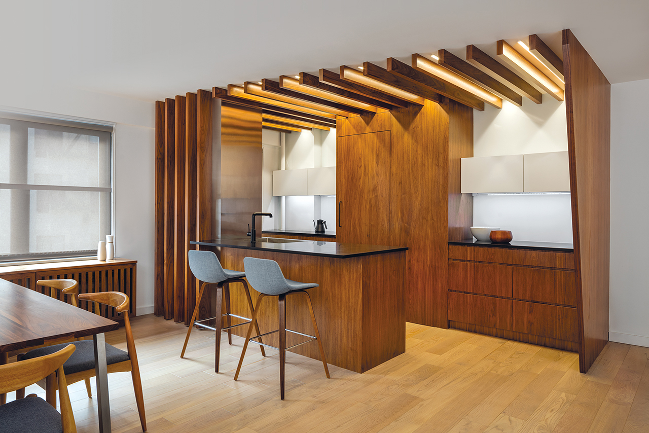
A tiny concrete cave of a New York City apartment is turned into a work of art by architect Andrew Mikhael, who used walnut not just for cabinetry but also for structural elements. The concrete ceiling couldn’t accommodate recessed lighting, so he installed LED tape lights in channels and then surrounded them with walnut slats. The angled walnut wall was designed to reference a drawn-back curtain revealing the sculptural space.
Modern Nostalgia
When a 30-something guy bought a tiny, concrete cell of an apartment on New York City’s Upper East Side, he turned to architect Andrew Mikhael for help. The client showed Mikhael photos from his grandmother’s home, a place that inspired wonderful memories. When Mikhael saw the grandmother’s Danish serve ware and the simple, elegant mid-century furnishings, he knew exactly what to do.
“Since he loves to have people over and cook and bake for them, I knew the kitchen should be an unexpected centerpiece,” reports Mikhael, “a functional work of art. We removed the wall between the galley kitchen and the living room to combine the spaces. We also extended the kitchen into the entryway space, thus expanding the kitchen from 56 square feet to 87 square feet. Next, we installed an angled walnut wall that recalls a partially pulled-back curtain, dramatically revealing the sculptural kitchen.”
Mikhael used walnut throughout the kitchen as an homage to the client’s grandmother. He even wrapped a structural column that couldn’t be moved in walnut. The remarkable workmanship morphs and blends, wraps and anchors, and ultimately hammers out a rhythm.
Lighting was a problem in the apartment. “Because the ceilings were concrete, lighting couldn’t be recessed into them,” explains Mikhael. “As a result, LED tape lights were mounted in long channels one inch below the ceiling, and we then used wood slats to give them a home. The slats don’t just shield the lighting channels, they also hide the unsightly concrete.”
Cabinetry is frameless with simple finger pulls to keep the look minimalist, countertops are matte black Corian, the range and hood are wrapped in stainless steel, and backsplashes are backlit glass.
Mikhael warns that a meticulous carpenter is needed for this kind of work. “I asked my contractor if he minded if I worked with the carpenters at Conex Interiors directly,” he relays, “and he gave me his blessing. They did an incredible job.”

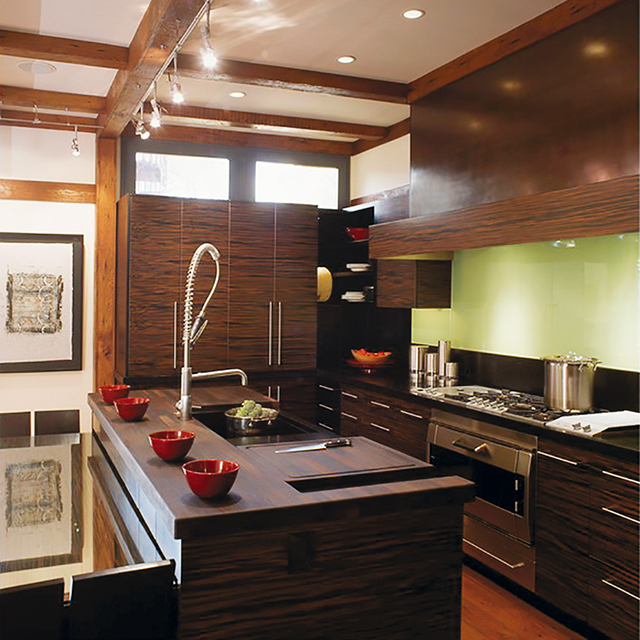
Designer Jennifer Gilmer proves that Japandi minimalism can be elegant and timeless, designing this kitchen with cabinetry crafted from Macassar Ebony, an engineered veneer.
Photos: OEO Studio
Japandi Meets Bungalow
Jennifer Gilmer, an award-winning kitchen and bath designer and principal of Jennifer Gilmer Kitchen & Bath with showrooms in Maryland and Virginia, says that she tells clients, jokingly, that she designs “Western Feng Shui” kitchens. “But I am really quite serious,” she remarks. “The more I learned about Feng Shui, the more I realized that I was unwittingly doing just that. It has become my signature style. So no matter what the design is, and they are all very different, the one thing they have in common is that they make you feel good. That’s Feng Shui.”
Japandi fans will testify to its built-in Feng Shui, so it’s no surprise that Gilmer chose modern Japanese design as the look she wanted for her own home. “This was a Sears bungalow,” she tells. “It was a far cry from the elegant minimalism of Japanese design, but my architect magically made my aspirations possible with a modern addition at the back of the house. There, I got the beautiful and functional space I had visualized for cooking, family life and entertaining.”
Knowing that the cabinetry would be the main focus of the kitchen, Gilmer sought out Premier Custom-Built Cabinetry, which has developed its Mizuki style inspired by Japanese folk houses and traditional Tansu cabinetry.
“We chose an engineered veneer crafted to look like Macassar Ebony,” relays Gilmer. “The wood grain is horizontal, and the ‘striped’ look is so striking that everything else in the kitchen was chosen to complement the cabinetry. No other element was allowed to distract from its beauty. For example, honed black granite was used for the countertops and wenge for the island wood detail. Wenge is similar to cherry, but turns dark over time. The backsplash behind the cooktop is backpainted glass, the farmhouse sink sits on black granite to protect the cabinets from water damage, and dishes are kept on floating shelves.”
She’s especially fond of the pantry, with its retractable bi-fold doors. They open to reveal a countertop, and it houses a steam oven as well as a plethora of cooking accessories. When not in use, the doors are shut so the pantry looks beautiful when entering the kitchen.
The gnarly irregularity of the unclaimed wood floors and beams contrasts with the clean, sleek cabinets, creating precisely the kind of juxtaposition that’s quintessentially Japanese. “So, yes, modern Japanese design and American Bungalow can mix well,” concludes Gilmer. “This space will never go out of style because it honored and melded two very tasteful styles that have proven the test of time.”

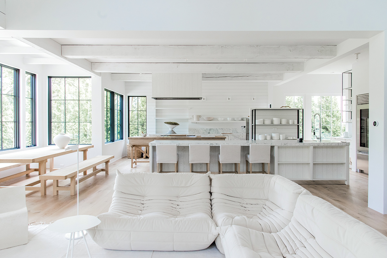
Neutral colors but strong texture contrasts of this Winnetka, IL open kitchen/family room/ dining area by Mick De Giulio reflect the design aesthetics of both Scandinavia and Japan.
Photo: Belen Aquino
Detailed Minimalism
Mick De Giulio, principal of de Giulio Kitchen Design in Chicago, IL, pays visits to near and far locales, and those influences have a way of creeping into his kitchen designs. Japanese and Scandi aesthetics may appear in a design here and there, but in typical De Giulio fashion, inspirations remain just that. From there they are carefully curated and translated into one-of-a-kind designs.
Such is the case of a kitchen he designed in Boston – a classic 19th-century Victorian with a modern addition in the back. “It was just right for a family friendly kitchen,” notes De Giulio. “It’s a contemporary, clean-lined space, but it blends seamlessly with the old part of the house, he remarks. “The design emphasizes asymmetry and horizontals, and the layout is straightforward. Materials play an important role in keeping the space serene. We used light walnut in an organic, almost natural color that we nicknamed ‘Norwegian’ for its sun-bleached, Scandinavian look.”
Of course, everything that De Giulio designs is actually not that simple. A kitchen may look minimalistic, but it’s sure to include exquisite details that don’t shout. The Boston kitchen’s cabinetry, for example, is framed in bronze and contrasts subtly with brushed Iceberg quartzite. The edges of the quartzite counter were mitered to make the slab look extra thick, and a stair-step design at one end provides room for extra seating. The quartzite is repeated on the backsplashes and wrapped the range area.
In another kitchen in Winnetka, IL, De Giulio, worked the wood, creating cabinets with seemingly unfinished, textured surfaces. The space was a riff on a style that the client called Belgian farmhouse, but it is also a look that’s beloved in Scandinavian and Japanese farmhouses. De Giulio achieved it using white oak, cross-cut against the grain. To emphasize the casual, freewheeling look of the light-filled space, he installed legs on the island and placed the cooktop on a table made of reclaimed wood. Finally, he introduced some freestanding stainless steel cabinets for a bit of an industrial vibe.
“There’s nothing sleek about this space,” comments De Giulio. “It is full of textures and juxtapositions. Nobody ever heard of Japandi when this kitchen was designed, but I think it plays into the style. It’s a strong style, especially because it is so adaptable.”

Marcus Otten calls the Royal Ebony veneer used for the cabinets in this kitchen the most beautiful he has ever seen, with unique colors and patterns that dictate that the cabinetry should be the key element.
Photos: Kimberly Gavin
Globetrotting Style
How do a couple of world travelers get a kitchen that reflects their global style, works as a canvas for treasures from many countries and yet functions for everyday life? They get together with award-winning designer Marcus Otten of Exquisite Kitchen Design in Denver, CO. Otten is known for a singular motto: “There are 10,000 different ways to do things, but only one way to do it right.”
For the world travelers, he designed a space where everything tells a story and brings up memories. The couple’s objets d’art are displayed throughout the space, including on floating shelves. The most stunning element, however, is the cabinetry featuring Royal Ebony veneer.
“It’s the most beautiful material I have ever seen,” remarks Otten. “It features unique color patterns and is very rare. There simply are no more logs. This African tree grows slowly and can only be turned into lumber when it’s 100 or so years old.”
Rift-cut oak for other cabinets and the island plus steel accents provide the layers and textures that Otten favors. Altogether, the space contains a lot of the Japandi influence: meticulous craftsmanship, beautiful wood, thoughtful contrasts and artistic accents.
Japandi’s elements are expected to continue to resonate with designers, who find its sophisticated minimalism warmed by craftsmanship and artistry endlessly adaptable. Many homeowners also understand and embrace the concepts of hygge and wabi-sabi, which Japandi fans call “yin and yang” at its best. Gilmer’s reference to it as “great Feng Shui” reflects its staying power in design. ▪
