
When is a scientific experiment like a beautiful work of art?
There is a long tradition among scientists of comparing scientific models, images, theories and experiments to works of art. We are told that Albert Einstein’s theory of relativity, the double helix structure of DNA molecules, and images of colliding particles are beautiful, and that, just like works of art, they evoke in us aesthetic responses. Scientists themselves, like artists, are praised for their creativity, originality and aesthetic sensibility. Einstein, for one, regarded the American physicist Albert Michelson, who with Edward Morley co-designed the experiment to measure the velocity of Earth relative to the ether, as ‘the Artist in Science’, claiming that not only did Michelson care for devising a good experiment, he wanted his creations to be beautiful too.
So what does it mean for an experiment to be beautiful? Let us start with the example of Foucault’s pendulum, which allows us to illustrate three important ways in which an experiment can be beautiful. In 1851, the French physicist Léon Foucault devised a way of demonstrating that Earth rotates on its axis. He hung a heavy metal weight from a long cable fixed to the inside of the dome of the Panthéon in Paris. When he set this pendulum in motion, it slowly swung back and forth, tracing lines in sand placed beneath it. After some time, it became clear that the traces were not all in one line because of Earth’s rotation beneath the pendulum.
This pendulum was beautiful in an obvious visual sense – as a kind of kinetic sculpture with an almost mesmeric, slow, back-and-forth movement. Scientific equipment can indeed be beautiful, and often is. Take, for instance, chemical retorts, prisms, microscopes and complicated structures built in laboratories. Museums house beautifully crafted scientific instruments and equipment from the past because we can appreciate their aesthetic features. The phenomena we study in the experimental setup – such as copper sulphate crystals, rainbows produced by prisms, and the microscopic structure of cells – can be beautiful too. But what made Foucault’s pendulum a beautiful experiment is more than its visual beauty. Far more importantly, it showed the effects of Earth’s rotation, something important that hadn’t been demonstrated before, and it did this in a clever, imaginative and elegant way. The pendulum itself was beautiful, but the ultimate beauty of the experiment is a combination of its significance and its design.
It’s hard to identify the most beautiful experiment in science, but one of the most beautiful in biology was designed by the American geneticists Matthew Meselson and Franklin Stahl to discover how DNA replicates. What is it about this experiment that makes it beautiful? To understand this, first let us reflect on what the experiment set out to do. It was performed only a few years after one of the most exciting scientific breakthroughs of the 20th century: the discovery in 1953 of the double helix structure of DNA. With the structure of DNA established, the next question the scientific community needed to address was how DNA replicated. There were already three different hypotheses proposed: 1) conservative replication, according to which each of the two strands of the parent DNA molecule are replicated in the new one; 2) semi-conservative replication, according to which one strand of the parent DNA is conserved in the daughter DNA; and 3) dispersive replication, according to which the parent DNA chains break at intervals, with the parental segments combining with new segments to form the daughter DNA. Meselson and Stahl set out to give an answer to the question of how DNA replicates by designing an experiment that would decisively discriminate between the three proposed hypotheses.
In 1958, the two scientists published the results of that experiment. What they had done to determine the correct hypothesis on DNA replication was to feed bacteria nutrients containing a heavy nitrogen isotope that gets incorporated into the bacterial molecules through metabolising. They studied the genetic material through the next generations, knowing the rates at which bacteria multiply. Instead of using radioactive labelling of the DNA strands, which was common at the time, they decided to use density, and separated the heavy DNA from the light using density-gradient centrifugation. By studying the ratios of light, heavy and hybrid DNA that they obtained, Meselson and Stahl were able to eliminate the conservative and dispersive replication hypotheses, confirming that DNA in fact replicates semi-conservatively.
A further aspect of its aesthetic value is not only what this research taught us but also how it did so
One of the reasons why this experiment is celebrated in science is because it is an example of an experimentum crucis, or a ‘crucial experiment’. Such experiments are important; they deliver a decisive answer to a question. Usually, an experiment is considered crucial when it confirms a hypothesis among alternative competitors, and thus settles a dispute. It is from this ability to deliver a decisive answer to the question of how DNA replicates that the Meselson-Stahl experiment can be considered to derive its beauty. The results are taken to have been clear and straightforward, to have decisively spoken in favour of one of the contender hypotheses, and to have dismissed the alternatives. In his book Beauty and the Beast (1999), the German historian of science Ernst Peter Fischer argues that ‘the Meselson-Stahl experiments speak … for themselves and made all further commentary superfluous’. In his history Meselson, Stahl, and the Replication of DNA (2001), Frederic Lawrence Holmes further argues that the simplicity and clarity of the result makes this experiment easily presentable even to students, serving as an exemplar experiment for science education.
The above considerations focus on what the Meselson-Stahl experiment did, the significance of its results, but a further aspect of its aesthetic value is not only what this research taught us but also how it did so, and this later consideration concerns its design. The Meselson-Stahl experiment is regarded as having an elegant and apt design that is optimally suited for the purpose it set out to achieve. Following the reasoning behind their experimental setup reveals the ingenious beauty of the design that the scientists created. By making the genetic material initially heavy and then light, Meselson and Stahl could extract and measure its weight through the next generations. It is this idea that makes their design original and elegant, and they used the optimal materials and techniques for the job. As such, their simple experiment integrates innovative and creative thinking, and shows aptness by delivering on what the elegant experiment was designed to do, by conclusively deciding which hypothesis was correct.
Having established that the beauty of experiments lies in the elegance and simplicity of their design, the significance of their results and the creative thinking of their designers, I now want to consider whether these aesthetic ideals have carried over to contemporary experiments in science.
There is a clear asymmetry between experiments of a century ago and experiments today. Past experiments, such as the Meselson-Stahl experiment, often involved a few scientists in a room, relatively cheap equipment, and generally the results could be perceived or established without lengthy interpretative work. Experiments today look rather different. Take, for instance, CERN’s experiments at the Large Hadron Collider (LHC) near Geneva, which not too long ago made one of the most significant discoveries in the history of particle physics: the detection of the Higgs boson that was predicted by the Standard Model. This experiment involves highly complex machinery (which has its own kind of beauty) and data analysis; it is the result of collaborative work between thousands of scientists; and the very boundary of the experiment transcends the borders of countries. Given their complexity and size, do large-scale experiments fit with previous aesthetic ideals? Have they become aesthetically disvalued, or can they still be praised for their aesthetic features?
It is undeniable that such contemporary experiments are highly complex: from the machinery they use to the data they produce, they can overwhelm with their size and setup. However, perhaps there is still scope to assign a similar aesthetic value to them as to experiments from a century ago. It seems to me that, despite the complexity behind large-scale experiments, design and aptness continue to be the subject of aesthetic appreciation, and so is the creativity and originality exhibited in the experiment’s design. This is despite the fact that the creativity exhibited in the experimental design is now better ascribed to the collective thinking of the community, rather than necessarily to a specific individual, and the optimality and aptness of the design is concealed beneath the complexity of the experimental setup and the machinery involved.
The appreciation of beauty in science, and in art, is not necessarily immediate to us
Even if we could make the argument that similar aesthetic features get praised during different experimental traditions, there is a further difference between experiments from a century ago and those of today that perhaps should force us to reconsider the claim of similarity. The difference concerns the way in which we arrive at experimental results. As mentioned earlier, one of the aspects we can appreciate in the experiments on DNA replication is their immediacy: we can observe the results in a ‘singular historical event’, as Holmes noted. Such immediacy was characteristic of many, although certainly not all, early experiments. Let’s go back to the experiments that natural philosophers performed with the air pump, which allowed them to study many phenomena with a newly invented instrument that could extract air from a cylinder.
As the painting An Experiment on a Bird in the Air Pump (1768) by Joseph Wright of Derby depicts, one could immediately perceive the effect on the living creature when the air from the cylinder was extracted using the air pump, which in turn generated a variety of responses in the audience, from fascination and awe to terror. Similarly, we can see the rainbow through Isaac Newton’s prisms, and we can see the bands of light-, heavy- and intermediate-density genetic material in the Meselson-Stahl experiments.

But is there anything immediate when it comes to detecting particles and forces in a huge particle accelerator such as those detected by the LHC? Is there any sense in which the experimenter perceives the result in a ‘singular historical event’? Large-scale experiments often involve lengthy statistical data analysis before the experimental scientists can agree whether the data collection indicates an ‘event’ and whether the event constitutes a discovery. But this asymmetry between experiments with immediately perceivable results and those whose results involve time-consuming analysis, while noteworthy, is not surprising. It simply shows us that the appreciation of beauty in science, and in art, does not always involve perceptual features, and the aesthetic response is not necessarily immediate to us. After all, while many paintings and sculptures might evoke in us an immediate aesthetic response, this is certainly not necessary, and is certainly not the case when we consider artworks such as novels and concertos. We need some time and work to get through an entire novel or a concerto before we can fully appreciate its beauty and aesthetic significance more generally. Similarly with the results of many, especially very complex, experiments, it is ultimately the appreciation of the interplay between design and the significance of the result that provokes the aesthetic response.
So far, we have seen that design is an integral part of our aesthetic appreciation of experiments, but we also seem to value those experiments that did something important: whose results helped to confirm a theory or to make a discovery. A final point I want to explore is how we can understand the significance of experiments that produce null results – can such experiments be beautiful too? Both the abovementioned experiments – the Meselson-Stahl and the Michelson-Morley – were highly original and elegant in their design. But while the former helped confirm the nature of DNA replication, the latter did not deliver on what it was designed to do: the interferometer never detected ether drift, despite continued attempts. Is the Michelson-Morley experiment then disqualified from being beautiful, because of the null results?
I have argued that our understanding of what qualifies as a successful experiment needs to be much broader than simply its confirmation of a hypothesis or its discovery of a predicted particle. For example, the existence of the ether was once an undisputed assumption, until Michelson and Morley set up their incredibly careful experiment, which showed creativity and imagination in its elegant design. Even though it turned out that there is no such thing as an ether, their null results challenged accepted beliefs at the time and prompted the exploration of a new paradigm. So the Michelson-Morley experiment is beautiful because it offered the most elegant way to achieve its goal: the two scientists exhibited original and creative thinking, inventing one of the period’s most precise measurement devices, and delivering an experiment of insurmountable scientific import.
Contrary to Meselson and Stahl, who did deliver an answer aligning with scientific expectation, the results of the Michelson-Morley experiments were disruptive. But it is this disruptive nature of their results that prompted the identification of the limitations of our knowledge and opened the door to revisit and reformulate our physics, leading to the acceptance of Einstein’s special theory of relativity and the abandonment of the Newtonian framework. The design was beautiful, the setup careful and original, and the results were disruptive, surprising and awe-provoking. Just like many artworks that challenge our fundamental assumptions about ourselves and our place in the world, beautiful experiments can deliver results that prompt us to reconsider our working assumptions. Their aesthetic significance is intricately related to our state of understanding, and illustrates the diverse nature of the aesthetic experiences that scientific products and artworks can elicit.
New interactive art installations light up South Lake Union
The light art will be here until Dec. 31. Sponsored by South Lake Union Chamber of Commerce.
SEATTLE — Holiday lights are common this time of year — but a new art installation in Seattle’s South Lake Union neighborhood is taking lights to the next level.
“One of the goals was to bring to Seattle installations that would occupy and activate the public spaces,” said Alexandre Lemieux, co-founder of Creos who brought the art installations to Seattle. “So, it was to find something very unique, interactive that would generate very unique interest,”
One of those displays generating interest is called Passage.
“The installations itself, you have sensors on the side of you, and when you’re walking you trigger the installation itself. So, it’s a very beautiful, luminous installation where interactively every user has a part in it, and you can see different patterns whenever you go.”
A few blocks away you’ll find two more displays to interact with.
“Prismatica, I would say that it’s one of the pieces that we traveled the most,” said Lemieux. “You have those 25 units at Prismatica. So just in terms of quantity, you have all of them that you can go and have them for a spin. It kind of invites you to whenever you’re on your working hours or go during the day, but at night, you want to come back with your friends and family. It kind of gives you this ability to kind of see something different whenever you go by.”
At the display Oscillation, you can see as well as hear the art.
“You can trigger sensors with your hands. Each of the units becomes a musical instrument that whenever you activate them, and it’s free, you can have your very own experience with them and the unit themselves.”
The light piece Impulse can be found by the Amazon Spheres.
“This installation, it’s really about bringing the nostalgia in, thinking about when you’re a little younger, you’re going to the park. But then with this unique vision of the artist, you have something that is really beautiful. That’s where you can play, you can go on to seesaw. For a moment of time, you want to go for a laugh, you just forget all problems and anything that you had during your day and you’re just you become a child for a few minutes.”
So while holiday lights are nice, in South Lake Union, they’re even better after dark.
“You want to come in and enjoy your neighborhood in a way that you’ve never experienced it before.”
SLU After Dark will be in place till December 31.
Thompson Savannah features new art installation, curated by local gallerist Susan Laney | Visual Arts | Savannah News, Events, Restaurants, Music
Thompson Savannah is featuring a new art installation with hopes of connecting both locals and tourists to art and culture in the Hostess City.
The new installation is a part of the Thompson brand’s “Culture Lives Here” campaign.
The hotel has partnered with local gallerist Susan Laney, owner of Laney Contemporary, to bring 40-50 pieces of work by Atlanta-based Benjamin Jones to its lobby.
Jones’ featured works include sculptures of rabbits made from multicolor pins and pom poms, a display of hundreds of toy animals from Jones’ childhood, drawings and more. Laney Contemporary says Jones has been creating art for over 25 years that shows his “innermost feelings and insecurities, while touching a familiar place in all of us.”
Matt Graham, General Manager of the Thompson Savannah, says the point of the “Culture Lives Here” campaign is not to feature Savannah-themed art in the hotel’s lobby, but to celebrate work found in local galleries or by local artists that will be attractive to Savannahians. He says when locals enjoy a hotel in town, it creates a better experience for tourists and ultimately benefits the entire community.
“The best way to make a hotel great for visitors to Savannah is to make it relevant to locals in Savannah,” Graham said. “If we can position this hotel as having some relevance to what we find interesting, whether it’s established or up-and-coming, here, it lends a value to the community that guests feel when they visit.”
“If you come to the bar in the evening as a visitor, and the person to your left or to your right is someone from Savannah, it opens up the experience of visiting Savannah in a different way and connects you a little more to what’s happening in our town than a hotel may normally be able to do,” Graham added.
Graham says finding art, both established and up-and-coming, to feature in the hotel was a fun task.
“Savannah punches over its weight culturally,” he said. “I think there’s our history, the influence of SCAD, the people who choose to make this place their home. It’s not difficult to find things to celebrate. There’s a lot of things going on when you just go for a walk around town.”
Ultimately, Thompson Savannah landed on Laney Contemporary to put together the first “Culture Lives Here” installation.
“Susan graduated from SCAD and has been in town most of the time since then,” Graham said. “I think she has a good eye and she’s a really fantastic person.”
Laney has also put together a list of local “hot spots” for visitors of the hotel to check out. Graham says he’s excited about the idea of visitors looking at art curated by Laney, then being able to go visit her favorite spots around town, feeling even more connected to the community.
“I hope they feel that they chose a hotel for their visit to town that allowed them to connect to Savannah in a more meaningful way,” he said. “I hope that they feel the same love and connection to the arts that we all feel here and that they come away with the idea that culture matters in this town. If our hotel can be a small part of that just by celebrating others, then I feel like we’re on the right track.”
Jones’ work will be on display at Thompson Savannah, located at 201 Port St., through January, and then a new installation will go in.
You can follow Thompson Savannah on Instagram at @thompsonsavannahga and learn more about Laney Contempory at laneycontemporary.com
From Olafur Eliasson to Gerhard Richter: the art show aiming to unite Europe | Art
When it comes to outsized projects with geopolitical undertones, Walter Smerling has form. Between 2015 and 2017, the chairman of the Stiftung für Kunst und Kultur (Foundation for Art and Culture) in Bonn and a German art-world statesman of sorts organised the largest ever exhibitions of Chinese art in Germany and German art in China. And when tensions between western Europe and Russia started rising around the same time, he envisaged a continent-spanning exhibition: “A dialogue,” as he puts it, “about what unites people in Europe. About democracy, about solidarity, about personal and political freedom.”
The result is Diversity United, a traveling group exhibition comprising over 150 artworks by around 100 living artists, from 34 countries, chosen by 10 curators. It is not, mercifully, about Brexit, but it does aim to highlight “the importance of a united Europe during times of political uncertainty”. Smerling says he is on a mission to promote basic liberal values. “How do we work together?” he wanted the show to ask. “What do respect, dignity and freedom mean?”
In 2018, he convened curators from museums and galleries across the continent and together they whittled down a longlist of 300-plus living artists to about 90. And for something funded almost entirely by the private sector, it is an impressive muster. All the textbook Europe-related names feature: from octogenarian luminaries Georg Baselitz, Paula Rego and Sheila Hicks to Sonia Boyce (who will represent Britain at the Venice Biennale in 2022), and Yan Pei-Ming (one of the few contemporary artists whose work sits in the Louvre, following his own Venice appearance in the early 2000s). Moscow-based painter Ekaterina Muromtseva is the youngest, born in 1990.

Gerhard Richter, who at this point in his career really could get away with always saying no, called Smerling up and instantly agreed to take part. He proposed his European Landscapes, a set of 60 uncharacteristically small, gem-like overpainted photographs, that few will know. Anselm Kieffer too went all out, with a piece that no one had seen yet: a full-scale mise-en-scène of 19th-century Romantics (from Madame de Staël to Lord Byron), inscribed, in that immediately recognisable cursive of his, into a painterly, wintery forest.
And Christian Boltanski, who sadly passed away between the printing of the catalogue and the show being installed in Berlin in May, made a new video work entitled Etre à nouveau (“To be again”) Diversity United. Formatted like one of those children’s books where you can mix and match the heads, bodies and tails of creatures, this piece features monochrome headshots of unnamed children from Russia, Germany and France, their foreheads, eyes and mouths constantly shuffling into new facial configurations.
The curatorial team spent hours transcribing telephone conversations with the artists about their work and their relationships to Europe as a place and an idea. Nothing about that is straightforward though, not least what is meant by “Europe”.
The term refers neither to the EU, nor to the Council of Europe. The map in the catalogue excludes Turkey (which has been on said council since 1950, 46 years before Russia was granted membership) yet Turkish-born, Amsterdam-based conceptual artist Ahmet Ögüt makes his mark with an arresting installation composed of protective police shields.
Several of the curators point out that most of the artists here have lived in at least two countries, many in several more, and several weren’t born where they now call home. As Paris-based British curator Simon Baker says of Yan Pei-Ming: “One of China’s greatest artists has been based in Dijon for the last 38 years and has made these incredible paintings about Napoleon. To me, that’s contemporary Europe.”
I saw the first instalment in West Berlin, entering through a discombobulating portal of yellow light courtesy of Icelandic – Danish artist Olafur Eliasson (the second instalment is now open in Moscow). The show is divided into 10 chapters. In the opener – titled Dreams and Democracy – at Lucy and Jorge Orta’s Antarctica World Passport Office, you can acquire citizenship and papers for a fictional community dedicated to combatting climate change and global inequality. My passport is numbered 2188. You can get a mini man too – one of the thousands of plastic models Fernando Sanchez Castillo has made of the one resistant who refused to give the Nazi salute in a crowd of Hitler supporters in 1936. And you can sit with Moldovian film-maker Pavel Brăila’s magnificent Shoes for Europe, from 2002: a documentary about how former USSR trains have to make a stop en route to western Europe because their carriages are fitted for a wider gauge of railroad track. They have to change their shoes.

Yan’s depiction of Napoleon crowning himself (in masterful, monochrome crimson) anchors the third and most powerful of the chapters. Entitled Memory and Conflict, this grouping includes a Tarkovskyesque video meditation on fear – an endless shot of what looks like an asteroid that ceaselessly flames but never crashes, by Moscow collective Bluesoup. Polish sculptor Alicja Kwade’s rocks on slender structures is a mesmerising moment of heft and disquiet both. And Latvian artist Kristaps Epners offers up a deeply evocative diptych featuring, on the one hand, a silent film about an old man in a leather jacket traversing a cold lake and, on the other, a patchwork travelogue about two young men on a journey into Siberia.
You come out of that (I was moved to tears) only to be greeted by Estonian sculptor Kris Lemsalu’s altogether more rambunctious poetry: a wall-based pincushion of freewheeling, lifesized limbs cast in clay and glazed like a Jackson Pollock, ensconced in this tufted pink eiderdown with a boombox and multicoloured climbing wall grips scattered all about in every which way. It is a dance you can’t hear but you can definitely feel: satisfyingly and gleefully tactile.
The project, like any textbook, is as deeply flawed as the territory it seeks to showcase. For something that literally has “diversity” in the title, the cast is almost all white. Certainly all the curators are. But there is, undeniably, beautiful art everywhere, from some of Europe’s most spellbinding artists. And in that sense this is a show that cannot fail.
The Art of Japandi – Kitchen & Bath Design News
Kitchens
authors
Lis King | November 29, 2021
Sometimes two great styles are better than one. That’s what happens when the raw functionality of Scandinavian design fuses with Japanese nature-suffused simplicity, and it’s a look that fits American kitchens like a glove. Designers say it creates wonderful zen, with some famous Scandi and Japanese variants adding warmth and interest to sleek minimalism.
At first glance it may seem an unlikely design union, since Japan and Scandinavia are on opposite sides of the globe. But, in actuality, their design sensibilities are remarkably similar, and Denmark, especially, has had a close trade relationship with Japan for hundreds of years. The Danish design museum in Copenhagen even devotes exhibit space to Japanese design.
Thomas Lykke of OEO Studio in Copenhagen, Tokyo and Kyoto applauds the design fusion of the two countries, but dislikes that it’s dubbed a trend.
“Trends tend to pass by,” he says. “The Japanese-Danish connection goes far beyond that. I call it shared DNA. Meticulous craftsmanship and attention to details, simplicity and timelessness are deep-rooted in both countries’ culture. We want design that will be relevant 50 years from now. And we are, in our hectic lives, looking for meaningful ways to live, through craftsmanship and rituals, whether that’s a tea ceremony in Kyoto or a coffee break in Copenhagen. Also, neither country has vast natural resources, so we respect what we have and work with it.”
Although Japandi at its roots is the epitome of minimalism, two special concepts set it apart. One is “hygge,” a Danish word now known by designers everywhere, meaning cozy comfort. In Scandinavia this is achieved with lots of textures and touches of color. The other is wabi sabi, the Japanese concept of finding beauty in something imperfect. This could be a well-loved heirloom, perhaps a piece of furniture or a well-used utensil. Although Scandinavians don’t talk about wabi sabi, they, too, love to let the patina of something old and well-loved add charm to a space.
Cabinetry in a Lykke kitchen is always the main event. In one kitchen, for example, cabinets aspire to be more a piece of furniture that fits naturally into living environments rather than a stand-alone kitchen. It combines simplicity and refined, contrasting materials. Lykke calls it “a quality culinary space rather than merely a show kitchen.” Another kitchen features modular cabinets, a popular concept in European homes. The modules are sectioned using slender metal dividers and sit on metal plinths creating a light, floating look.

A tiny concrete cave of a New York City apartment is turned into a work of art by architect Andrew Mikhael, who used walnut not just for cabinetry but also for structural elements. The concrete ceiling couldn’t accommodate recessed lighting, so he installed LED tape lights in channels and then surrounded them with walnut slats. The angled walnut wall was designed to reference a drawn-back curtain revealing the sculptural space.
Modern Nostalgia
When a 30-something guy bought a tiny, concrete cell of an apartment on New York City’s Upper East Side, he turned to architect Andrew Mikhael for help. The client showed Mikhael photos from his grandmother’s home, a place that inspired wonderful memories. When Mikhael saw the grandmother’s Danish serve ware and the simple, elegant mid-century furnishings, he knew exactly what to do.
“Since he loves to have people over and cook and bake for them, I knew the kitchen should be an unexpected centerpiece,” reports Mikhael, “a functional work of art. We removed the wall between the galley kitchen and the living room to combine the spaces. We also extended the kitchen into the entryway space, thus expanding the kitchen from 56 square feet to 87 square feet. Next, we installed an angled walnut wall that recalls a partially pulled-back curtain, dramatically revealing the sculptural kitchen.”
Mikhael used walnut throughout the kitchen as an homage to the client’s grandmother. He even wrapped a structural column that couldn’t be moved in walnut. The remarkable workmanship morphs and blends, wraps and anchors, and ultimately hammers out a rhythm.
Lighting was a problem in the apartment. “Because the ceilings were concrete, lighting couldn’t be recessed into them,” explains Mikhael. “As a result, LED tape lights were mounted in long channels one inch below the ceiling, and we then used wood slats to give them a home. The slats don’t just shield the lighting channels, they also hide the unsightly concrete.”
Cabinetry is frameless with simple finger pulls to keep the look minimalist, countertops are matte black Corian, the range and hood are wrapped in stainless steel, and backsplashes are backlit glass.
Mikhael warns that a meticulous carpenter is needed for this kind of work. “I asked my contractor if he minded if I worked with the carpenters at Conex Interiors directly,” he relays, “and he gave me his blessing. They did an incredible job.”
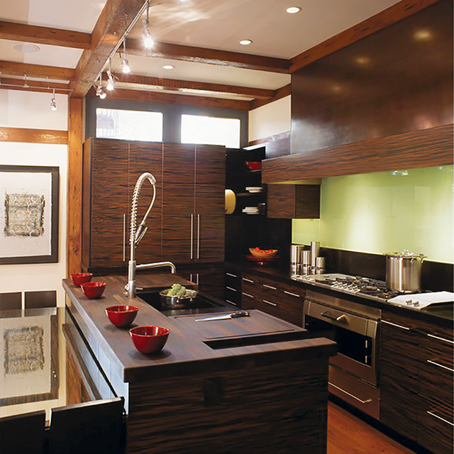
Designer Jennifer Gilmer proves that Japandi minimalism can be elegant and timeless, designing this kitchen with cabinetry crafted from Macassar Ebony, an engineered veneer.
Photos: OEO Studio
Japandi Meets Bungalow
Jennifer Gilmer, an award-winning kitchen and bath designer and principal of Jennifer Gilmer Kitchen & Bath with showrooms in Maryland and Virginia, says that she tells clients, jokingly, that she designs “Western Feng Shui” kitchens. “But I am really quite serious,” she remarks. “The more I learned about Feng Shui, the more I realized that I was unwittingly doing just that. It has become my signature style. So no matter what the design is, and they are all very different, the one thing they have in common is that they make you feel good. That’s Feng Shui.”
Japandi fans will testify to its built-in Feng Shui, so it’s no surprise that Gilmer chose modern Japanese design as the look she wanted for her own home. “This was a Sears bungalow,” she tells. “It was a far cry from the elegant minimalism of Japanese design, but my architect magically made my aspirations possible with a modern addition at the back of the house. There, I got the beautiful and functional space I had visualized for cooking, family life and entertaining.”
Knowing that the cabinetry would be the main focus of the kitchen, Gilmer sought out Premier Custom-Built Cabinetry, which has developed its Mizuki style inspired by Japanese folk houses and traditional Tansu cabinetry.
“We chose an engineered veneer crafted to look like Macassar Ebony,” relays Gilmer. “The wood grain is horizontal, and the ‘striped’ look is so striking that everything else in the kitchen was chosen to complement the cabinetry. No other element was allowed to distract from its beauty. For example, honed black granite was used for the countertops and wenge for the island wood detail. Wenge is similar to cherry, but turns dark over time. The backsplash behind the cooktop is backpainted glass, the farmhouse sink sits on black granite to protect the cabinets from water damage, and dishes are kept on floating shelves.”
She’s especially fond of the pantry, with its retractable bi-fold doors. They open to reveal a countertop, and it houses a steam oven as well as a plethora of cooking accessories. When not in use, the doors are shut so the pantry looks beautiful when entering the kitchen.
The gnarly irregularity of the unclaimed wood floors and beams contrasts with the clean, sleek cabinets, creating precisely the kind of juxtaposition that’s quintessentially Japanese. “So, yes, modern Japanese design and American Bungalow can mix well,” concludes Gilmer. “This space will never go out of style because it honored and melded two very tasteful styles that have proven the test of time.”
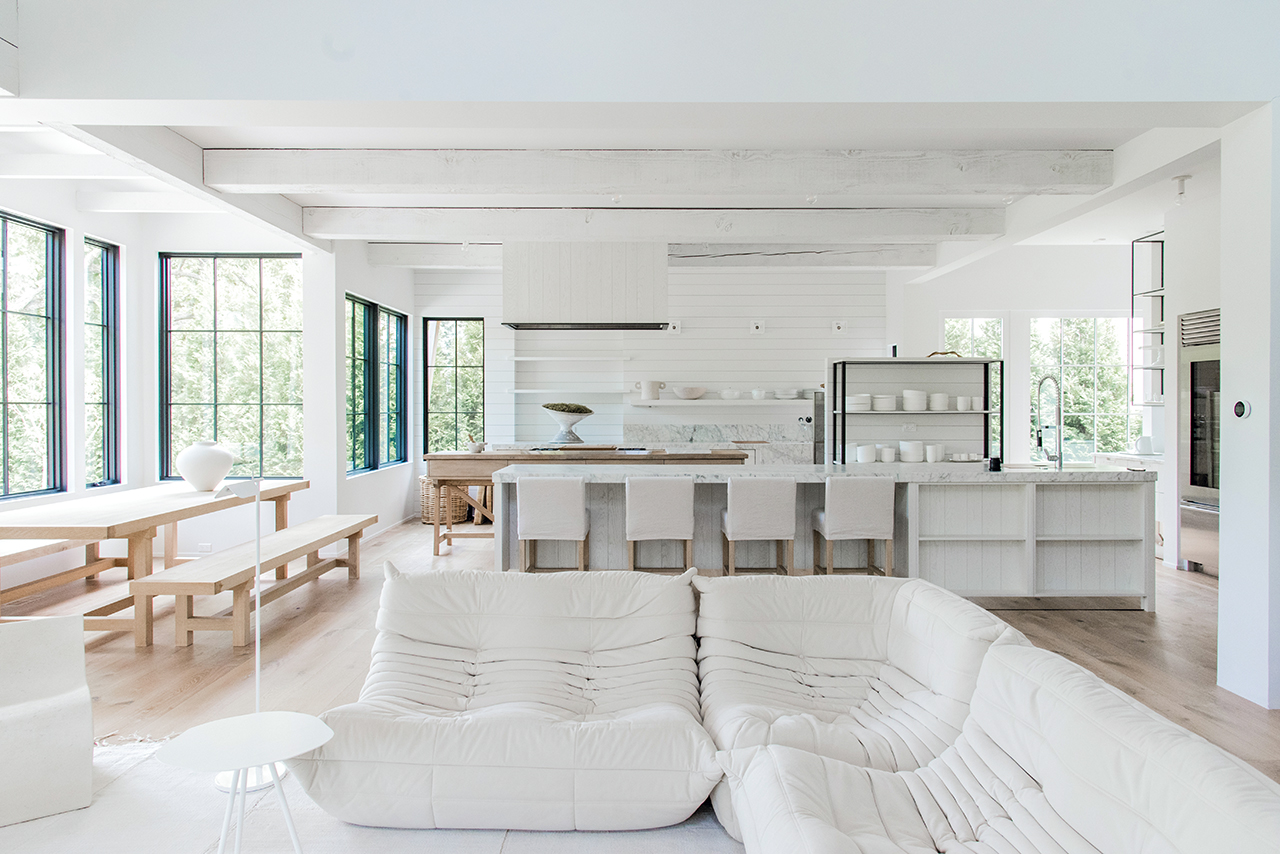
Neutral colors but strong texture contrasts of this Winnetka, IL open kitchen/family room/ dining area by Mick De Giulio reflect the design aesthetics of both Scandinavia and Japan.
Photo: Belen Aquino
Detailed Minimalism
Mick De Giulio, principal of de Giulio Kitchen Design in Chicago, IL, pays visits to near and far locales, and those influences have a way of creeping into his kitchen designs. Japanese and Scandi aesthetics may appear in a design here and there, but in typical De Giulio fashion, inspirations remain just that. From there they are carefully curated and translated into one-of-a-kind designs.
Such is the case of a kitchen he designed in Boston – a classic 19th-century Victorian with a modern addition in the back. “It was just right for a family friendly kitchen,” notes De Giulio. “It’s a contemporary, clean-lined space, but it blends seamlessly with the old part of the house, he remarks. “The design emphasizes asymmetry and horizontals, and the layout is straightforward. Materials play an important role in keeping the space serene. We used light walnut in an organic, almost natural color that we nicknamed ‘Norwegian’ for its sun-bleached, Scandinavian look.”
Of course, everything that De Giulio designs is actually not that simple. A kitchen may look minimalistic, but it’s sure to include exquisite details that don’t shout. The Boston kitchen’s cabinetry, for example, is framed in bronze and contrasts subtly with brushed Iceberg quartzite. The edges of the quartzite counter were mitered to make the slab look extra thick, and a stair-step design at one end provides room for extra seating. The quartzite is repeated on the backsplashes and wrapped the range area.
In another kitchen in Winnetka, IL, De Giulio, worked the wood, creating cabinets with seemingly unfinished, textured surfaces. The space was a riff on a style that the client called Belgian farmhouse, but it is also a look that’s beloved in Scandinavian and Japanese farmhouses. De Giulio achieved it using white oak, cross-cut against the grain. To emphasize the casual, freewheeling look of the light-filled space, he installed legs on the island and placed the cooktop on a table made of reclaimed wood. Finally, he introduced some freestanding stainless steel cabinets for a bit of an industrial vibe.
“There’s nothing sleek about this space,” comments De Giulio. “It is full of textures and juxtapositions. Nobody ever heard of Japandi when this kitchen was designed, but I think it plays into the style. It’s a strong style, especially because it is so adaptable.”

Marcus Otten calls the Royal Ebony veneer used for the cabinets in this kitchen the most beautiful he has ever seen, with unique colors and patterns that dictate that the cabinetry should be the key element.
Photos: Kimberly Gavin
Globetrotting Style
How do a couple of world travelers get a kitchen that reflects their global style, works as a canvas for treasures from many countries and yet functions for everyday life? They get together with award-winning designer Marcus Otten of Exquisite Kitchen Design in Denver, CO. Otten is known for a singular motto: “There are 10,000 different ways to do things, but only one way to do it right.”
For the world travelers, he designed a space where everything tells a story and brings up memories. The couple’s objets d’art are displayed throughout the space, including on floating shelves. The most stunning element, however, is the cabinetry featuring Royal Ebony veneer.
“It’s the most beautiful material I have ever seen,” remarks Otten. “It features unique color patterns and is very rare. There simply are no more logs. This African tree grows slowly and can only be turned into lumber when it’s 100 or so years old.”
Rift-cut oak for other cabinets and the island plus steel accents provide the layers and textures that Otten favors. Altogether, the space contains a lot of the Japandi influence: meticulous craftsmanship, beautiful wood, thoughtful contrasts and artistic accents.
Japandi’s elements are expected to continue to resonate with designers, who find its sophisticated minimalism warmed by craftsmanship and artistry endlessly adaptable. Many homeowners also understand and embrace the concepts of hygge and wabi-sabi, which Japandi fans call “yin and yang” at its best. Gilmer’s reference to it as “great Feng Shui” reflects its staying power in design. ▪