
Home decor essentials for Pantone Color of the Year

While most of us are trying to keep our head above water as we survive the holidays, Pantone is looking ahead — specifically to 2022 — by announcing the color of year. Dubbed “Very Peri,” the periwinkle-esque hue marks the first time the company has created a color from scratch rather than delving into its vast archive of options. “It was really important for us to come up with a new color, because we have a very new vision of the world now,” Pantone Color Institute’s executive director Leatrice Eiseman told CNN, adding, “It is literally the happiest and the warmest of all the blue hues.”

Interior design experts coast to coast couldn’t agree more, telling us (practically in unison) that Very Peri is ab-so-lutely a fit for home interiors. “It’s bold, but also serene; it’s equal parts lively and tranquil; it has some bright energy to it, but it also feels comforting,” explains Think Chic Interiors founder Malka Helft of White Plains, New York. “And I love that it can add a lot of design ‘oomph’ into a space quite easily.”

Bringing more color into the home, says Shaolin Low, founder of the Honolulu-based Studio Shaolin, is always a good thing. “I think after the neutral years of gray, this an amazing departure and moves us toward eclectic styles we are starting to see pop up,” she says, adding, “It’s soothing, playful and feminine, which always makes for a great space, and it’s going to blend easily with the coastal styles we see here a lot in Hawaii, so I think it’s kind of a neutral pop of color — present, but not dominating.”

Lance Thomas of the Louisiana-based Thomas Guy Interiors agrees, saying that the color is actually a versatile workhorse we should all have in arsenals. “Very Peri is a great color choice to warm up a cool-toned room while keeping in a similar color family,” says Thomas. “Table lamps or draperies would be a great way to do that. Conversely, Peri can also be used to cool down a warmer-toned room.”

So, how exactly do we infuse some Very Peri into our homes? Well, there are pretty much only two ways to do it — go big or go small. If you’re going to go big, you might consider swathing an entire wall or space in the hue. “We love using a color like this in a serene space like a bed or bath,” says Nina Grauer, principal and co-founder of Dekay and Tate Interiors, which has offices in Florida and Colorado. “It packs a punch, but still feels relaxing and moody, which is the perfect vibe for those areas. It’s probably best to use an accent wall, even on the ceiling!”

Zane Kearney, Ruggable’s senior director of art and design, advises, “If you’re a maximalist you’ll want to be sure you’re using a good range of complementary colors like a nice teal or sage blue-green to keep it fresh and fun.”

If that is a bit too daunting, baby steps are a better Very Peri tactic for you. “Bedding would be a wonderful place to start,” recommends Paige Gray, partner and lead interior designer at British Columbia firm Parker & Harlow. Gray adds that color can also be injected via some paint on the front door, stacked subway tiles in the bathroom or a textured seagrass wallpaper behind the bedroom’s headboard.

It’s true, Pantone’s Color of the Year can easily be mixed into any space (and with minimal investment), thanks to decor stalwarts like paint, rugs, throw pillows and blankets, artwork, vases, lamps and accent furnishings like an armchair or a console. Says Hillary M. Stamm, founder of Manhattan Beach, California-based firm HMS Interiors, “I love Peri for the interior color of your bookshelves, for the dreamy drapes in the kitchen — this color has so much depth and breadth, it can easily be folded into any room.”

Below, you’ll find your very own Very Peri home decor cheat sheet, brimming with pieces that can quickly and easily be added to your home.

West Elm Watercolor Field Rug

Rugs are a designer’s secret tool for anchoring a space and creating distinct areas within a room — choosing one that blends in some Very Peri will hit two birds with one stone. “This rug would look great in a dreamy, whimsical bedroom with soft bedding and elegant accents,” recommends Leslie Murphy, creative director and owner of Murphy Maude Interiors in Memphis.
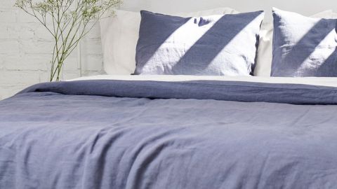
AmourLinen Blue Linen Sheets Set

A big fan of channeling Pantone’s Color of the Year via bedding, Gray loves this set specifically for its fabric. “I love when the color speaks to the texture of a product, and for Peri, my mind went immediately to linen. Here, a soft, livable textile application on the bed makes the color the focus and lets the fabric sing its praises.”
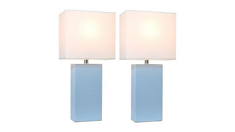
Elegant Designs Modern Leather Table Lamps in Periwinkle with Fabric Shades

A must-have Peri item on Grauer’s list? This set of gorgeous leather-textured lamps that are great for bedside tables or anchoring a living room console. Pro tip: Grauer recommends swapping out the shades for a custom option.

Top Plaza Natural Amethyst Geode Cave Healing Crystal

“I recommend using Very Peri in small doses as the vibrant color in the room,” says Sarah Stacey of Sarah Stacey Interior Design in Austin, Texas. “For example, when covering your whole room in color, you could use a muted petrol on walls, navy on your sofa and have hints of Very Peri on accent chairs or small accessories.” Case in point: This awesome geode that is bursting with periwinkle hues. “Decorating with natural stone is always elegant and timeless,” Stacey advises, adding, “Place some amethyst in bookcases for layered styling.”

Baccarat Papillon Lucky Butterfly Sculpture

“If you want to just add a few touches of Peri, think throw pillows, an accent chair, vases and even flowers,” recommends Grauer. Case in point: This stunning objet d’art from Baccarat. Uplifting to look at, the glinting crystal butterfly (in the purple hue!) is a gorgeous piece to add to a desk, coffee table or bookshelf.

Chasing Paper Got the Blues Print

Statement-making art that is also oversized and easy on the wallet? Yep, it exists — even in Very Peri hues. “I loooveee this piece and am planning on using it in a project,” says Low. “It’s feminine, playful and soothing, all the things I used to describe Peri packed into one piece of art. It’s simple and bold without being overwhelming.”

Le Creuset Mug

We all need an excuse for more Le Creuset in our lives, and luckily Stamm found one for us, saying that this periwinkle-hued Le Creuset coffee mug “is gorgeous for your open-kitchen shelving…and your early morning coffee!” You can get a set of four on Amazon for just under $60 too.

KDC Tile and Marble Blue Ceramic Subway Tile ($14.69 per square foot; wayfair.com)
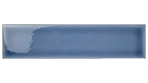
KDC Tile and Marble Blue Ceramic Subway Tile

“I love a bold powder room, and what better way to integrate Peri than to mimic the subtle gloss and watery hues of seashells in a stacked subway tile,” says Gray, who loves this long and narrow option from Wayfair.

Crane & Canopy Admiral Blue Fringed Throw Blanket ($130; craneandcanopy.com)

Crane & Canopy Admiral Blue Fringed Throw Blanket

Pretty much every designer we chatted with recommended investing in a Very Peri-hued throw blanket, and this pretty option from luxe bedding and bath retailer Crane & Canopy is among our favorites.
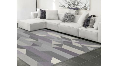
Ruggable Urbano Lilac Rug

“If you have a Ruggable, you already know our rug covers are interchangeable — so you can swap out your existing rug cover with a nice neutral-toned rug that uses Very Peri as a pop of color,” says Kearney, who suggests this lilac-and-gray geometric area rug.
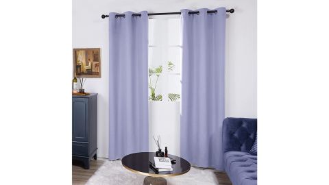
Deconovo Grommet Blackout Curtains

More than 47,000 Amazon reviewers agree that these blackout curtains are worth the purchase — especially in Very Peri. Perfect for a nursery or kid’s bedroom, the curtains not only add a dose of Pantone to the room but also work to keep little ones sleeping by blocking out natural light.
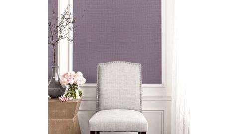
Gracie Oaks Periwinkle Woven Raffia 3D Embossed Wallpaper Roll

Zhuzh up an accent wall with some color and texture. “The natural fibers of seagrass give subtle tonal variations to the Peri color here, which will result in a deepening presence on the wall,” advises Gray.

Everly Quinn Corouthers Velvet Geometric Throw Pillow

“Throw pillows are an easy way to add a pop of Very Peri into the home,” says Murphy, adding that this 18-inch-by-18-inch velvet option — which serves our purpose in the dark blue or purple colorways — would “add some drama in a black-and-white living room.”

ArtEqualsJoy Original Painting Floral Still Life Art

Judy Pickett, founder of the Raleigh, North Carolina, firm Design Lines Signature, is all about channeling Very Peri into her clients’ spaces. “I could see this color used anywhere from a child’s room, to lacquered cabinetry in a sophisticated home bar, to the tile color on a spectacular backsplash,” she advises. We can see why she loves this 10-inch-by-14-inch artwork from Etsy — it’s the perfect way to add a pop of Peri into rooms big or small.
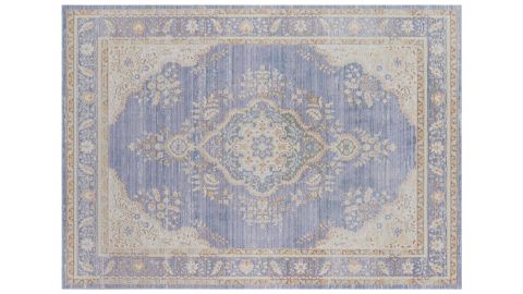
One Kings Lane Luigina Rug

Both Thomas and Helft agree that this beautiful area rug is a surefire way to add a subtle dose of Very Peri to your space, whether it’s a living area or a smaller nook like a library, bathroom or mudroom.

Pottery Barn Teen Watercolor Rainbow Ombré Comforter & Sham (starting at $29.50; pbteen.com)
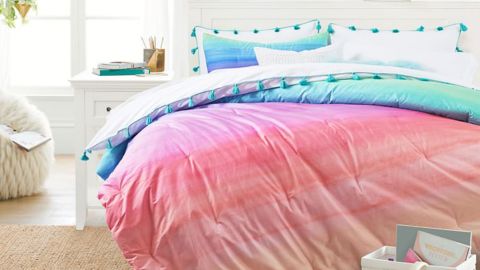
Pottery Barn Teen Watercolor Rainbow Ombre Comforter & Sham

Multiple designers recommended bedding as an easy way to incorporate Very Peri into your bedroom, including Stamm. “Pottery Barn Teen has a fantastic ombré watercolor duvet and sham, which is gorgeous and full of Pantone vibes. I would anchor a teen’s bedroom with this and build around the color,” she says.
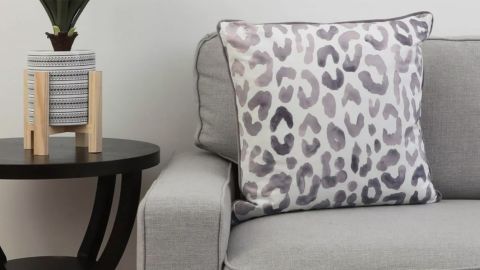
Decor Therapy Oversize Miron Cheeta Printed Throw Pillow

Love you some print? Luckily, so does Low. “I’m always down for a little animal print, and this pillow is the perfect muted, animal style to throw on a bed, a daybed or even the middle of a sofa,” she says.

Estelle Colored Glass Champagne Coupe, Set of 6

We’re totally on board with the colored glassware trend right now, and this pretty champagne set from West Elm hits all the right notes. Says Stacey, “Champagne coupes are so fun to use, and these purple glasses add a pop of color and will look great amongst all of your clear barware.”
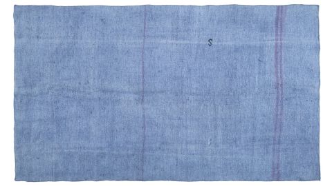
Jarka Vintage Turkish Rug

Lighten up your space with this one-of-a-kind beauty from direct-to-consumer vintage rug retailer Revival. Clocking in at a 4’11 x 8’5, the flatwoven rug is made from 100{6d6906d986cb38e604952ede6d65f3d49470e23f1a526661621333fa74363c48} hemp and features a minimalist design that puts the yarn’s periwinkle hue on display.

Tiffanni Reidy Uses Design to Transform Restaurants and Residences Into Welcoming Spaces

Reidy was able to work with Plauson’s builder on design challenges, such as where the kitchen sink should be placed, moving the master bedroom door, and how to set up the bathroom in the diminutive home, which was completely gutted.

“She navigates difficult times with a lovely, calm focus and gracious presence,” Plauson says. “What I appreciate about her is that she is always the most creative person in the room but also the most focused…and is the first to solve seemingly intractable problems.”

When Reidy works with clients, she meets with them to find out their ideas and intentions and then comes up with conceptual boards and 3D models to guide the project. “A lot of my job is education,” she says. “There should be reasons we’re making design decisions, not just that it looks pretty. It should have meaning behind it.”

Her background in computer graphics and photography often comes into play in her work. She encourages her commercial clients to determine what their branding is, so they can decide on what kind of design they want.

“The more they know about branding the more I can bring that to life in their space,” says Reidy, who has experience with logo and website design. She credits photography with giving her insight into the composition of a space. “You want to capture it from many angles, especially when you’re in a restaurant space. You don’t want people to think it looked great when they walked in, but once they sat down, it’s [just] okay.”

Reidy is currently working with Chelsea Gregoire, the managing partner at the yet-to-open Church bar in Old Goucher. Reidy describes the multi-room space as a “long, older home with front patios, decks, a vestibule, bar, kitchen, and a main area” with each sector having its own feeling and mood. “Chelsea is my ideal client,” Reidy says. “Chelsea knows what their business is and what the brand is.”

Gregoire didn’t want to discuss specific details about the layout and decor, but says that Reidy is helping with finishes, furniture, and designing a space that “fits our concept and the spirit we want to create for the community,” a place where people will gather and feel welcome and comfortable.

“I’m really thrilled about Tiffanni being part of Church,” Gregoire says. “At the end of the day, there’s no one more talented for this project. She goes above and beyond what is expected.”

Reidy knew from the time she was a child that she was interested in art. “That was the thing that really made me happy: drawing and painting,” she says. While she says her two younger sisters are also artistic—one is a musician; the other dabbled in visual arts—she notes there is no one in her family who was an artist role model.

“I think it’s more an influence of being given the space to create versus saying, ‘I want to draw like this person or paint like this person’ as a child,” she says.

Reidy is an avid farmers market-goer, supporting the 32nd Street Farmers Market in Waverly, the Baltimore Farmers Market & Bazaar, and the Hamilton Farmers Market near her home. “My neighborhood is like a mini-Baltimore,” she says, referring to the many restaurants and businesses located in Lauraville-Hamilton.

Favorite spots include Red Canoe Cafe and Silver Queen Cafe for dining out, Walther Gardens for plants and crafty things, and Cloudy Donut Co. for vegan pastries.

When she’s not working, she maintains a large organic garden, where she grows eggplants, peppers, squash, cucumbers, beans, blueberries, and flowers. “We eat a lot of what we grow and give away produce,” she says. “I live in my garden all year.” This summer, she made a “tremendous amount of pickles,” she says.

Reidy follows her own design mantra at her 1920s home, keeping the public spaces minimal, though she admits her office is cluttered with work-related and other paraphernalia, from boxes of tile samples and paintswatch books to gardening seeds and props like glassware and gold flatware. “There is always chaos in the room,” she admits.

She prefers “simple colors” such as green, gray, black, blue, and purple for her house. “Paint is easy to change,” she says. She doesn’t use a lot of patterns except for accents like wallpapering and tiles and is a big fan of African mudcloth with its intricate designs.


“IT’S REALLY ABOUT MY APPRECIATION FOR CLEAN LINES. THERE’S NOT A LOT OF FLUFF OR EMBELLISHMENT,” SAYS REIDY.


A recent design project was particularly near and dear to her heart. Reidy designed a playroom for her daughter when she was 3, detailing the project in her blog, “The Tea,” on her website. “She can go in there and make a mess,” Reidy says. “If we need to have company over, we can shut the door.”

The room’s walls are painted a periwinkle with ample space for hanging Autumn’s artwork, while a colorful rug in periwinkle, orange, and blue makes the space pop. There’s a kid’s kitchen set, art tables, and a pillow-filled seating area.

“We tried to upcycle things and not spend too much when we thought she really wasn’t going to keep it for a long time,” Reidy says. To fashion the creative play zone, Reidy shopped at Target, Ikea, HomeGoods, and Burlington. “It screams kid space but remains modern, and, thankfully, not full of primary colors,” she says.

This is another one of Reidy’s talents. The inveterate bargain-shopper and collector actually likes to find ways to save money. “I love thrifting,” she says. And not just for her own clients. So far, her own keepsakes include about 25 teapots and several matching cups; more than 100 Pez dispensers, which she stores in a box; a growing batch of enamel pins; and all manner of tin cans with food-related themes. She’s also known for her exuberant earrings.

“It’s great,” she says. “But sometimes it’s a problem where to store them.” As such, Reidy can relate to her clients’ storage needs. “Through Tiffanni, I found Mathew Laflamme at Robbins Custom Builders, and together we created the kitchen of my dreams in an extremely tight space,” says Hampden homeowner Plauson. “Perhaps my favorite discussions with her were about paint, wallpaper, and lighting choices. She has such a wonderful eye.”

Reidy often develops close relationships with her customers. “I get to know my clients so well,” she says. “I’m about building a sense of friendship.”

One of those friends is Amanda Mack, who owns the bakery Crust by Mack with her husband, Jarrod, in Whitehall Market. “I met Tiffanni through Instagram, and we met at a coffee shop before I had a storefront,” says Mack. “She was trying to figure out how to get into designing small businesses and focusing on the food and beverage industry.”

When Mack decided to open a shop in the former mill, she turned to Reidy for advice. “I like her aesthetic and attention to detail,” Mack says. “She knew the history of my mission in Baltimore. She was involved from start to finish.”

The outcome is a gleaming sweets shop with a pristine, white quartz countertop and dusty-rose paint accents to showcase Mack’s baked goods, which often sell out early in the day. “I’m over the moon with the result,” Mack says. “Tiffanni helped personalize the store, so things would flow well in the 453-square-foot space. She helped make the space feel like you were going to an intimate setting instead of an 18,000-square-foot market.”

Reidy’s seemingly total takeover of Whitehall Mill continues. She was also involved in another Mack project there, a 3,000-square-foot event space called Layers the Loft, where she created architectural drawings and 3D models as well as recommending finishes and fixtures. She also worked with owner Jasmine Norton on the design of The Urban Burger Bar in the mill market. Outside the market, she was instrumental in designing the recently opened Vegan Juiceology, a storefront on Howard Street in the city’s Market Center-Bromo Arts District.

Though quiet by nature, Reidy is a fierce advocate for her charges. “She is sweet and introverted, but when it comes to business, she is a monster,” Mack says. “She makes sure her clients get what they need.”

Basket Ceilings Are Making a Comeback

When Eneia White unveiled her space at the 2021 Rooms with a View design showcase this fall, visitors were most captivated by one unusual detail: The ceiling, which White had covered completely with woven baskets, hung upside down to create a cozy, textural canopy that made the perfect topper to her dining room.

“We love finding ways to bring repetition of simple or expected objects into our designs, so we gathered as many baskets as we could find to make this space feel cozy,” explains white of the design. “Attaching them to the ceiling was our curve-ball moment in an otherwise soft and charming space.”

Recent shoppers in Manhattan’s Soho might look up to see a similar element in one store: Tory Burch took a similar approach in her new flagship store on Mercer Street. Like White’s dining room, the space features plenty of wicker and rattan (including on custom mannequins), and the ceiling treatment continues these organic textures up above.

store with baskets on ceiling

A take on the basket ceiling at Tory Burch’s new flagship store on Mercer Street in Manhattan.

Courtesy Tory Burch

Burch was inspired in her use by baskets her mother hung from the ceiling in her childhood home in Valley Forge, Pennsylvania. In the store, though, she adapted the design element with flatter, rattan discs, which give a similarly textural feel with a more streamlined ceiling. And why not? Basket-like woven pendants and shades have long been popular in home design—leave out the lights and you still get all the texture and visual interest.

Though White and Burch adapted the look in more modern ways, there’s design history behind decorating with more traditional baskets, too. When it comes to baskets as decor, we’d be remiss not to mention Bunny Mellon: The late horticulturalist and philanthropist so loved baskets—they were often stacked in the hallways, mudrooms, and flower rooms of her various homes—that she built an entire structure dedicated to them on the grounds of Oak Spring, her farm in Upperville, Virginia.

three women in room with baskets on ceiling

Bunny Mellon, right, in the Basket House at Oak Spring, as seen in the book Bunny Mellon Style.

Thomas Lloyd, courtesy Gibbs-Smith

For Mellon, the fascination began at a young age, when she was inspired by a basket factory in her grandfather’s hometown, write Linda Jane Holden, Bryan Huffman, and Thomas Lloyd in Bunny Mellon Style, a new book on Mellon’s homes, art, fashion, and jewelry. Enchanted by the New Hampshire factory—which, surrounded by a stream, necessitated walking across wood planks to enter—Mellon build a replica at Oak Spring, complete with an entrance by bridge over a trickling pool.

“Inside the Basket House, she placed a Georges Braque painting of a bird on one wall, echoing the birds at the New Hampshire farm, and she hung a gallery of baskets from the rafters,” write the authors of Style. The effect is a disarmingly simple, textural backdrop that exudes warm charm.

Entertaining

Brand: Clarkson Potter
amazon.com

$32.63

Mellon hasn’t been the only style icon to build a dedicated structure for her baskets, either: A few decades after the one at Oak Spring, Martha Stewart created a basket house at her home in Bedford, New York. Stewart’s love of baskets as ceiling decor dates back even further than this, too—just look at the kitchen in her onetime Connecticut farmhouse, Turkey Hill, where an assortment of baskets hung above the kitchen island alongside Stewart’s collection of copper pots (these particular baskets made a textural frame around Stewart on the opening spread of her 1982 book, Entertaining).

It probably goes without saying that if modern designers and reigning tastemakers are all in agreement, this is a look worth keeping around. Whether you add a few woven accents to your rafters, top shelves, or above your cabinets, or go full force and take to your ceiling with a staple gun, there are no shortage of options of baskets in every style. See a few of our favorites below (and scope out your local antique store, too; there’s nothing as charming as a vintage basket–or ten).

Follow House Beautiful on Instagram.

This content is created and maintained by a third party, and imported onto this page to help users provide their email addresses. You may be able to find more information about this and similar content at piano.io

‘A wake up call to the industry’: the artist homes blazing a trail for affordable UK housing | Architecture

There is something about the very English muddle of regulations, codes and standards that has set the quality of housing in this country on a race to the bottom. There are rules to ensure that a bare minimum of space, light and ventilation is provided, but, such are the commercial forces driving the industry, these minimum levels also serve as the maximum. Meeting the barely habitable baseline standard becomes the default goal.

Bedrooms are sized to contain a bed, and not much else. Hallways are just wide enough to allow escape in the event of a fire, ceilings just high enough that you don’t bang your head. Windows are the smallest size possible to avoid too much heat escaping, while letting in a small chink of daylight. Lacking a minimum area, it is often the living room – where you might spend the most time – that bears the brunt of the squeeze, cut down to the meanest sofa-shaped sliver. The straitjacket of codes gives architects and their clients little other option, they say, particularly when working within the constrained budgets of local authority housing.

But that’s not entirely true, as a new affordable housing block in east London goes to show. Built by the borough of Barking and Dagenham’s housing company, Be First, with the help of arts charity Create, it demonstrates how all the standards can be met and all the boxes ticked, while offering a radically open, flexible and light-flooded model of living – without costing the council a penny more to build.

“We see it as a built research project,” says Nicholas Lobo Brennan of Apparata architects, standing in the lofty open-plan living area of one of the 12 new flats in the striking concrete building, which will provide affordable homes for artists. “There is so much bad housing being built in the UK, mostly the product of a totally risk-averse procurement culture. We want this project to be a wake-up call for the industry, to show it’s possible to do it differently.”

Filled with light ... A House for Artists by Apparata
Filled with light … A House for Artists by Apparata Photograph: Ståle Eriksen

There is a reason this project differs from the norm, but it shouldn’t be allowed to remain an anomaly. Dubbed A House for Artists, it was initiated as part of the council’s wider strategy to attract artists to move the borough, and retain those that are already there. “Barking not Berlin,” was council leader Darren Rodwell’s rallying cry when he launched London’s first artist enterprise zone in 2016, pledging to put “art in the heart” of regeneration. There has since been a flurry of new studios and workspaces, and two big new film and TV studios are on the way; the housing project is part of an attempt to make sure the creative workforce is not priced out of the area in the process.

It is an unusual model. The 12 artist tenants, who have been selected from across London by a panel including Grayson Perry (who is making a permanent artwork for the site), will pay 65{6d6906d986cb38e604952ede6d65f3d49470e23f1a526661621333fa74363c48} of market rent in exchange for contributing to a community-facing arts programme in the ground floor of the building. “It could be anything from running homework clubs to dance sessions,” says Diana Ibáñez López, senior curator at Create, “or from video editing workshops to repair cafes. It’s not a gallery for exhibiting their work, but a public room for hosting a long-term, free programme that responds to local needs.”

The artists range from people in their early 20s to mid-70s, working in everything from theatre and photography, to clothing, sculpture and film-making, from self-taught makers, to someone with a professorship, and some on incomes that would be too low to qualify for affordable housing. Create will work with them for the first two years to facilitate the public programme, before leaving the group to self-organise. The idea, they say, is to avoid the common phenomenon of artists acting as gentrifying agents, whereby their presence contributes to raising property values but has little benefit for existing residents. “How can they be embedded in the community,” asks Ibáñez López, “and give something back?”

A House for Artists by Apparata
A bold arrival … A House for Artists by Apparata. Photograph: Johan Dehlin

The building is a bold arrival, standing on the edge of Barking town centre as a stark stack of chiselled concrete forms. It looks like an oversized model, as if made from a set of primary-shaped toy building blocks of the kind children might be given to play with at an austere Swiss kindergarten. Neat rectangles are carefully arranged to form a grid, offset by the whimsical placement of triangles and circular cutouts, giving it the look of a creature peering around the corner, raised on sturdy legs, one ear cocked. The hoardings came down this week and it’s already become a local selfie-magnet.

If it looks like something from more Teutonic climes, there’s a reason. Lobo Brennan and his partner Astrid Smitham spent several years working and teaching in Switzerland, absorbing a love of rigorous planning, structural logic and carefully poured concrete, before returning to London to found their practice in 2015. They bring not just Swiss precision, but a refreshing outsider’s approach to the maze of English regs and standards, starting from first principles rather than just doing what’s always been done. This is their first project on this scale and it shows an obsessive level of attention to the practical details of planning and construction, squeezing the tight budget as far as it will go.

The typical arrival at a new apartment block in England can be grim. You often enter an artificially lit lobby, which leads to a windowless stairwell and, in turn, to a long windowless corridor loaded with single-aspect flats on either side, each home enjoying a view out in just one direction. But here, you are taken up an outdoor staircase and along broad red-tiled decks, wide enough for furniture and plants, each shared by just three flats, to reach your front door. Huge openable windows bring light flooding in from both sides, while the usual hallway has been banished, giving more space to the open-plan living room and kitchen.

A House for Artists by Apparata
Rigorous planning … A House for Artists by Apparata. Photograph: Ståle Eriksen

“Usually a big chunk of a modern apartment is eaten out by the hallway,” says Smitham, “and you’re left with meaner individual rooms. But we’ve designed these flats so the area that would be given to the hall can become an extra bedroom instead, or a study, or simply make a much bigger living area.” The flats meet the usual London space standards, but they feel vast, helped by 2.8 metre high ceilings (up from the mandatory 2.5 metres). Partition walls between bedrooms have been designed to be easily removed (they are electricity socket-free), while the bare ceilings mean additional walls can also be added anywhere to suit tenants’ needs. The kitchen, designed as a single movable unit, can be easily plumbed in at any point along the wall. The layout is not only more open and adaptable, but safer, too: the bedrooms lead on to another balcony deck at the back, providing a secondary means of escape in the event of a fire.

The original competition brief called for co-housing, but Apparata won the project because theirs was the most practical and flexible model for how people actually live, with sharing “optional, not enforced”. One floor has been conceived as the potential co-housing level, with big double doors in the party walls between the flats, allowing three neighbours’ living rooms to be joined up – for shared childcare, co-working or simply having an amazing party in a warehouse-sized space. Another flat enjoys a double-height room in one of the quirky triangular volumes, allowing the potential for a mezzanine, and its own patio for messy outdoor work.

“Most contemporary housing is still designed around the model of the nuclear family,” says Smitham, “but that doesn’t reflect the diverse configuration of people’s lives today.” She describes how their design can accommodate multiple arrangements, from caring for an elderly relative, to housing extended families, to catering to a more communal way of living. As local authorities increasingly have to accommodate diverse family needs, this is an ideal blueprint for 21st-century council housing, adaptable for the long term and future-proofed for any scenario.

A House for Artists by Apparata
Radically open and flexible … A House for Artists by Apparata. Photograph: Johan Dehlin

It may all sound like an experimental one-off, but this building is eminently replicable and, in the words of the council’s maintenance department, “a compliance dream”. It has been built with entirely off-the-peg components and standard building methods that Lobo Brennan says “any contractor could do”. Avoiding the usual waste of additional cladding and linings, the structure has been stripped back to the raw concrete envelope, which does every job (and has a low cement content, cutting the building’s embodied carbon footprint to 20{6d6906d986cb38e604952ede6d65f3d49470e23f1a526661621333fa74363c48} less than the RIBA’s 2030 target). It was cast with reusable metal formwork, without the usual sacrificial layer of plywood. As a result of these savings and the efficient layout, the overall construction cost was lower than usual for the borough’s affordable housing programme, while providing much more generous homes.

In a curious way, the special status of the artist residents – classified in mayoral reports as a kind of fragile endangered species, pushed out of London by rising rents – has been a useful Trojan horse to ensure the high quality of these homes. When cost-cutting kicked in, and the business-as-usual approach threatened to take over, the nature of the tenants could be used as ammunition to argue for things such as bigger windows, higher ceilings and more robust finishes. It reflects the sorry reality of UK procurement culture that such things should be deemed special, a luxury for creatives.

“It’s not just artists that should have light, generous, affordable homes,” says Lobo Brennan. “This kind of quality should be available to anyone.” If other councils and housebuilders take note of Apparata’s radically practical innovations in Barking, it could well be.

Rodney L. Cooper Obituary – TheTimesNews.com

Rod Cooper passed into the mysteries of the universe on November 29, 2021. He was proceeded in death by the love of his life, his wife, B. J. Brantley Cooper. Devoted father to daughter Brantley Elliott Cooper, life mate Ryan M. Fitzgerald, and proud grandfather to his “buddy” Peyton Cooper Splawski, all of Greensboro. He is preceded in death by his parents and bother Gary Cooper. He is survived by his brother-in-law James Brantley, wife Kathryn, and nieces Allison and Meredith, all of Wendell.

A true southern gentleman, throughout his life Rod maintained the highest standards for himself. From hosting guests to reaching out to friends and family, he believed in making the world a better place through beauty, excellence and giving. His dry wit, sense of humor and ability to laugh at himself and at life, will leave a void in all who knew him well.

Rod was born April 12, 1951, in Burlington, North Carolina to Ellen Forbis Cooper and Wayne Harris Cooper. From the time he was able to hold a pencil Rod drew pictures and planned spaces. On his eleventh birthday, he began formal painting classes with his first box of oil paints. Rod’s mother was an artist and teacher. Her love of art and design affected and informed his life’s passions. She loved decorative arts, and he was weaned on antique stores and art galleries. Rod’s father supported his efforts from the time he held his first crayon.

Rod’s art and design education began with a summer session at The NC School of the Arts in high school. In 1973 he received a BFA from UNC Chapel Hill with a double major in Studio Art and Art History. He did graduate studies in Art History at UNC Chapel Hill and then lived in NYC and Washington, D.C. where he furthered his career. He continued his education in Washington with graduate studies at American University, classes at the Smithsonian Museum, and classes with Clement Conger, former Director of the State Department public rooms and collections.

Upon his return to North Carolina, he became Director of The Firehouse Gallery in Alamance County, served on the Board of directors for the Alamance County Arts Association and taught drawing and painting classes at Alamance County Community College. His first adult exhibition of art was at Green Hill Center for North Carolina Art in 1975. Rod’s work in the home furnishings industry and the decorative arts began at The Alderman Company in High Point as a set designer, graphic designer and finally Creative Director. He wrote copy, designed photo shoots, and was an award-winning art director of hundreds of catalogs and ads. He also restored homes and interiors for clients and himself.

In 1987 Rod co-founded Cooper and Cockerham, Inc., a marketing group doing branding, design, art direction, production, advertising, printing, data services and fulfillment. He was President and Creative Director until 2002 when he became Creative Director Emeritus. Rod created office interiors and did showroom design for many furniture and fabric manufacturing clients. He designed furniture, wallpaper patterns and fabrics. During his time as art director, Rod designed over 1000 room settings. Today, Cooper Cockerham, Inc. successfully does business as C2.

In 2010, he retired to be caregiver for his wife who was diagnosed with early-onset dementia. Upon retirement, Rod began painting again. In 2012 he had a one-man exhibit at The Shop at Green Hill coming full circle from the show in 1975. In 2016 he had a show of large works at The Center for Visual Arts and in 2018 he exhibited at the View on Elm Gallery. His paintings hang in the collections of Wells Fargo, BB&T, Lloyds of London, and many private collections.

He continuously gave generously of his time and funds to various organizations in the community. Rod gave his paintings freely to support charity auctions. He was a volunteer for Green Hill Center for North Carolina Art and served on the board of trustees for six years. Rod also served as a volunteer for Weatherspoon Art Gallery at UNC-G and was on the Association Board of Weatherspoon. He was a member of First Presbyterian Church where he was a Sunday school teacher and usher. Rod was designer of the Governor’s Guest house during the Hunt Administration and a volunteer for The Barnabas Network, did reading assistance at Jones Elementary school and Our Children’s House.

The family wishes to thank Constance Garner and Diane Quillen with At Home Care for the amazing care they provided. We would also like to thank Dr. Clarence Owen for being an advocate for our dad, especially the past few months.

A celebration of his life will be held on Sunday, January 09th, at five o’clock, 2022, at Undercurrent Restaurant, 327 Battleground Avenue, Greensboro, NC 27401. Services provided by Triad Cremation and Funeral Service.

Rod always surrounded himself with flowers, planting, gardening, so the family requests no flowers but rather donations to Weatherspoon Art Museum or Green Hill Center for North Carolina Art.

Posted online on December 11, 2021

Published in Burlington Times News

Art by Maudsch Tipped As 2022’s Best Interior Design Trend

The handmade painting company provides excellent artwork for those who need to add something special to their home.

Are you looking for the next big focal point for your sitting room? Need a piece that echoes the color scheme of your bedroom? We know the frustrations of trawling through catalogs to find suitable artwork to suit you. For the connoisseur, it might be enjoyable, but when you’re not an art critic – how do you know when you have found something good?

Enter the artistic flair of Art by Maudsch. This talented team creates hand-painted artworks which suit any space. They have been tipped as the next important thing in interior décor in 2022 since their pieces are highly adaptable to your needs. Its artwork is tailored to your specifications. Here is how it all works.

Handmade Paintings for Your Home

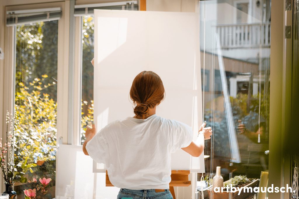
Art by Maudsch uses expert artists to hand paint each piece they sell. They use a mixture of mediums, either oil or acrylic paints. In addition, they use high-quality cotton canvases to create paintings using their network of professional artists.

Paintings are created to match your needs, then shipped worldwide free of charge. You can view and approve your painting online before committing to buy it. They have already gathered over three thousand satisfied clients, who each now own a piece of unique Amsterdam artwork. 

How does it Work?

The artworks are produced as original pieces and listed on the site with this seller. You can browse through the different sections to find art that matches your theme, space, or color scape. Next, you select the piece you would like to buy, and an artist paints it for you. Paintings are made entirely to order, and a painting purchased from Art by Maudsch is far more unique and exciting than mass-produced prints from any other outlet.

Framed by professionals

If you choose a framed painting, which we recommend you do, it will be framed by skilled professionals. The framing facility used by Art by Maudsch is also located in the Netherlands and produces frames from the highest-quality Czech pine wood. The framed pieces are delivered to your doorstep, ready to hang.

Canvas Sets from Art by Maudsch

Canvas sets are the ultimate way to decorate a designer home. They allow you to mix one art piece throughout several rooms or place many canvases on the wall to make up a single picture. Canvas sets are increasingly popular, allowing a pop of creative expression in any home. But, of course, the best part about a canvas set from this team of designers is that they are unrivaled in taste and style. They have been handmade for you by some of the finest modern artists in the world. Art by Maudsch is shipped to you from one of the best-known artistic cities on the planet.

Amsterdam & Art, a great combination, fueled by ArtbyMaudsch. 

What is the first thing that comes to mind when you hear ‘Amsterdam’? Maybe it’s the canals, the tolerance, or even the Red Light District! But did you know that Amsterdam was, in the Dutch Golden Age, the epicenter of world-renown art? Famous master artists like Rembrandt van Rijn, Johannes Vermeer, Frans Hals, and of course Vincent van Gogh all lived and worked in this beautiful city.
With many museums and statues to honor them around the city, their vision, expertise, and philosophy reverberate throughout older and future generations.

Spread the message

Art By Maudsch, based in Amsterdam, saw the big positive impact that art had on the population and the city. They acknowledged that art can be the bearer of timeless ideas and values and blissful beauty. Art can inspire people, spark new ideas or create a conversation between different people. With the many merits that art has to offer, Art By Maudsch felt the urge to share these with the whole wide world! 

Personal Adjustments

By offering handmade, original art pieces at fair prices online, they make pure, handmade art available worldwide. Sure, a printed painting is nice and affordable, but a real handmade artwork is something different! With a great communication center, available day and night, and even an option to make personal adjustments to the pieces, Art By Maudsch feels personal and as if you are in direct contact with the artists themselves. 

Canvas Sets

Because art is subjective, different people like different styles of art, the possibility to make personal adjustments can really help you find the exact piece for your home interior. And Art By Maudsch takes it even one step further, offering a variety of Canvas Sets. These sets consist of multiple, separated artworks with the same atmosphere, that you can freely adjust and style accordingly to match the atmosphere of your home interior perfectly.

Art By Maudsch is therefore more than just an online gallery, it is an experience where the professional team takes you by the hand in the search of your ultimate, handmade art piece. From the city where it all started, right to your doorway and without any costs whatsoever! 

Dave Verhoeven

Amsterdam

ArtbyMaudsch

Written in partnership with Aggrandize